Cultivating Identity: The Branding Journey of Farmish
Cultivating Identity: The Branding Journey of
Farmish
INTRODCTION
Farmish, a new venture by a renowned business house, aimed at exploring the fertile grounds of hydroponics, sought our assistance for their end-to-end brand launch. Our objective was to materialize their vision, starting from scratch, translating it into a comprehensive brand identity that mirrored their ethos of sustainable and innovative farming.
Challenge
Our challenge was to create an impactful brand identity, digital presence and tangible assets for Farmish, that spoke not only to the quality and innovation of their hydroponic solutions, but also the sustainability and earthiness of their approach. It was a journey from a blank canvas to a brand with resonance, from ambiguity to a compelling brand narrative.
Approach
Our work started at the heart of any brand – the logo. Given the importance of this task, we presented three distinct logo concepts, each embodying a unique direction, providing a glimpse into potential brand narratives.
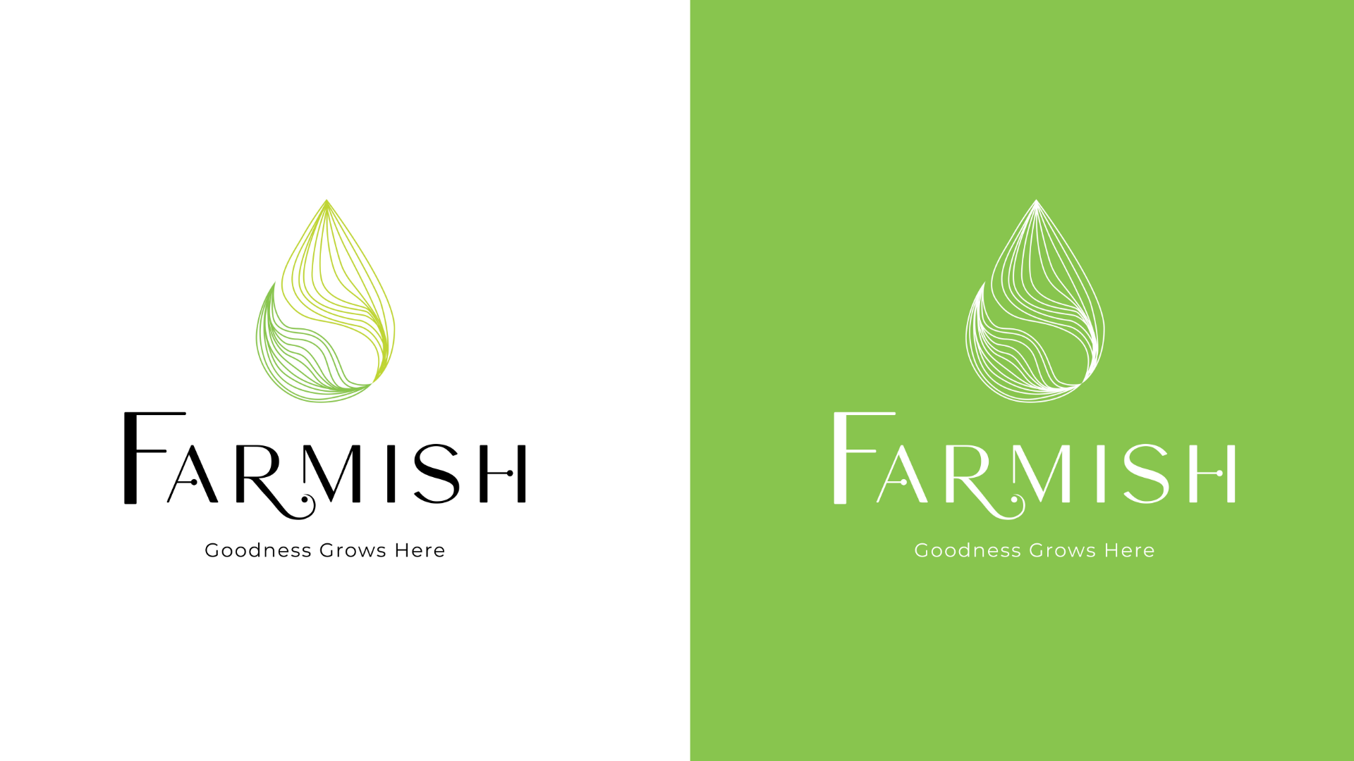
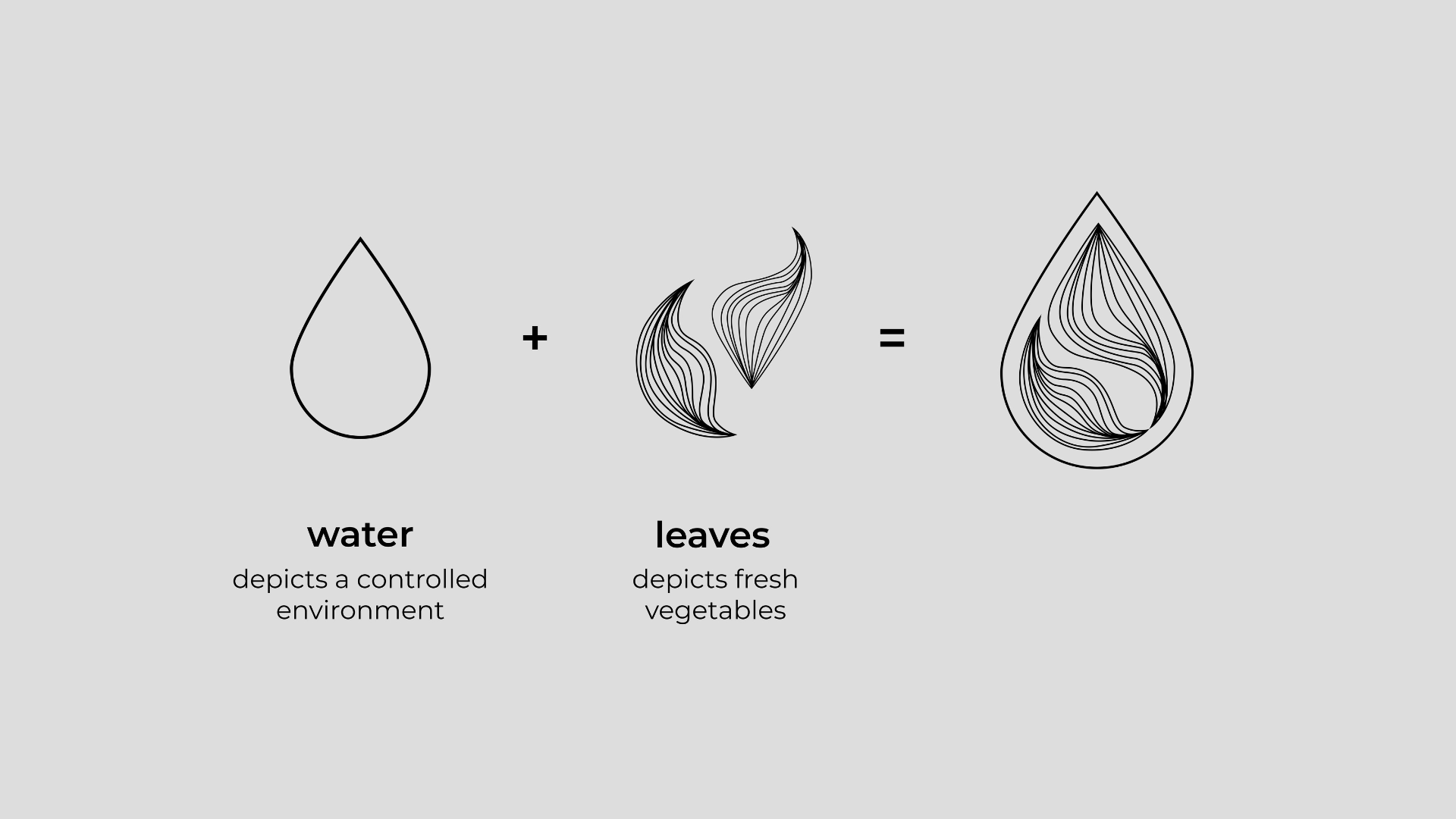
Nature's Drop of
Perfection
This logo concept is designed to represent Farmish’s commitment to producing fresh, sustainable, and controlled hydroponic farm produce.
The two leaves, arranged in a water droplet shape, symbolize the fresh produce that Farmish provides, while the shape itself represents the controlled hydroponic environment.
The custom stylized curves of the sophisticated word mark further emphasize the brand’s commitment to modernity, richness and quality.
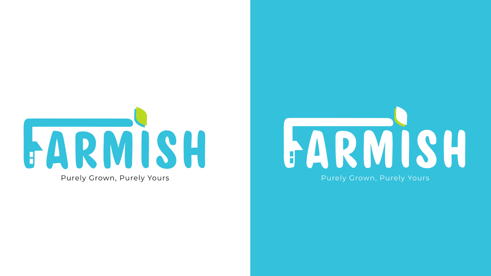
From Farm to Your
Home
This logo concept is designed to represent Farmish’s playful, yet fresh and sustainable approach to hydroponic farming.
The word mark is custom-made to be playful, but there is a deeper meaning.
The leaves on top of the letter “I”, symbolise the fresh produce that Farmish provides.
The leaves are directly connected with the letter F, where the vertical column depicts a home with a roof and windows.
The concept? A special, direct connection – Straight from farm to your home.
This logo concept is intended to communicate Farmish’s commitment to providing fresh, high-quality produce that is delivered straight to the consumer.
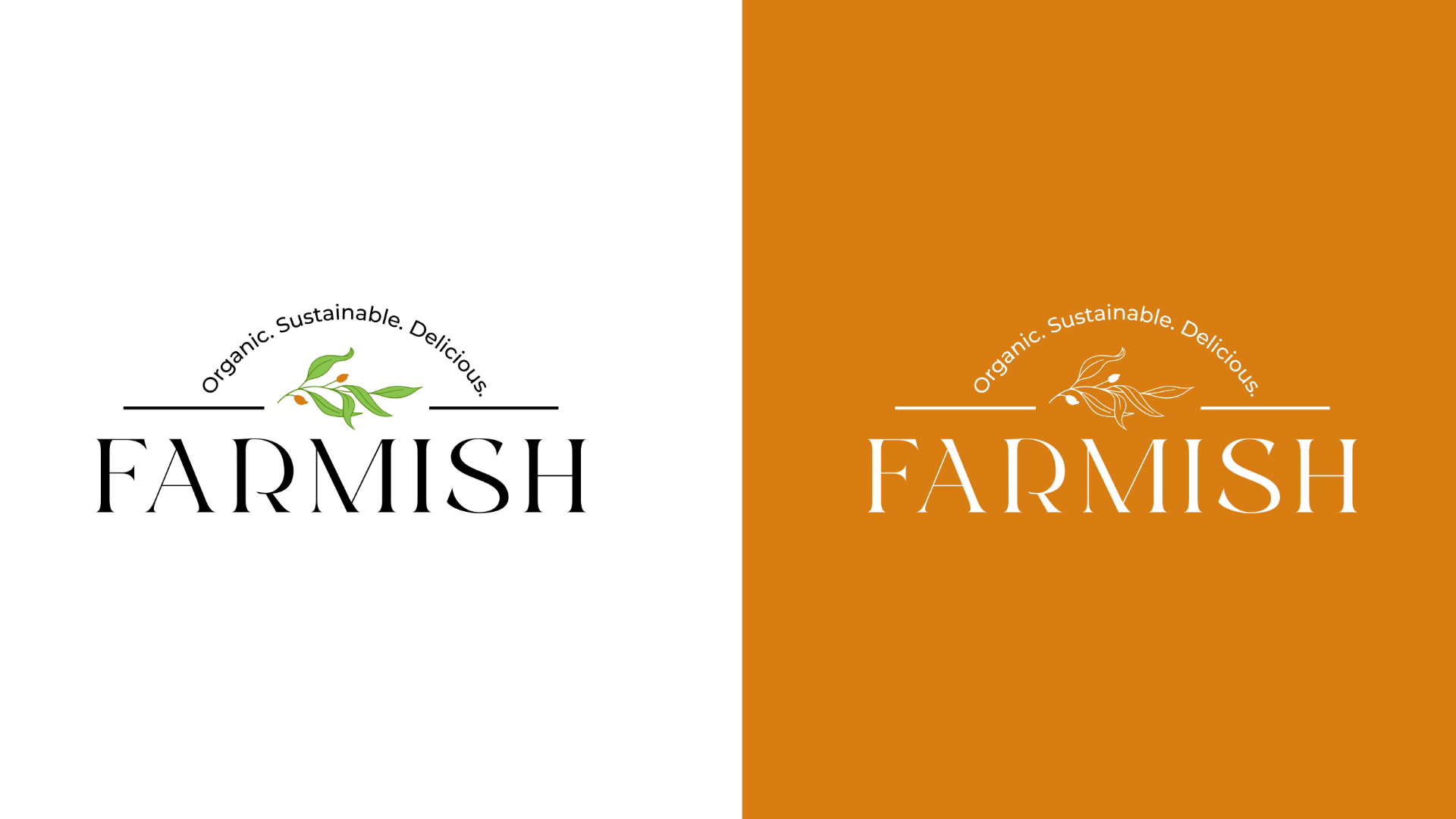
Tradition Meets
Modernity
This logo concept is designed to represent Farmish’s playful, yet fresh and sustainable approach to hydroponic farming.
The word mark is custom-made to be playful, but there is a deeper meaning.
The leaves on top of the letter “I”, symbolise the fresh produce that Farmish provides.
The leaves are directly connected with the letter F, where the vertical column depicts a home with a roof and windows.
The concept? A special, direct connection – Straight from farm to your home.
This logo concept is intended to communicate Farmish’s commitment to providing fresh, high-quality produce that is delivered straight to the consumer.
OUTCOME
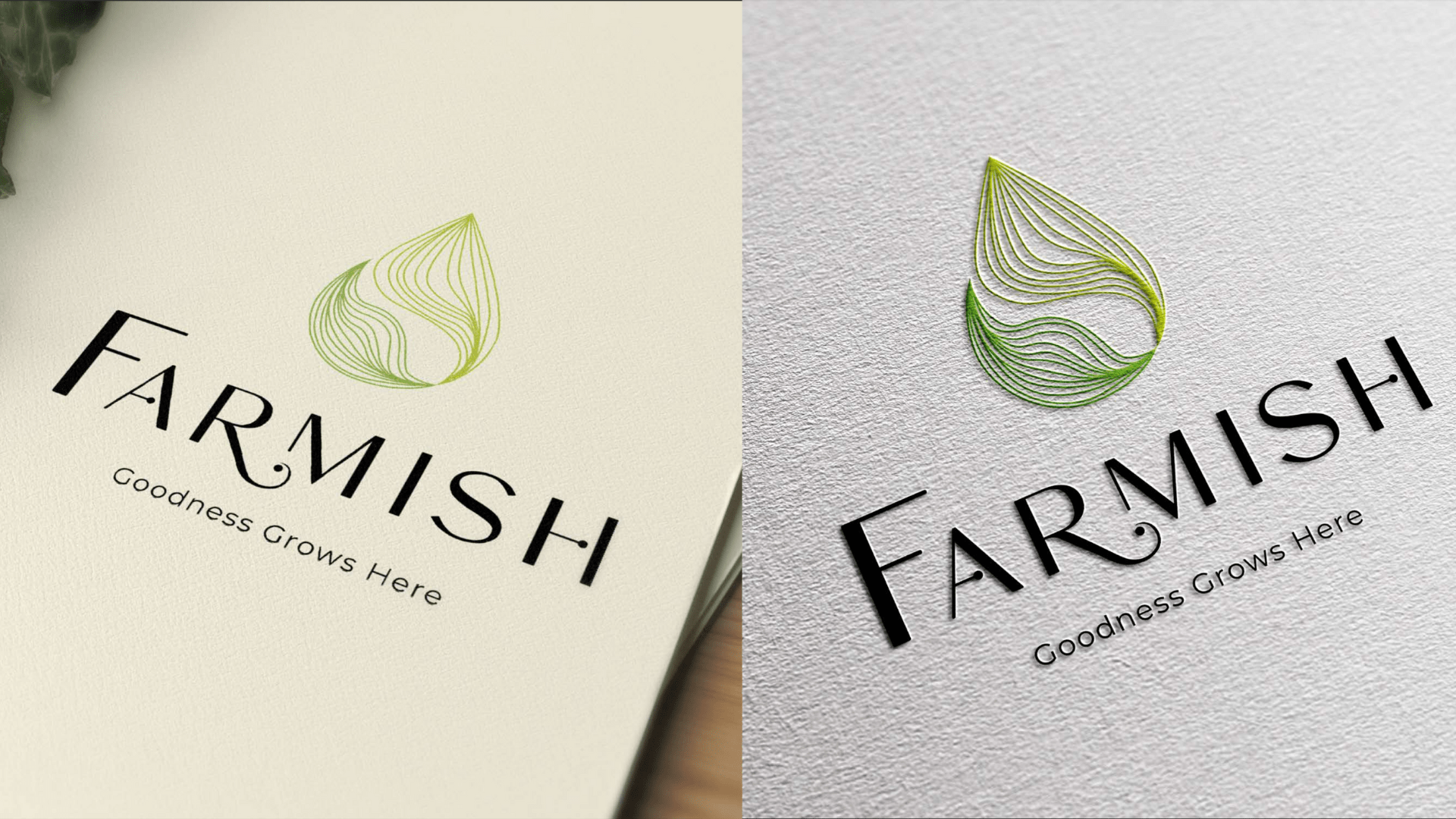
The chosen logo, christened “Nature’s Drop of Perfection”, encapsulated the brand’s core essence. The drop signified the essence of life and growth, while the meticulous design reflected precision and expertise, true to the nature of hydroponics. This was to be the cornerstone of the brand’s identity.
TAGLINE
With the logo set, we introduced the tagline – “Goodness Grows Here”. This served as a simple yet powerful brand promise, reflecting Farmish’s commitment to providing nourishing, homegrown produce, cultivated sustainably.
“Goodness Grows Here” sparks excitement in our audience, as they savor the perfect blend of innovative farming and nature’s purity in our luxurious, nutrient-packed produce. The tagline assures a healthy, sustainable, and indulgent food experience.
It encapsulates the essence of Farmish, celebrating the cultivation of fresh, nutrient-rich, and sustainably-grown produce that enhances the well-being of our consumers.
BRAND
STORY
Our branding journey would be incomplete without the captivating brand story that sets the tone for Farmish’s unique identity.
In the heartland of India, between the rhythmic beats of Kanpur and Lucknow, a seed of change took root – Farmish. We saw a vibrant India, yearning for a healthier future, and so our journey began. Not just to farm, but to farm better, cleaner, and more sustainably.
Inspired by the vast potential of hydroponics, we embraced this innovative technique, creating lush fields of nutrient-rich produce, unfettered by soil or seasonal shifts. Our vegetables thrive in their unique, water-based environment, absorbing the right balance of minerals and vitamins, each carrying a burst of health.
Every crisp leaf, every vibrant vegetable from Farmish is a testament to our commitment to purity and freshness. Handpicked with care, they travel directly from our fields to your tables, carrying the vibrant spirit of our farms into your homes.
Farmish is more than just a brand; it’s a movement towards conscious choices, healthier living, and a sustainable future. We envision an India where every meal is not just nourishment but an act of awareness and respect towards our planet.
Welcome to Farmish, where we celebrate the essence of life and vitality, where true goodness grows. Join us in this journey of transformation, and let’s cultivate a healthier future, together.
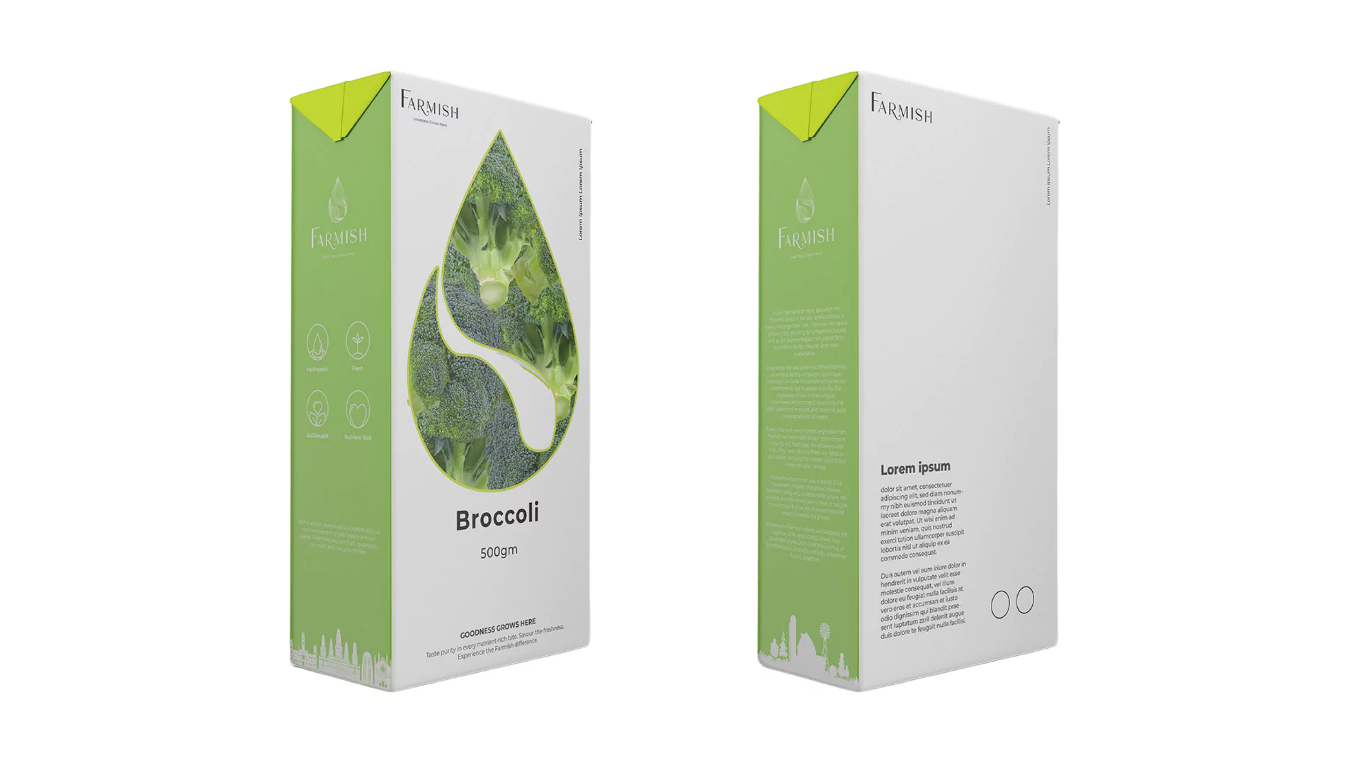
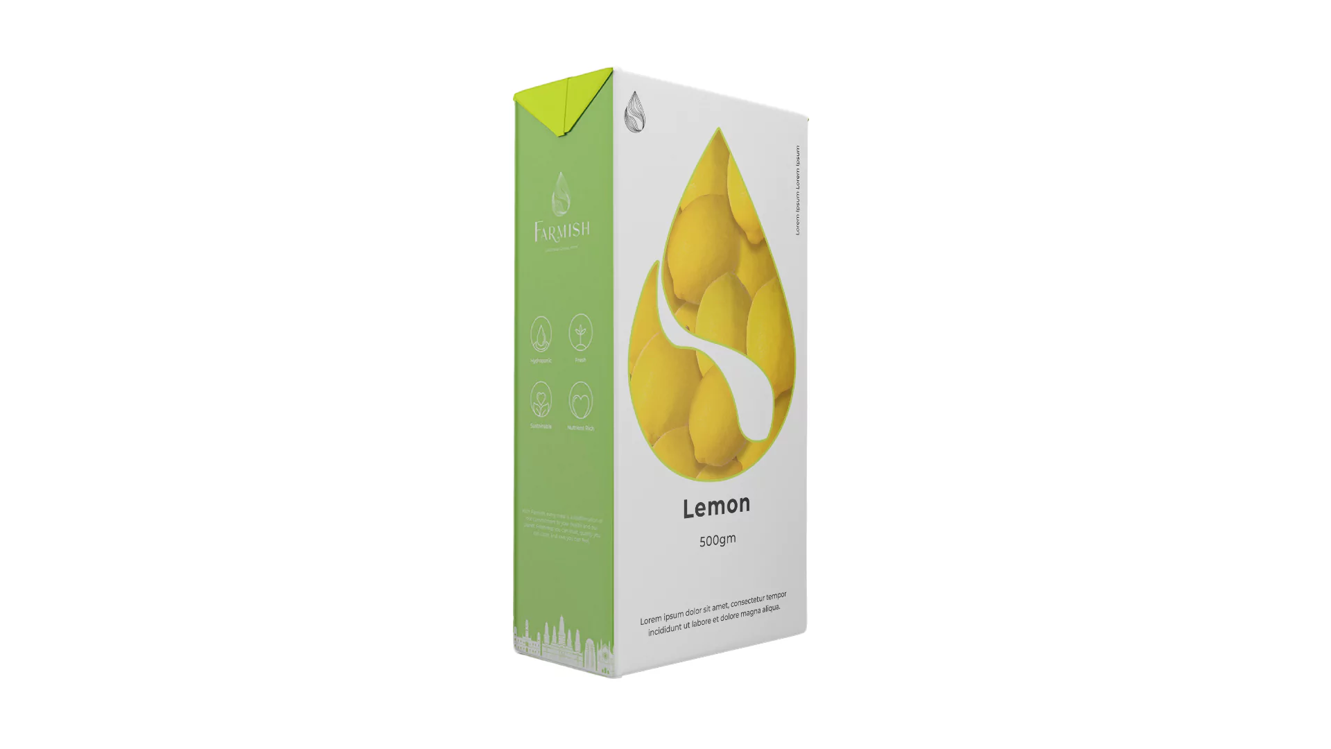
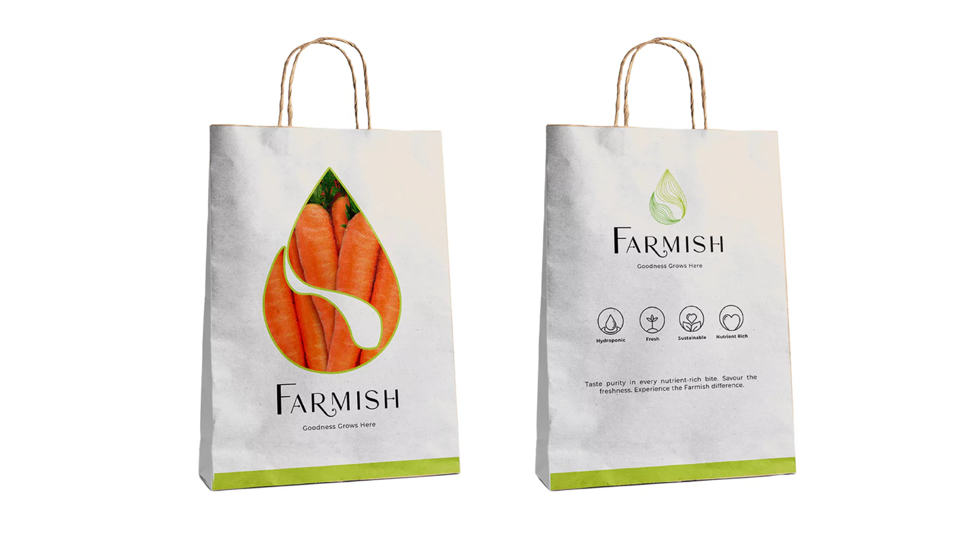
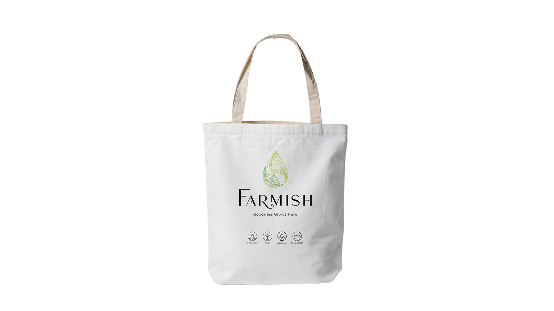
PACKAGING
With the foundation laid, we proceeded to develop the brand guidelines. These were a set of standards that detailed the brand’s aesthetic, communication tone, and overall identity. This comprehensive document was designed to ensure consistency across all brand touchpoints.
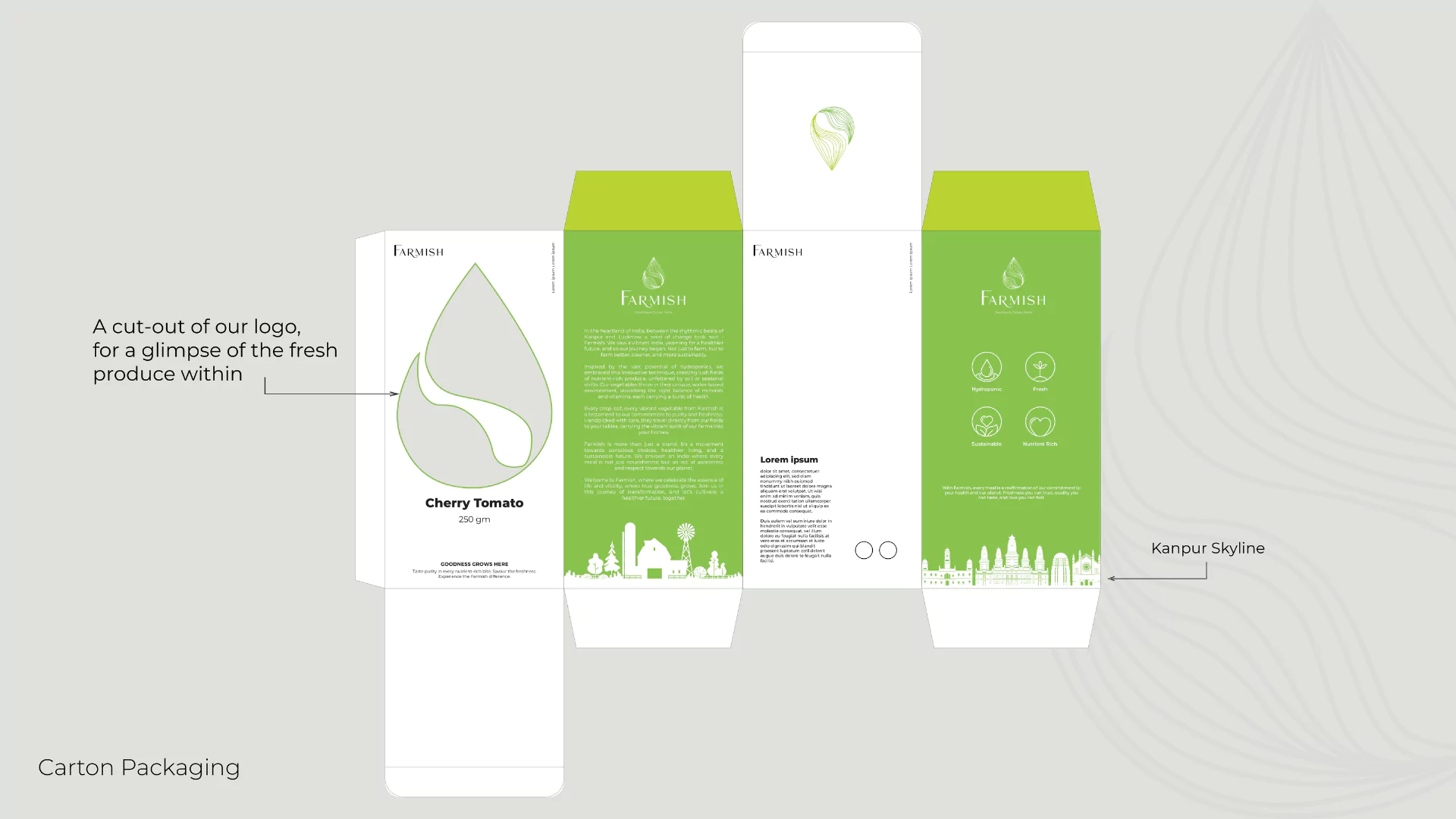
The next step was to translate the brand’s ethos into tangible assets, beginning with packaging design. To adhere to Farmish’s commitment to sustainability, we developed three different packaging solutions – box, paper bag, and a sustainable cloth bag, each marked with the unique brand identity.
CONCEPT NOTE - BOUNTIFUL
VISTAS
Our packaging is a canvas where Farmish’s ethos unfolds. Its harmonious white and green palette reflects purity and growth, the essence of our brand. The box and paper bag carry a distinctive cut-out of our logo – a water droplet, cleverly revealing a glimpse of the fresh produce within.
Integral to our design is the illustrated Kanpur skyline. This visual tribute to our roots marries tradition and innovation, symbolizing our hydroponic farming approach. The notable landmarks echo our local connection and add a touch of heritage to our modern aesthetic.
The reusable cloth bag underscores our commitment to sustainability. It invites customers to join us in this conscious journey towards reducing waste and making every choice count.
In its sophistication and thoughtfulness, our packaging isn’t merely a vessel; it’s a statement of our belief – ‘Goodness Grows Here.’
THE SPECIAL FACTOR:
KANPUR
Incorporating Kanpur’s iconic skyline in our packaging, we pay homage to our roots, showcasing the fusion of history and progress that mirrors Farmish’s journey – bridging traditional respect for nature with innovative hydroponic farming.
CUSTOM
ICONS
PACKAGING
ONGOING
JOURNEY
As with any dynamic brand, the journey doesn’t end at the initial launch. Our work continues as we strive to create a digital presence that matches the quality and ingenuity of Farmish’s offerings. As we venture further into the realms of tech and marketing, we aim to create a consistent and engaging narrative across all platforms.
Stay tuned as we prepare to unveil the digital face of Farmish – a platform where modern technology and Mother Nature converge to cultivate goodness.
Conclusion
Crafting a compelling brand story for Farmish has been an exciting journey that combined our end-to-end services with Farmish’s innovative vision. As we proceed towards creating a comprehensive digital and marketing presence for Farmish, we’re excited for the world to experience a brand that truly believes – “Goodness Grows Here”.