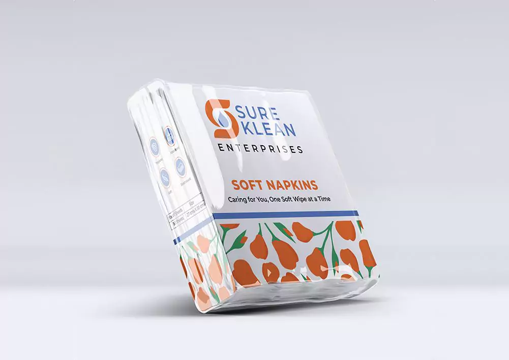
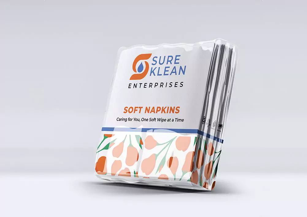
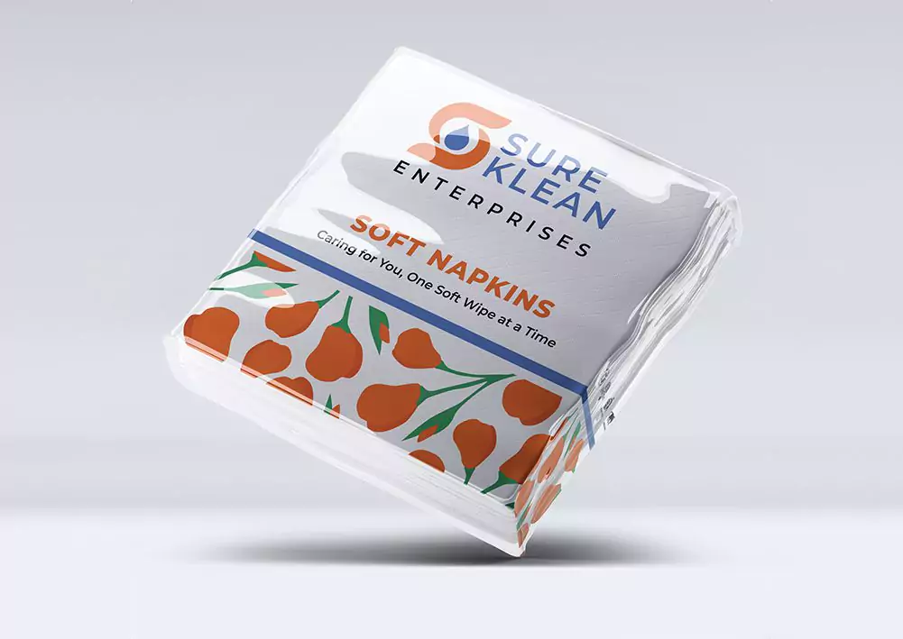
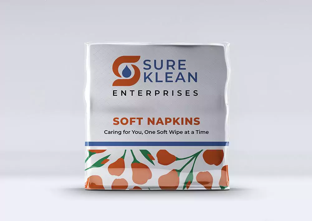
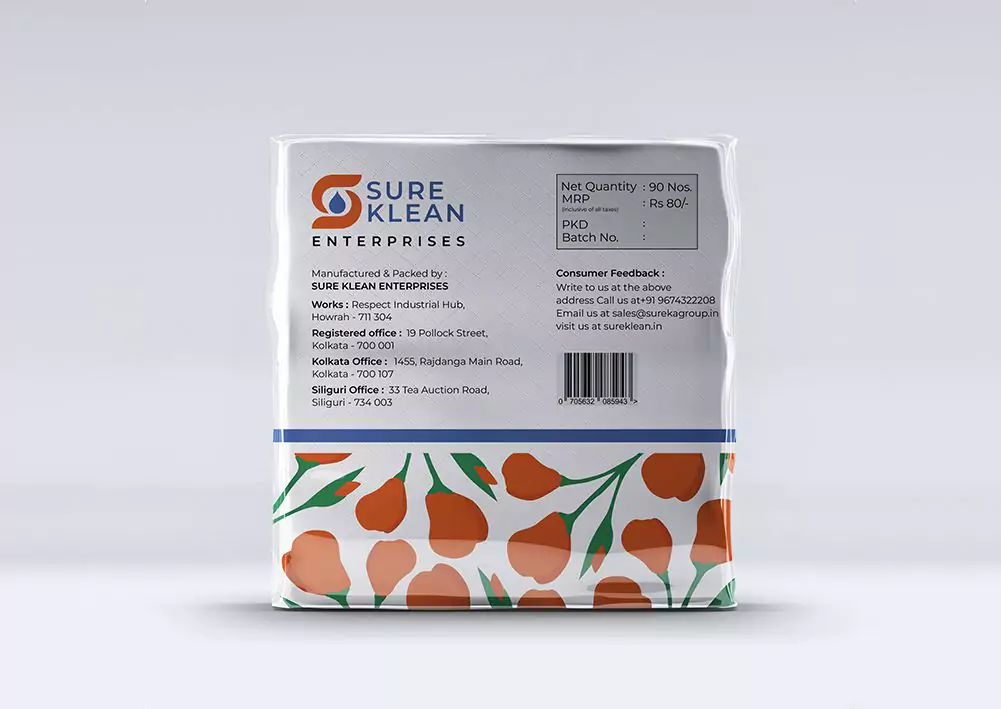
SureKlean Paper Napkin: Unfolding the Story of the Tulip
By incorporating flowers as a main branding element across our product line, we create a cohesive visual identity that communicates grace and sophistication.
The tulip motif embodies a fresh & elegant essence that resonates with consumers seeking high-quality paper products.
As a symbol of beauty and renewal, the tulip evokes feelings of comfort and rejuvenation, which aligns perfectly with our brand values and the experience we aim to provide.
In the eyes of consumers, the tulip motif signifies our commitment to delivering products that not only meet but exceed their expectations for performance, softness, and sustainability.
Client:
SureKlean
Date: