UPRise Summit
UPRise Summit: A Logo Illuminating the Path to Sustainable Progress
At our agency, we are passionate about creating visual identities that resonate with the core essence of an initiative.
One such project that stands as a testament to our mission is the logo design for the UPRise Summit, a platform focused on fostering sustainable and inclusive growth in Uttar Pradesh.
Logo Design: Cultural Roots Meeting Industrial Evolution
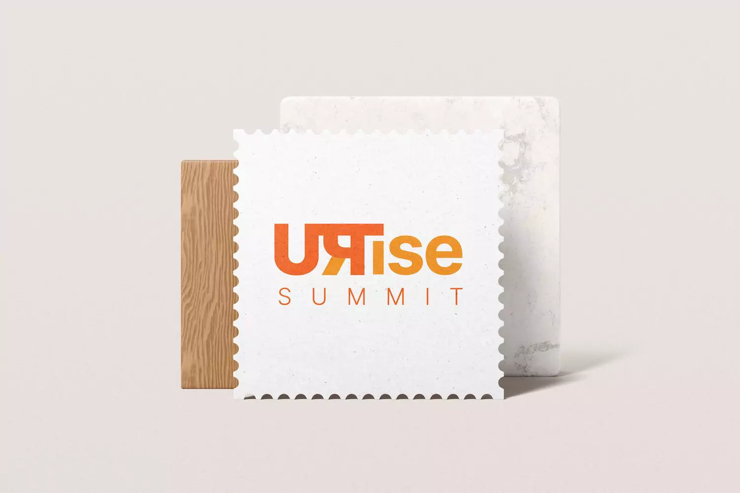
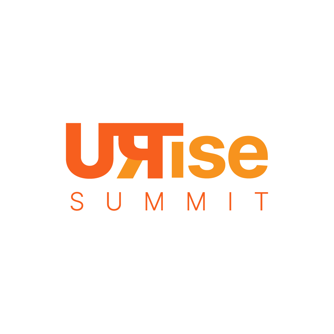
Our inspiration for this project stemmed from a prominent business house’s vision to uplift Uttar Pradesh’s industrial sector while preserving its rich cultural heritage. To embody this dual focus, we innovatively merged the Hindi ‘Pa’, a nod to Uttar Pradesh’s linguistic roots, with a horizontally flipped ‘R’ to form ‘UPRise’. This design, while appearing modern and minimalist, is steeped in meaning, bridging the gap between tradition and progress.
Symbolizing Hope, Renewal and Responsible Growth
The color palette for the UPRise logo echoes the ethos of the Summit. The vibrant orange hue, reminiscent of the rising sun, infuses the design with symbols of hope, renewal, and the dawn of a new era. It is a visual representation of the UPRise Summit’s core mission: to light the path towards a balanced, sustainable industrial landscape in Uttar Pradesh.
In essence, the UPRise Summit logo is more than a graphic element; it’s a powerful symbol that perfectly intertwines the cultural relevance of Uttar Pradesh with the summit’s mission of industrial evolution. This project showcases our ability to translate complex narratives into compelling visual identities. To discover more about our transformative work, browse through our extensive portfolio.
Date:


