Snackergy
Logo Design
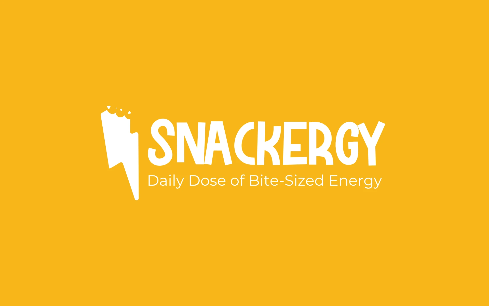


Snackergy’s identity is what happens when snacking meets supercharge.
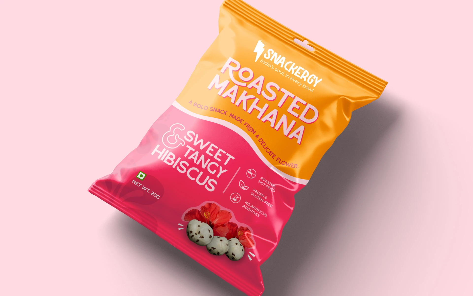
Snackergy is a health-forward snack brand that delivers clean, bite-sized energy to keep you going. Think protein-packed, flavor-loaded munchies designed for people who move fast and think faster.
Our task?
Build a brand that doesn’t just look energetic — it feels energetic, at every bite, glance, and shelf stop.
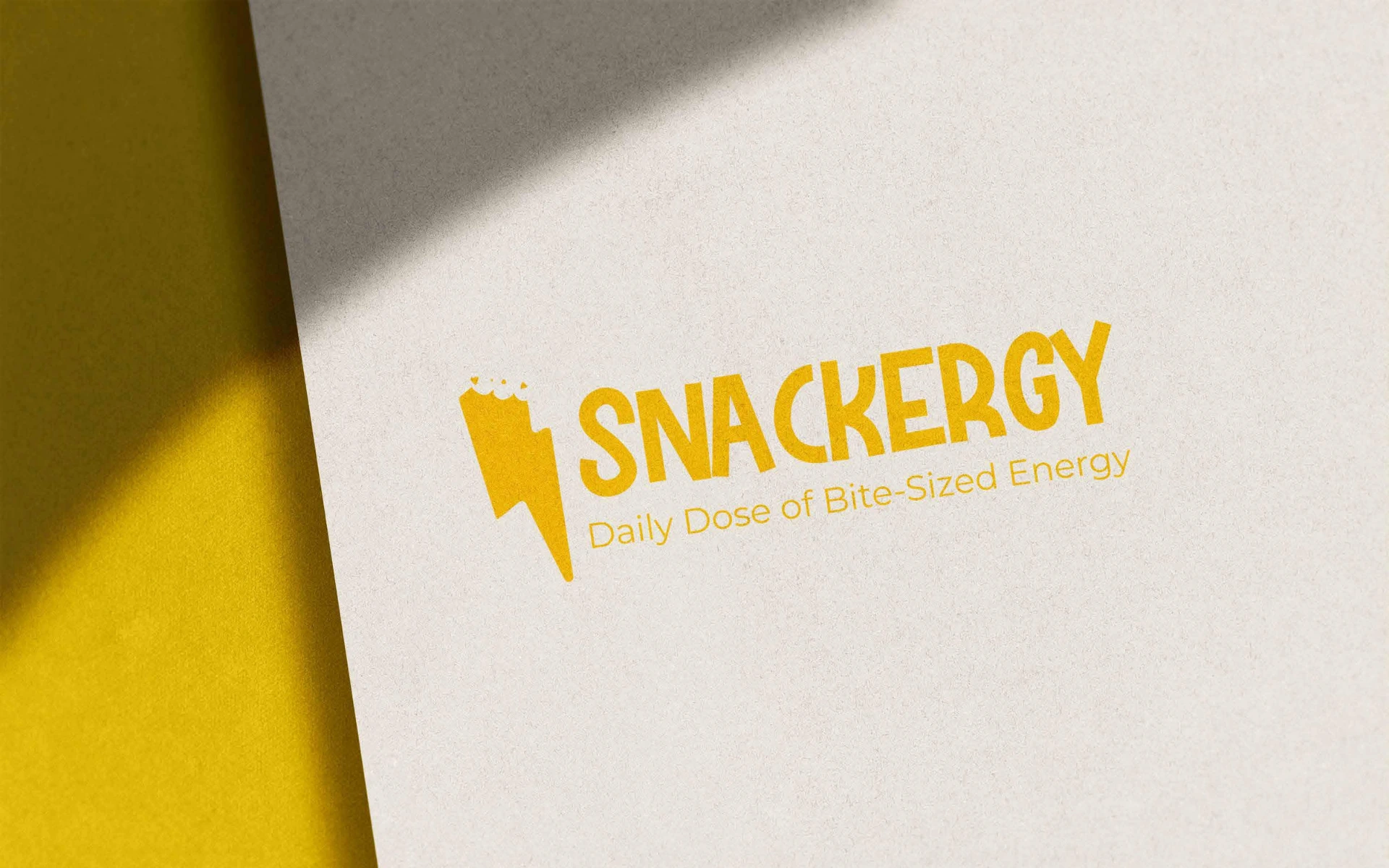
Daily Dose of Bite-Sized Energy.
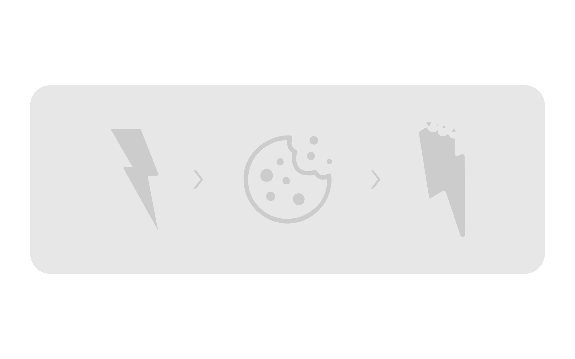
At the heart of the identity is a bitten lightning bolt — a sharp, cheeky symbol that captures the exact promise: snacking that powers up your day.
The bold, active typeface was chosen to feel chunky, vibrant, and fast-moving — like it could sprint off the pack.
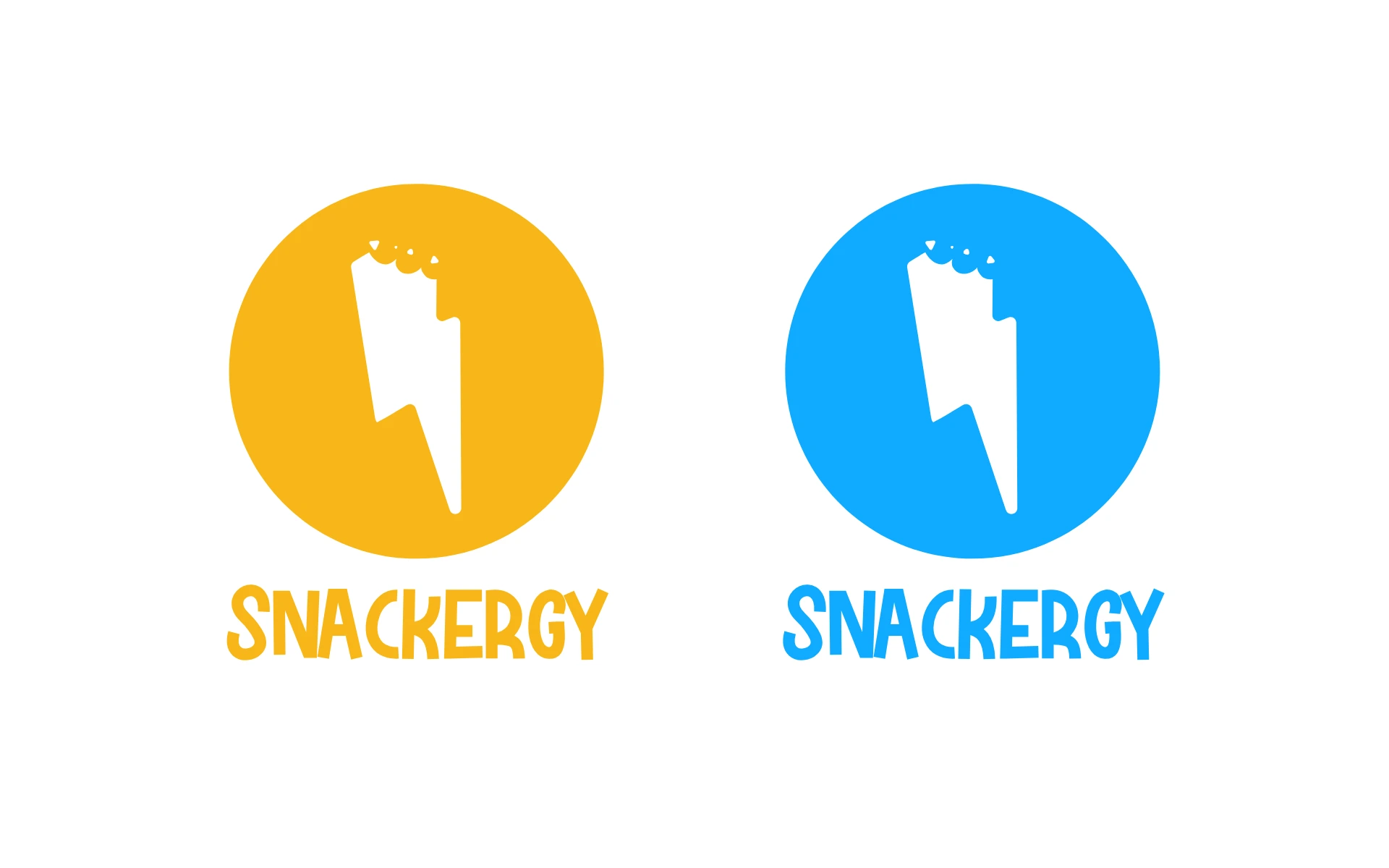
A punchy, zesty yellow becomes the signature shade — bright enough to grab attention, optimistic enough to feel healthy.
The entire logo system was designed to work across verticals — from pouches and protein bars to merch and digital — scaling energy wherever it’s seen.
We didn’t just design a logo.
We designed a call to action.
Every element — the bite, the bolt, the bounce — was rooted in one core idea: snacking that doesn’t slow you down. From fuel breaks at work to fitness-fueled diets, we imagined the brand in motion and designed to keep up with it.
Snackergy doesn’t whisper “healthy.”
It shouts “Let’s go.”
The result is a visual identity that delivers as much energy as the product itself. Fast, fresh, fun — and unapologetically alive.