Tasty Tops
Logo Design

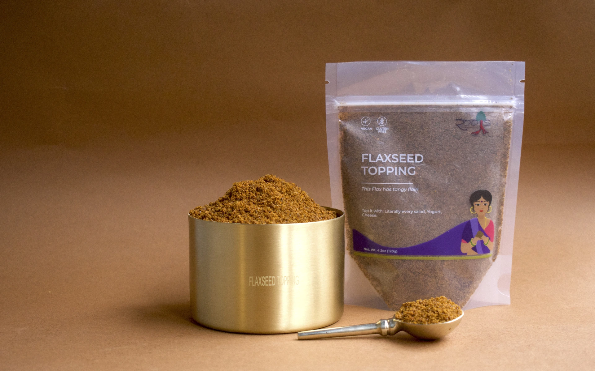


Podi wasn’t the problem. Positioning was.
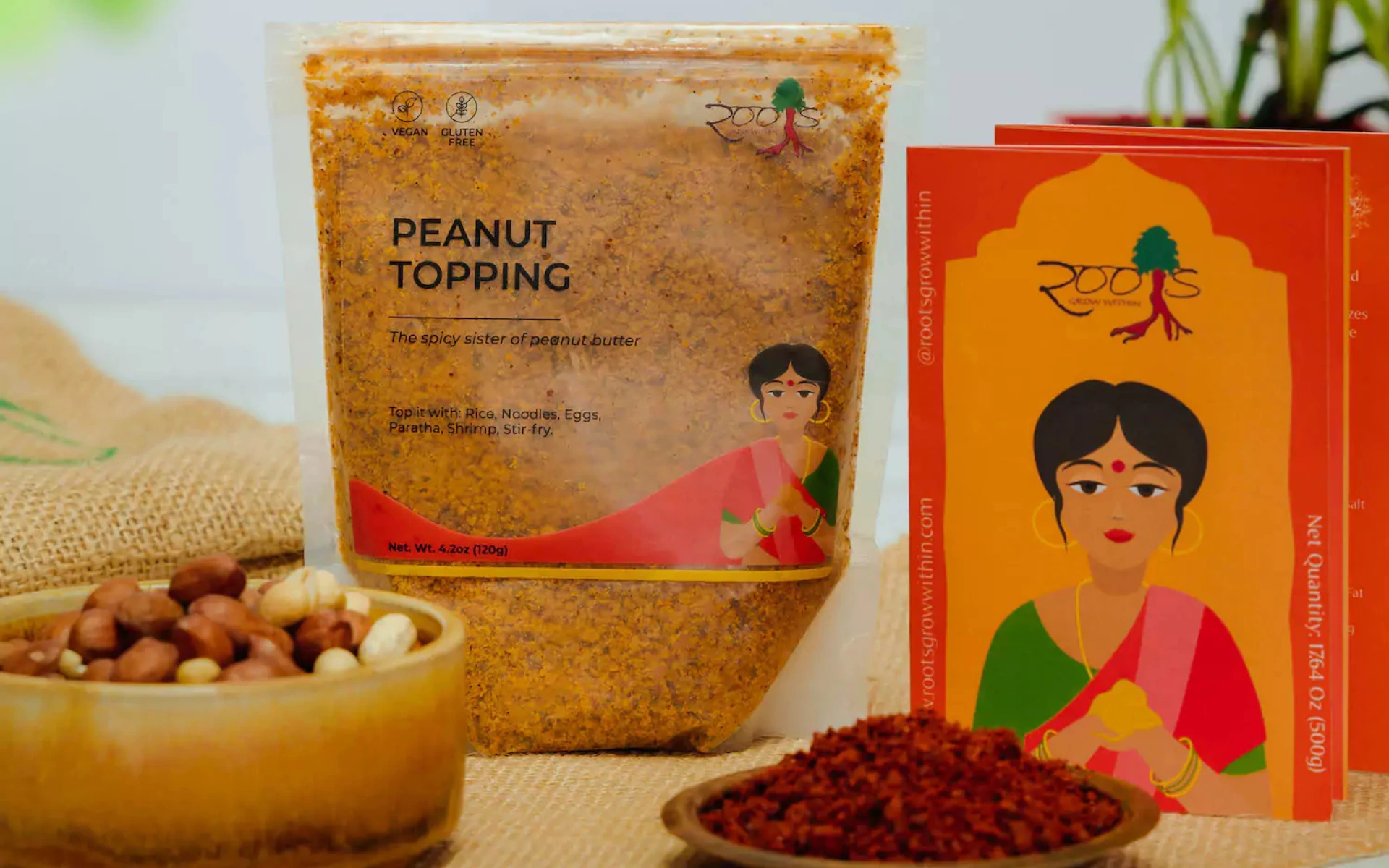
Tasty Tops set out to introduce podi — a traditional South Indian dry chutney powder — to the US market. But not as a seasoning or spice. As an everyday topping.
Our job was to build packaging that simplifies the idea, sharpens the use case, and makes a niche Indian product feel globally relevant without losing its soul.
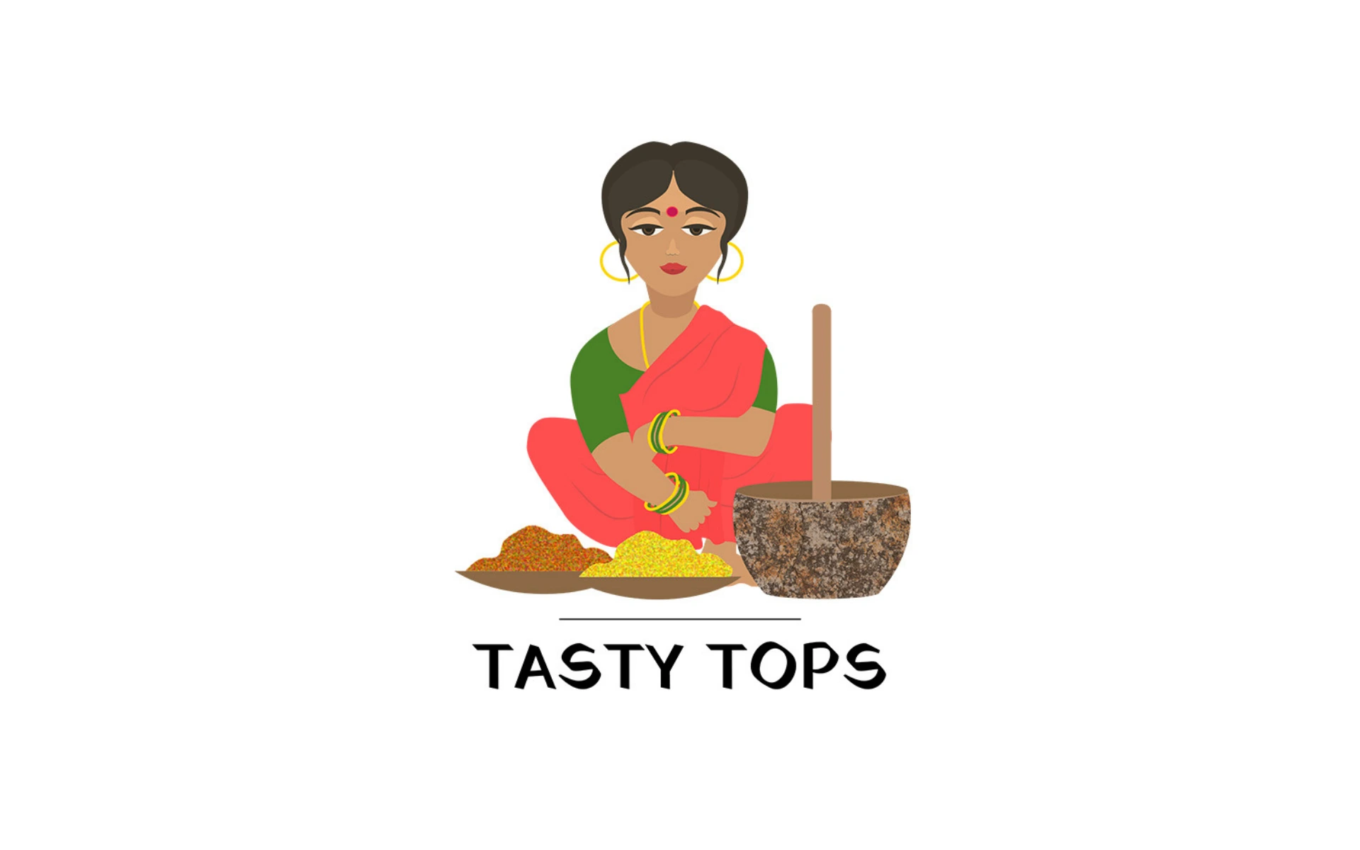
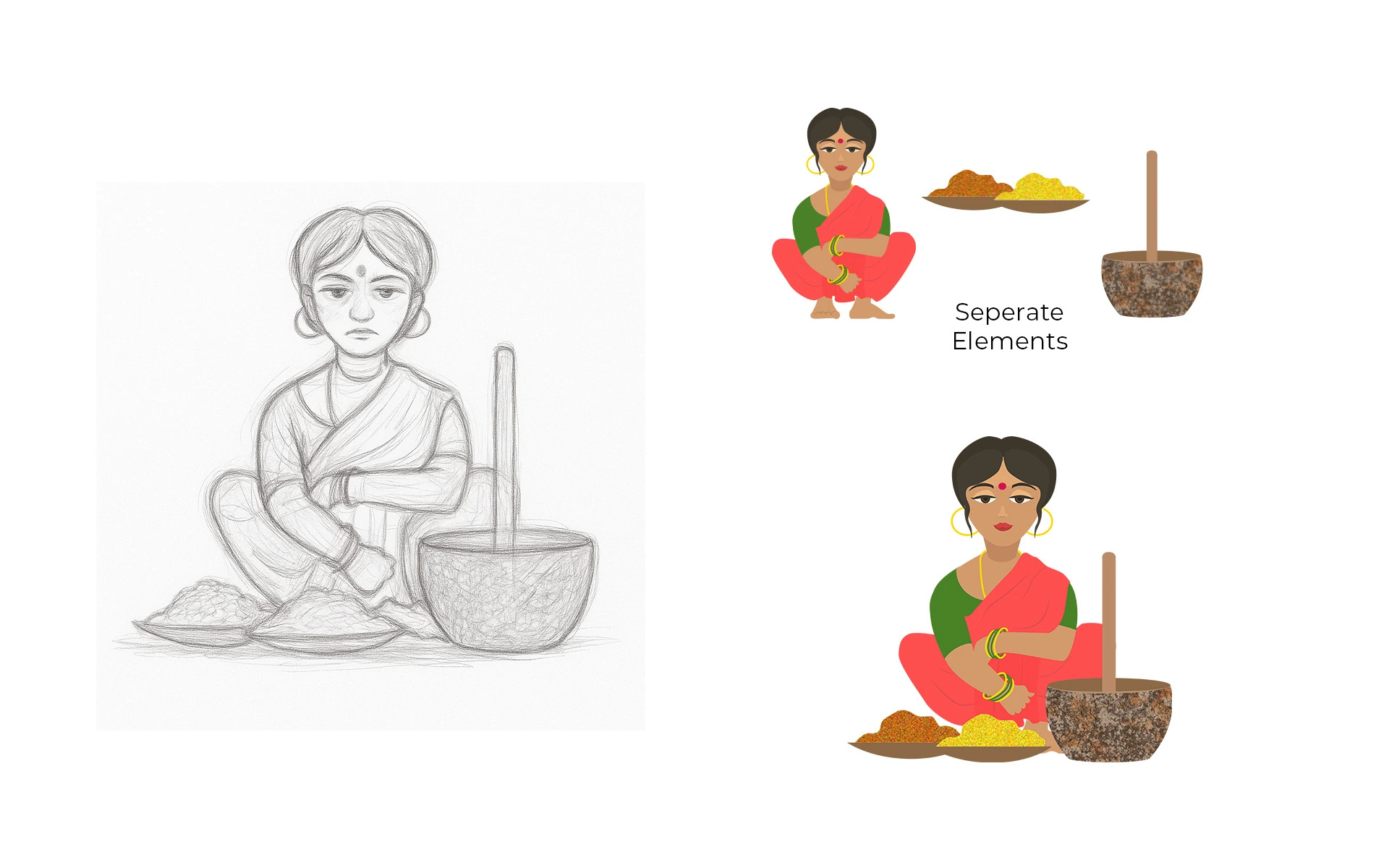
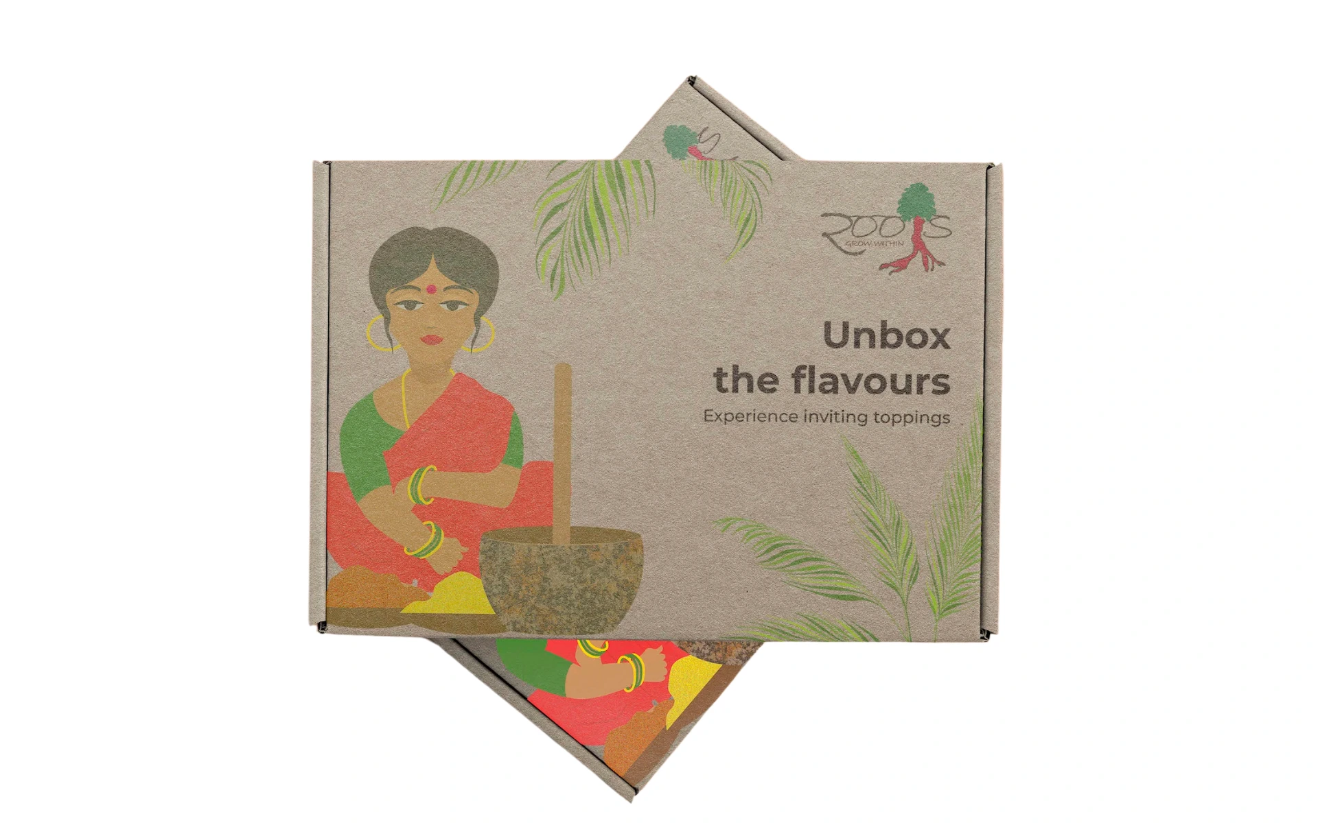
The mascot-style logo features Amma, the soul of the brand — mortar and pestle in hand, ready to serve tradition with a smile. She’s not just visual branding; she’s emotional positioning.
The wordmark is modern, grounded, and built to pair with or without the mascot — adaptable across digital and print touchpoints.
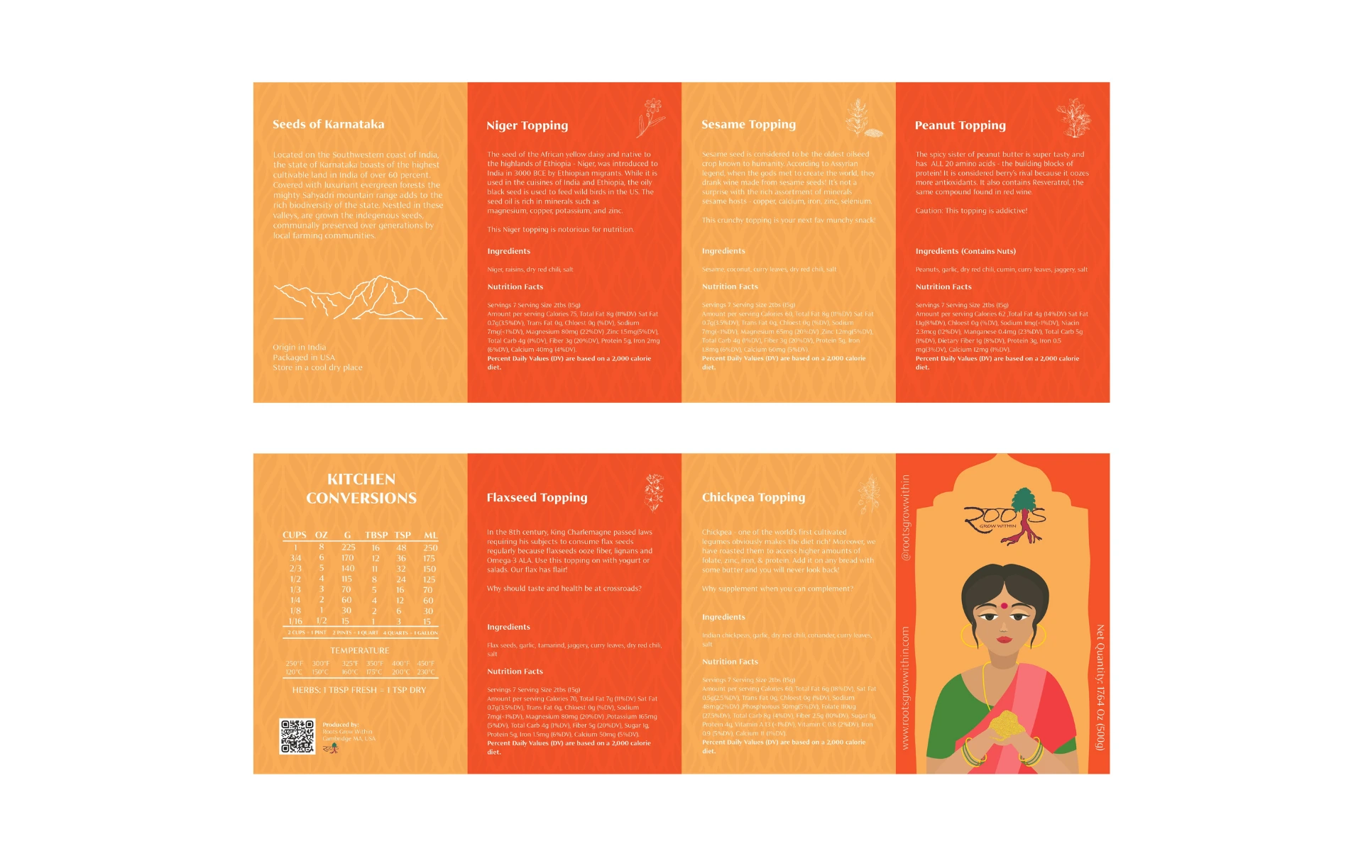
The color palette draws from Indian kitchen cues but avoids the overly ethnic look, keeping it fresh, young, and shelf-ready.
The entire system works together — from icon to type — to ensure Tasty Tops looks at home both in a Brooklyn Whole Foods and on an Indian kitchen shelf.
We didn’t explain podi.
We showed how to use it.
Every design decision — from the mascot’s gesture to the line spacing — was rooted in cultural familiarity and first-world readability. The packaging educates without overwhelming, invites without overselling.
Tasty Tops doesn’t whisper heritage.
It smiles and says “Try me.”
The logo is now more than an identifier — it’s the brand’s warmest introduction.