Eyewear Project
Logo Design
India’s first luxury designer eyewear brand didn’t just need a logo.
It needed a symbol — of lineage, of luxury, and of lasting presence.
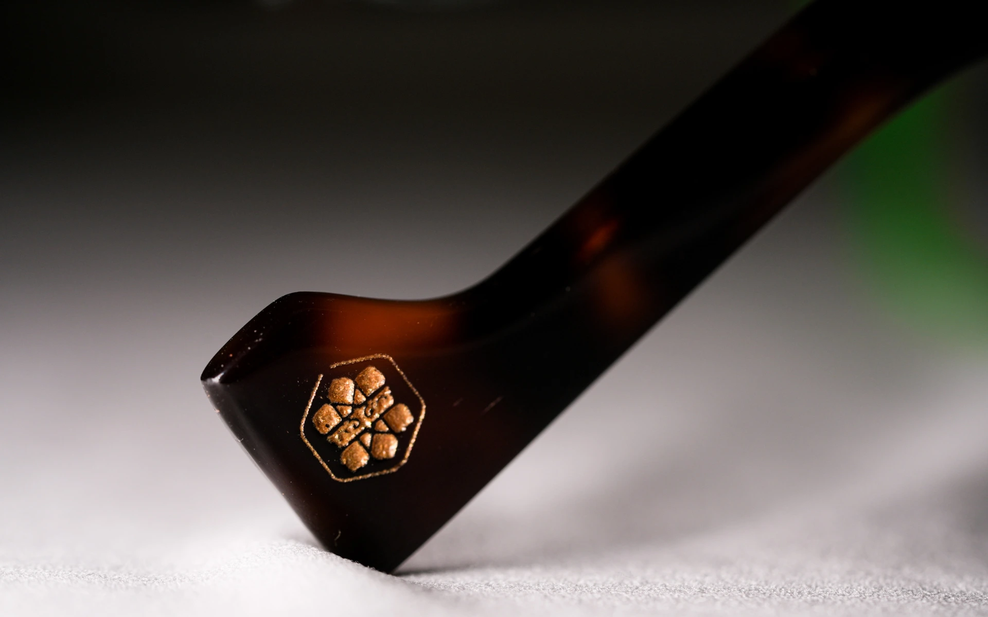
A symbol that represented the intricacy the product carries, but simple enough to be engraved on it, and work seamlessly across print & digital.
The Eyewear Project set out to do something that hadn’t been done before: create an Indian-origin luxury eyewear brand that competes globally and does so with unmistakable cultural depth.
The logo had to strike a precise balance — timeless yet modern, rooted yet refined, regal yet minimalist.
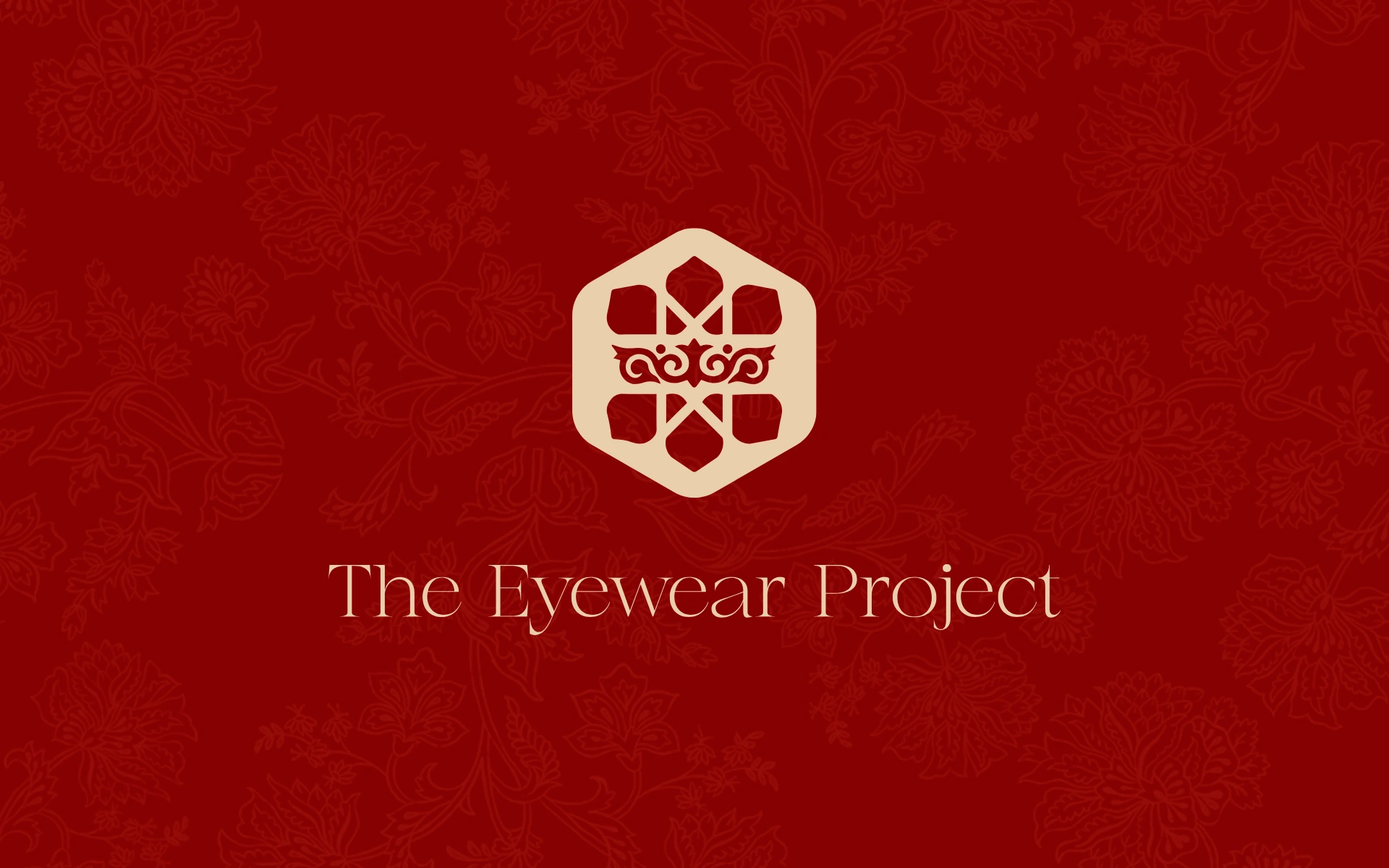
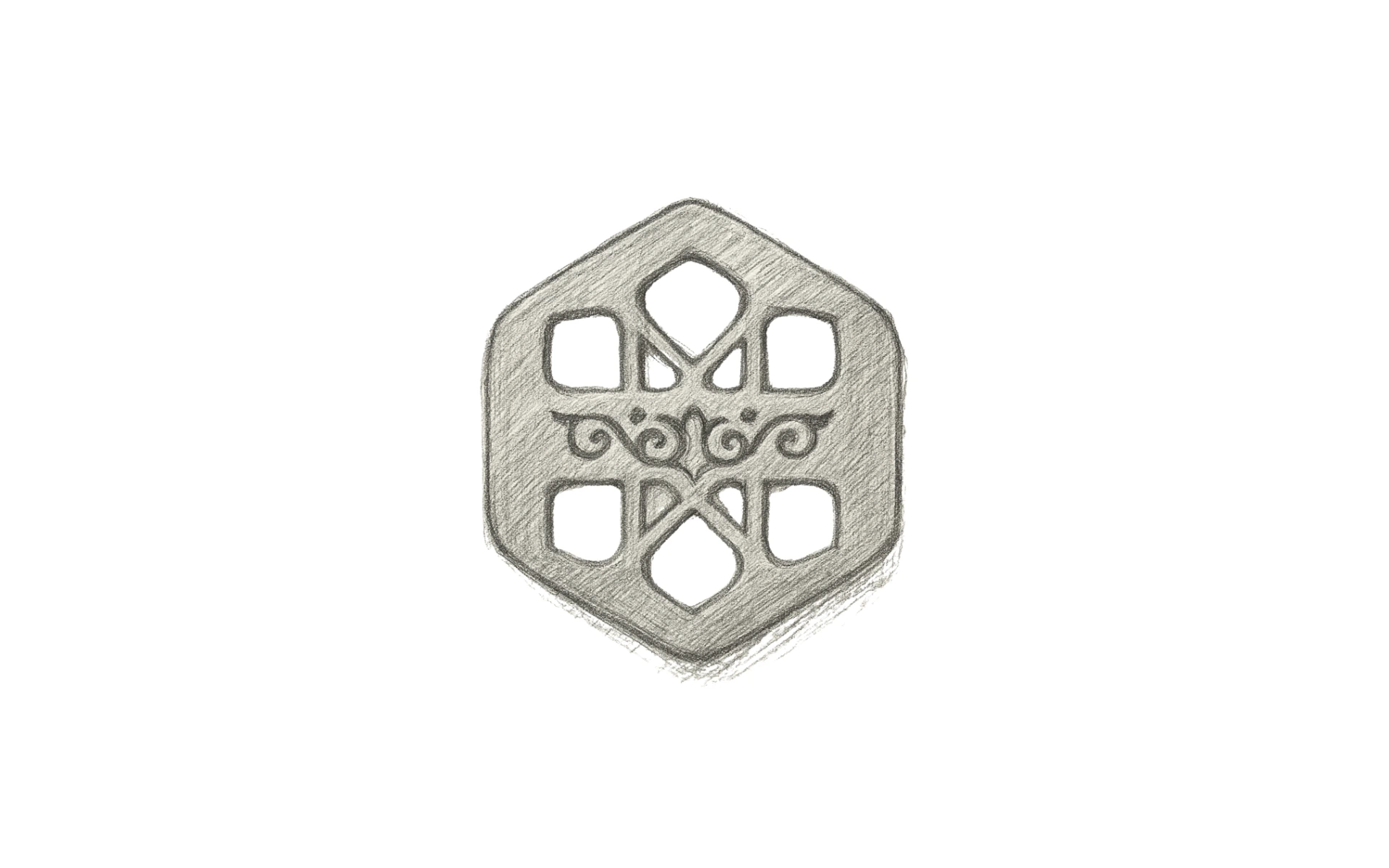
The monogram-style symbol draws inspiration from jali patterns, royal insignias, and Indo-Islamic symmetry — evoking heritage without overwhelming the form.
The interior loopwork nods subtly to both the contours of the human eye and the decorative grace of Indian design — making it emotionally resonant and functionally compact.
The hexagonal structure was carefully chosen for its structural strength and timeless balance — practical for engraving and scalable across product lines.
The typeface pairing is restrained — elegant serif wordmark beneath a gold-toned emblem, giving the brand both gravity and grace.
We didn’t design a logo for spectacles.
We designed a crest for a movement.
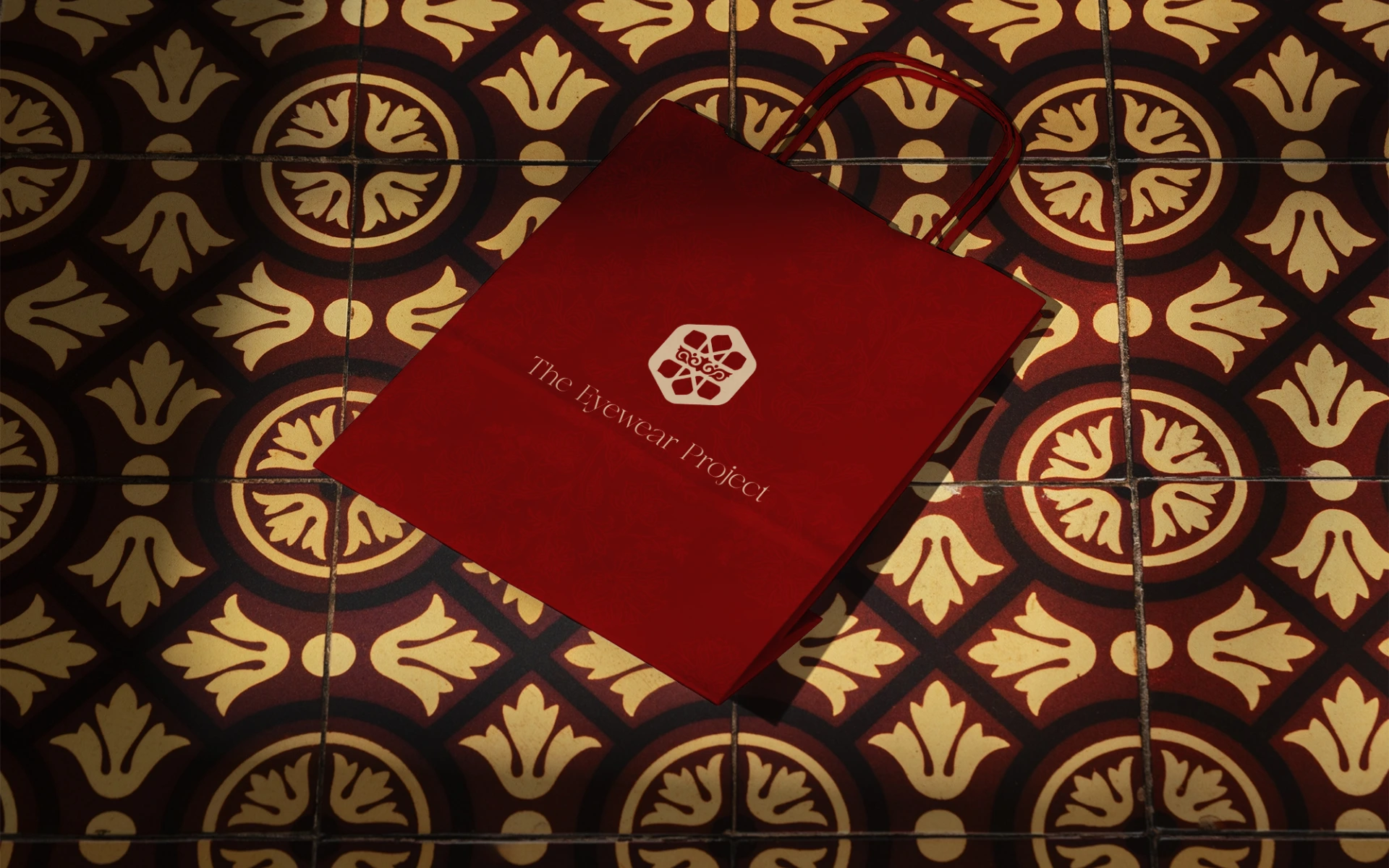
The goal was to create a visual identity system that could be etched into titanium, embossed onto leather, or animated on screen — and still hold the same weight. We had to design for permanence, precision, and poise.
Luxury today doesn’t need to shout.
It just needs to feel inevitable.
The Eyewear Project now owns a mark that feels as enduring as heritage, and as refined as the frames it graces.