Arit
Logo Design


Arit is a candle brand rooted in craft, calm, and quiet luxury. Our task: to translate this essence into a mark that feels as gentle as a flame and as intentional as the hand that pours it.
Arit wasn’t just selling candles. It was selling a moment—one of pause, presence, and poetic stillness.
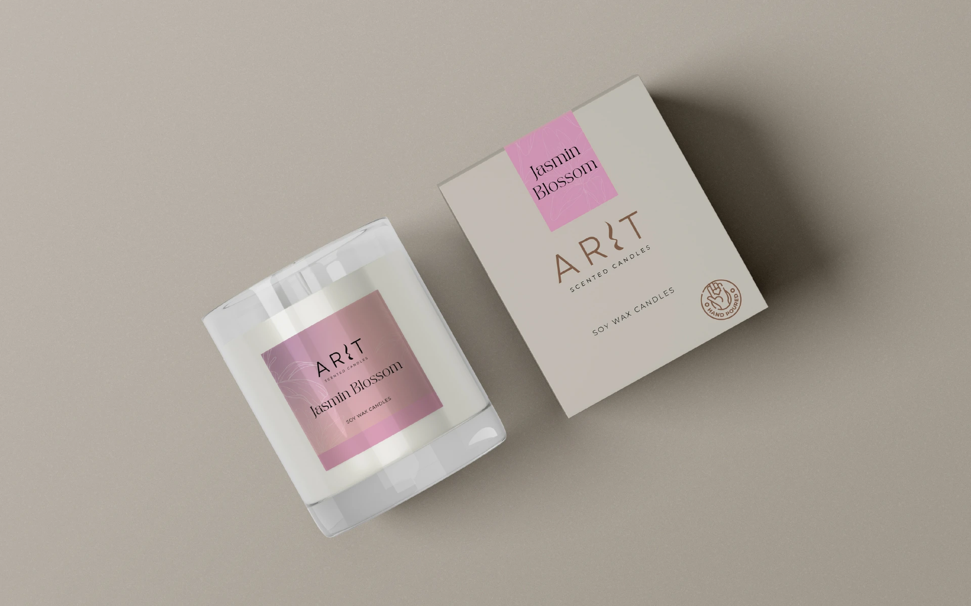
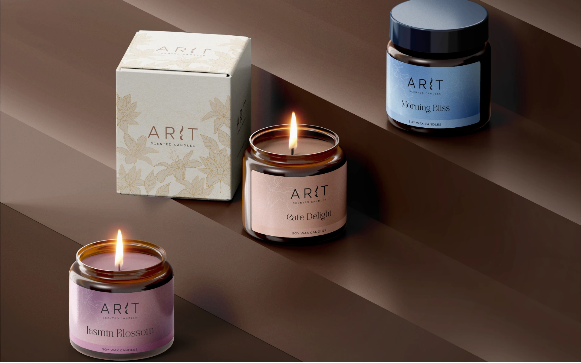
Built on the foundation of artisanal soy wax and understated beauty, the brand needed a logo that would sit softly on packaging, linger in memory, and mirror the stillness its candles offer.
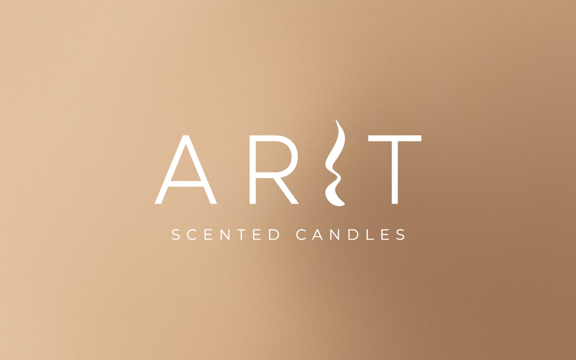
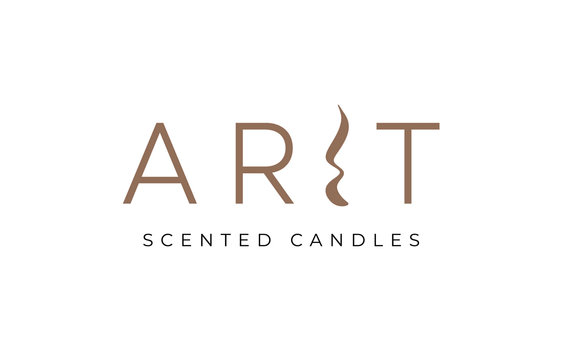
We designed a mark that flickers with meaning.
The Flameform ‘I’:
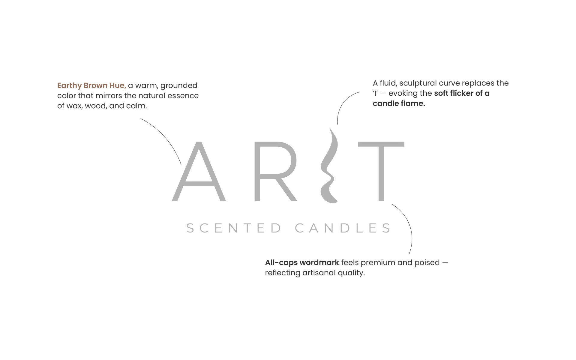
The most defining move—replacing the letter ‘I’ with a sculptural, flame-like curve. It introduces motion, softness, and sensuality without ever being literal.
Earthy Brown Hue:
A grounded, warm brown evokes natural elements—wax, wood, and earth—tying the product back to its origins and spaces it inhabits.
All-Caps, Balanced Wordmark:
Elegant yet quiet. The uppercase lettering brings in balance and modernity, while maintaining the artisanal, small-batch ethos of the brand.
The result? A logo that doesn’t overstate. It whispers.
Every decision here was about restraint—with depth.
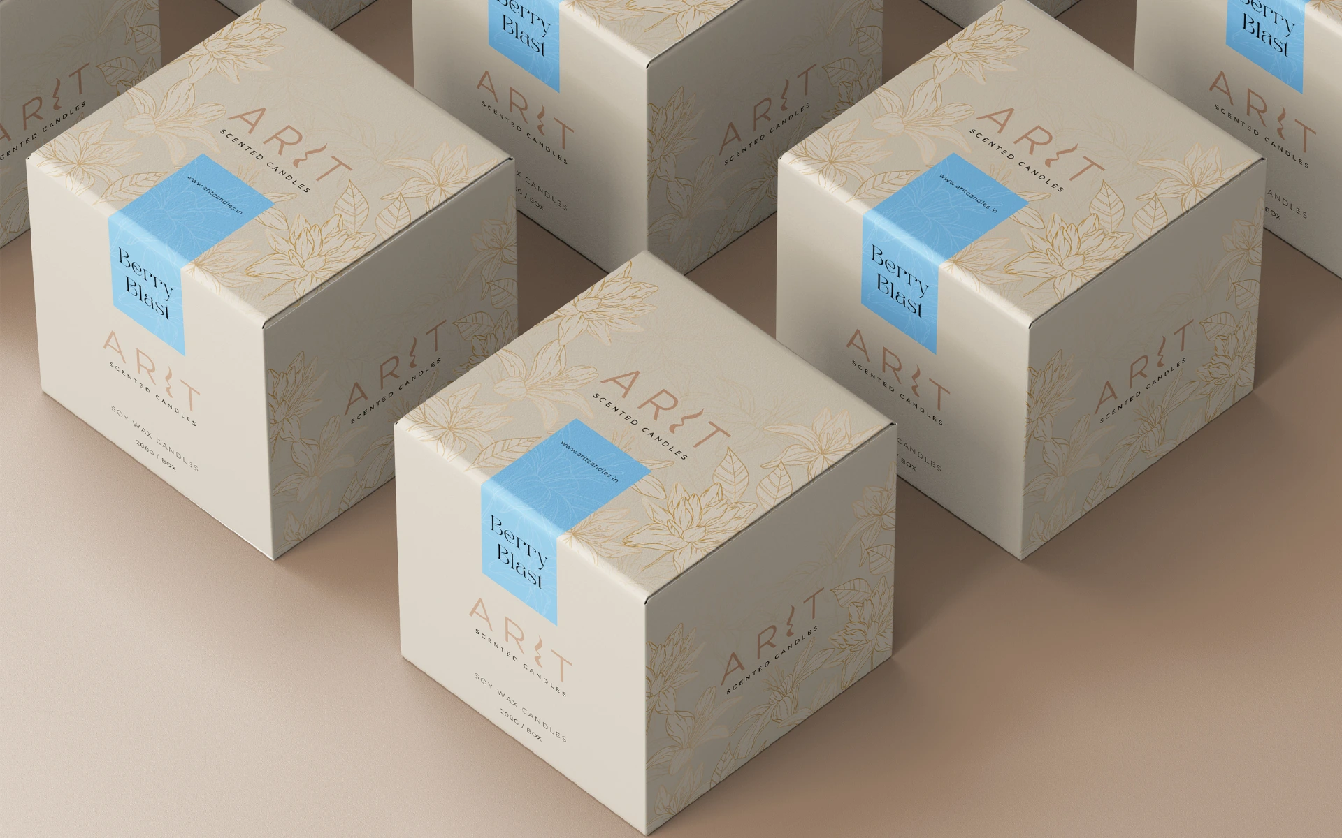
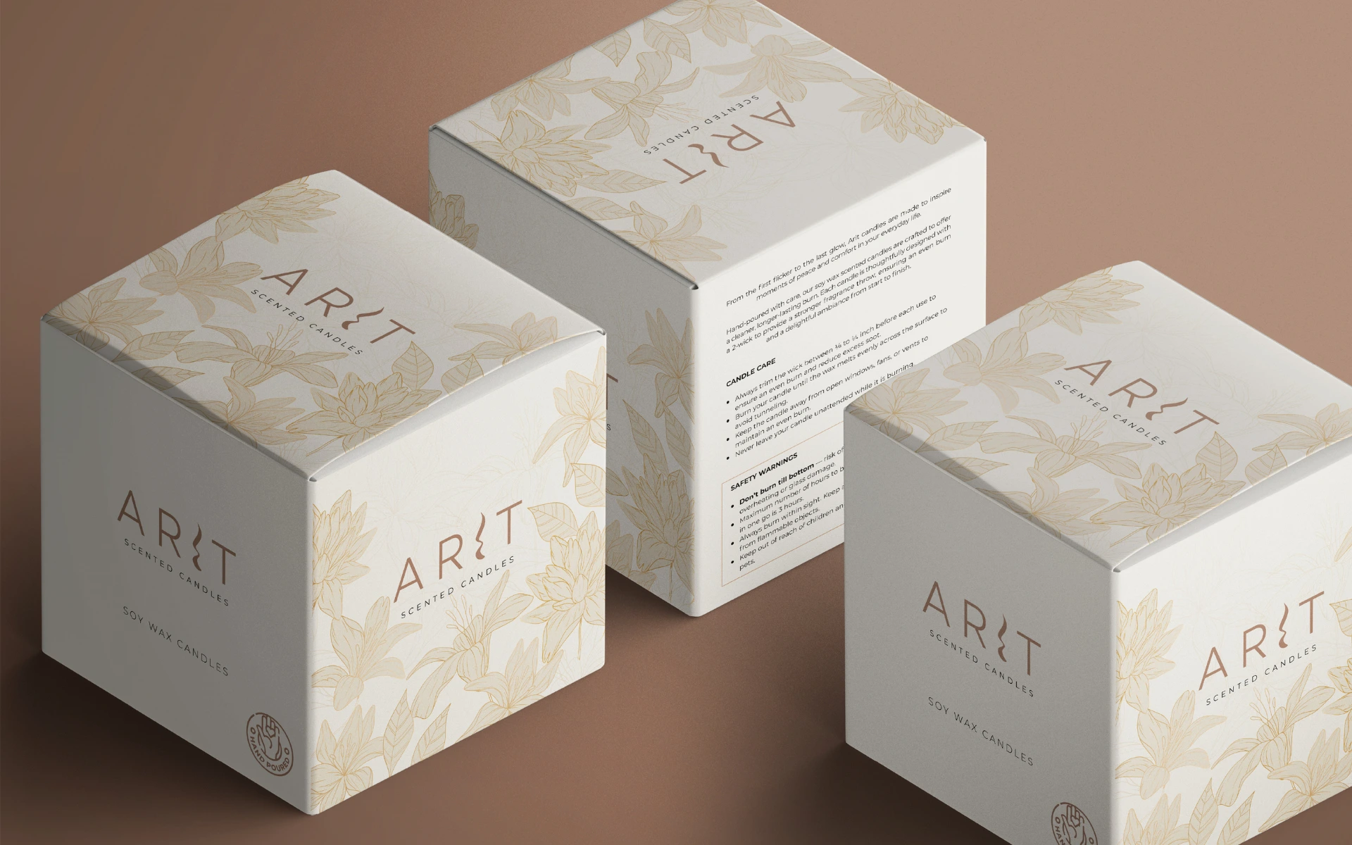
From the curve of a letter to the neutrality of the palette, we stripped away the excess until what remained felt elemental. The logo seamlessly adapts across touchpoints—boxes, glass jars, labels—while maintaining its poetic integrity.
This wasn’t just branding. It was sensory storytelling.
The Arit logo proves that simplicity can still carry soul.
In a world of noise, it’s a reminder that subtlety speaks—when it’s built with meaning. Just like the candle it represents, the identity doesn’t seek attention. It earns presence.
Elegant. Minimal. Crafted.
Exactly what a good candle—and a good logo—should be.