Natrio
Logo Design
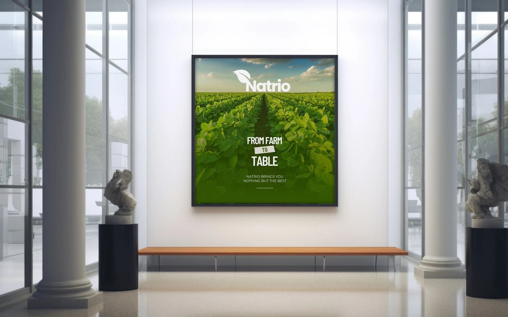
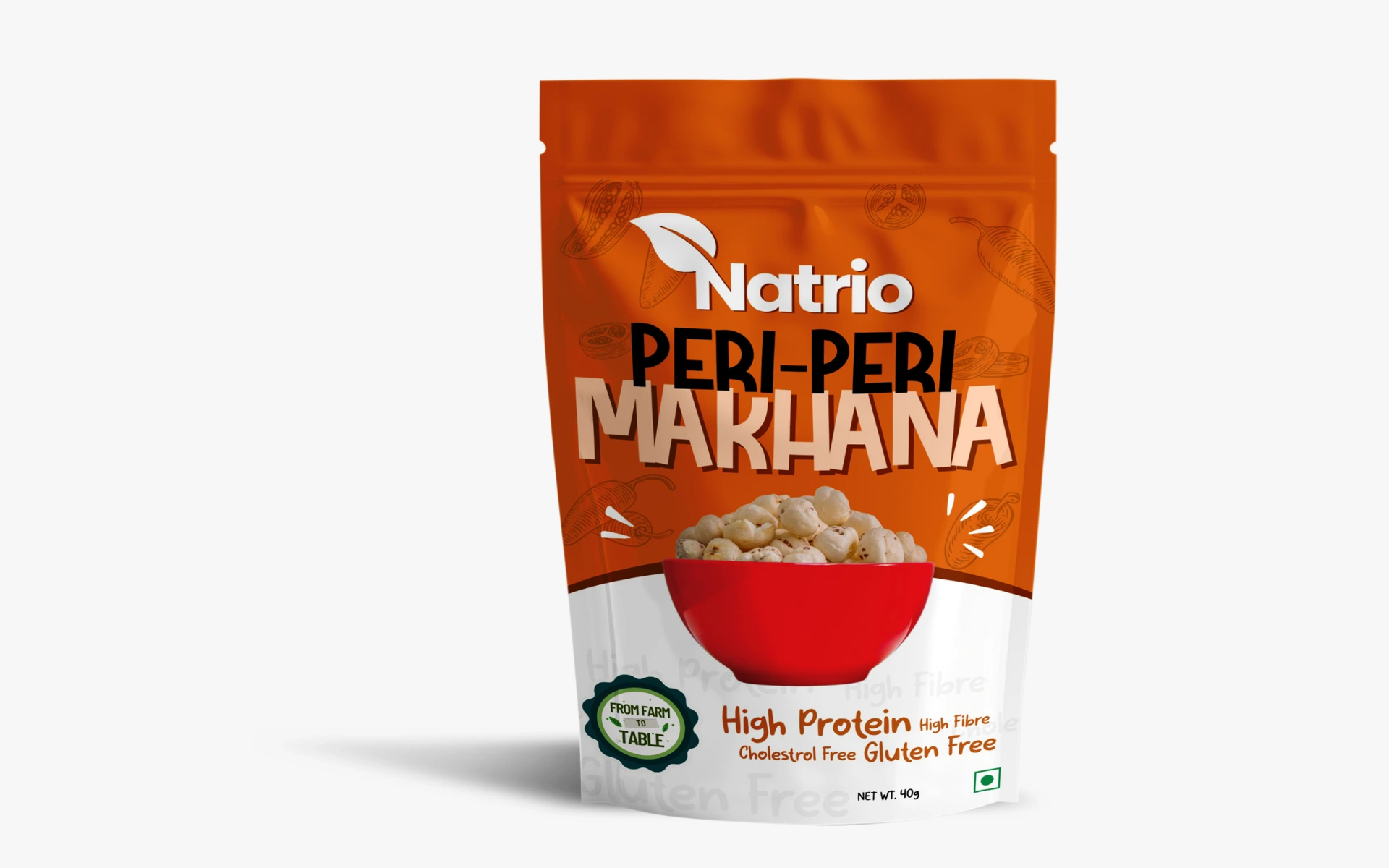


For a brand rooted in purity, freshness, and farm-to-table goodness, the logo had to feel as clean and wholesome as the product itself. Natrio isn’t just a name—it’s a promise: Nature’s essence in every bite.
Natrio stands at the intersection of simplicity and sustainability.
As a modern health-first food brand, Natrio needed a visual identity that captured its core values—natural ingredients, transparent sourcing, and everyday wellness. The identity had to feel as fresh as the food itself.
We built a logo that grows organically—from field to shelf.
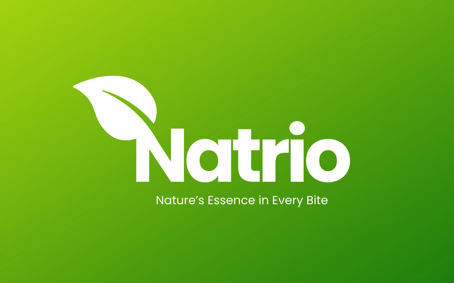
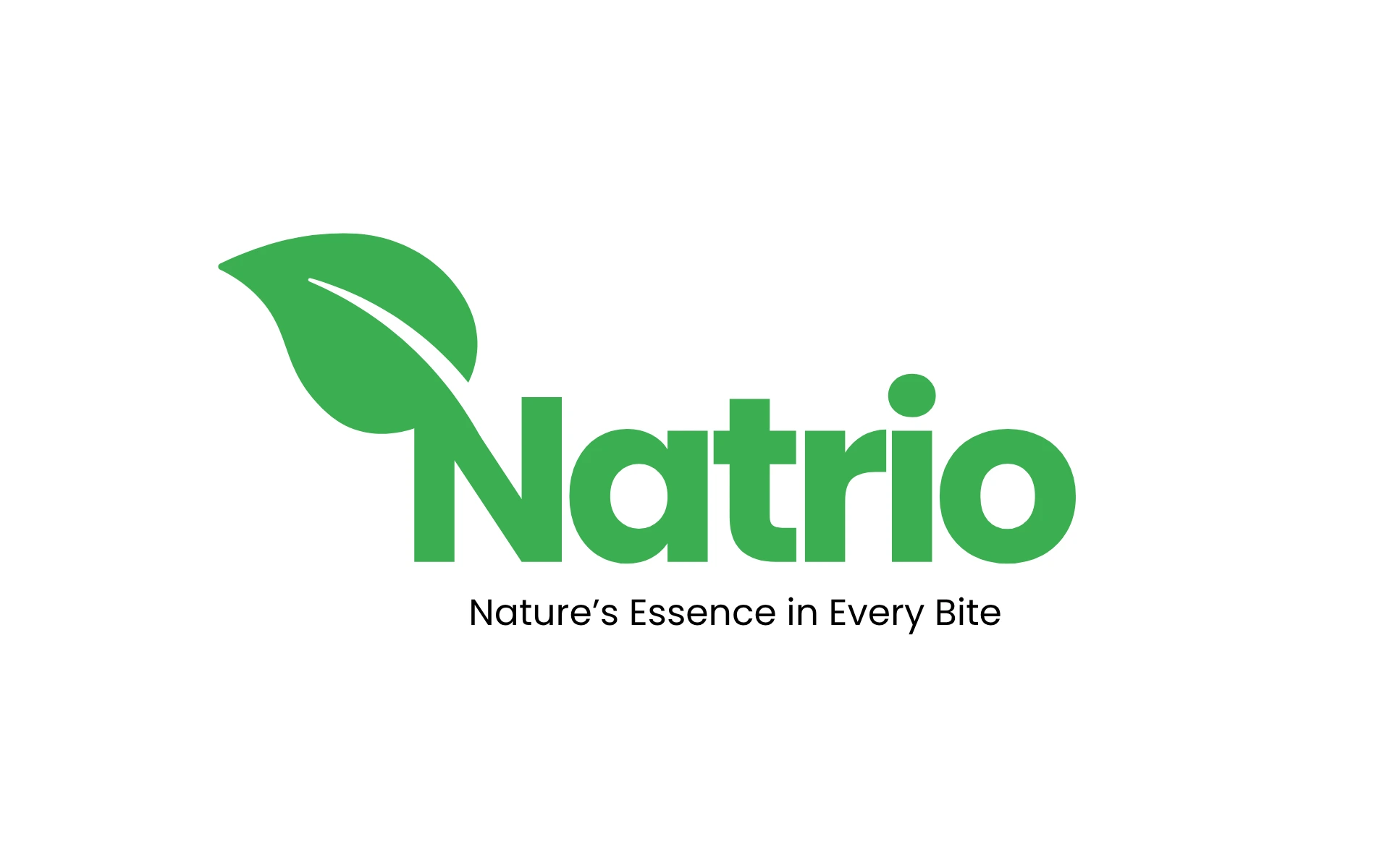
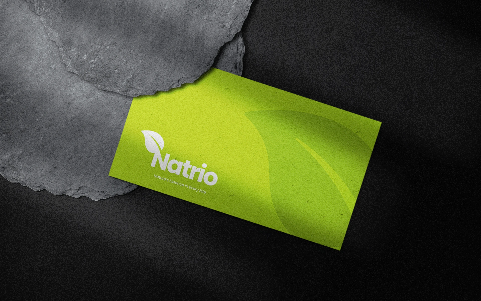
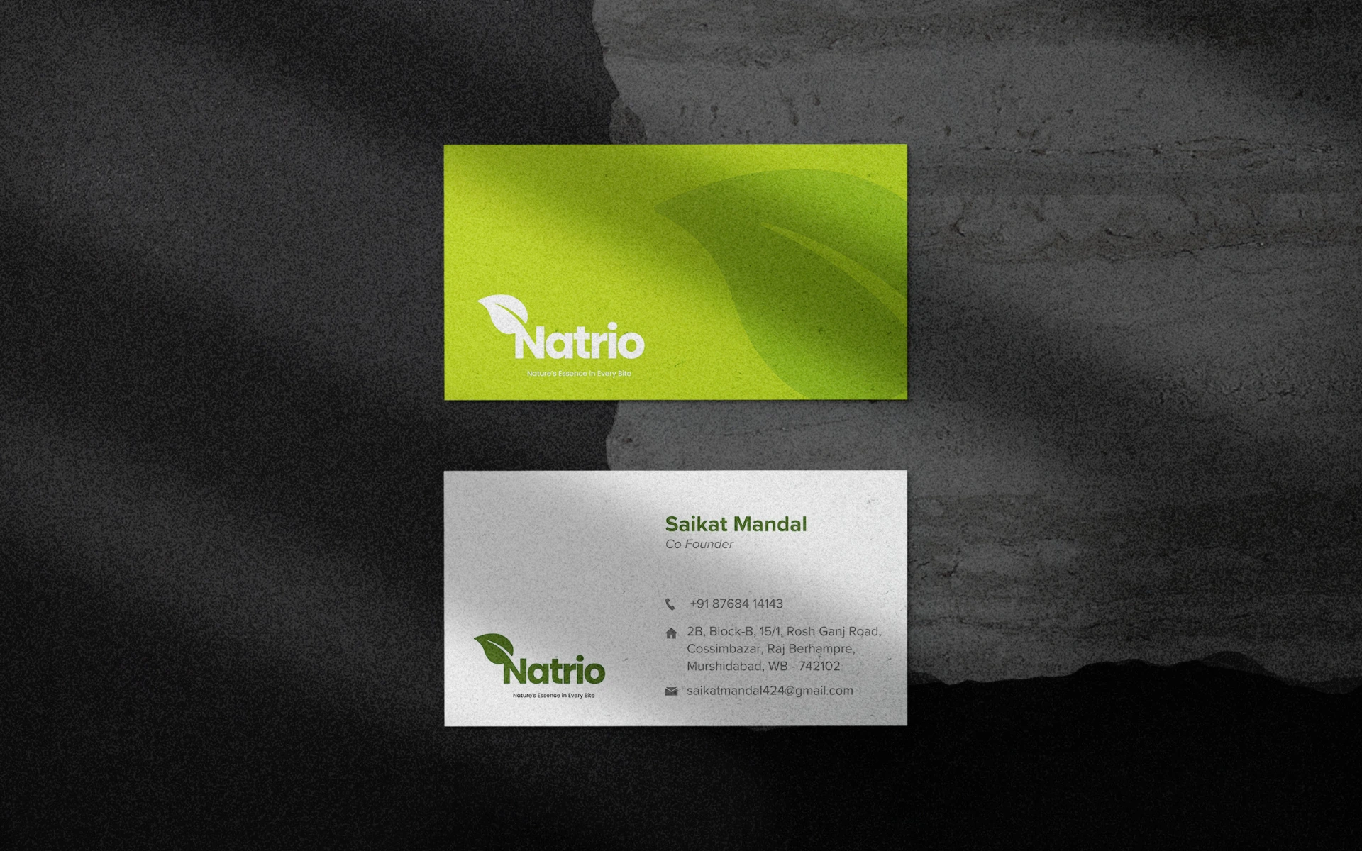
Leaf-Formed ‘N’:
The defining element is the bold, clean leaf that seamlessly forms the letter ‘N’. It represents Natrio’s direct connection to nature—while creating a strong, instantly recognizable visual hook.
Rounded Typography:
Soft curves in the type evoke approachability and nourishment. The font feels friendly and modern, designed to speak to today’s conscious consumer without being overly rustic or cliché.
Green as Identity:
The vibrant green stands for more than just color—it speaks of freshness, life, and the brand’s commitment to clean, chemical-free produce.
Tagline That Tastes Real:
“Nature’s Essence in Every Bite” complements the visual identity—balancing emotion with clarity, and setting the tone for Natrio’s honest food philosophy.
We approached Natrio as more than a health food brand—it’s a lifestyle.
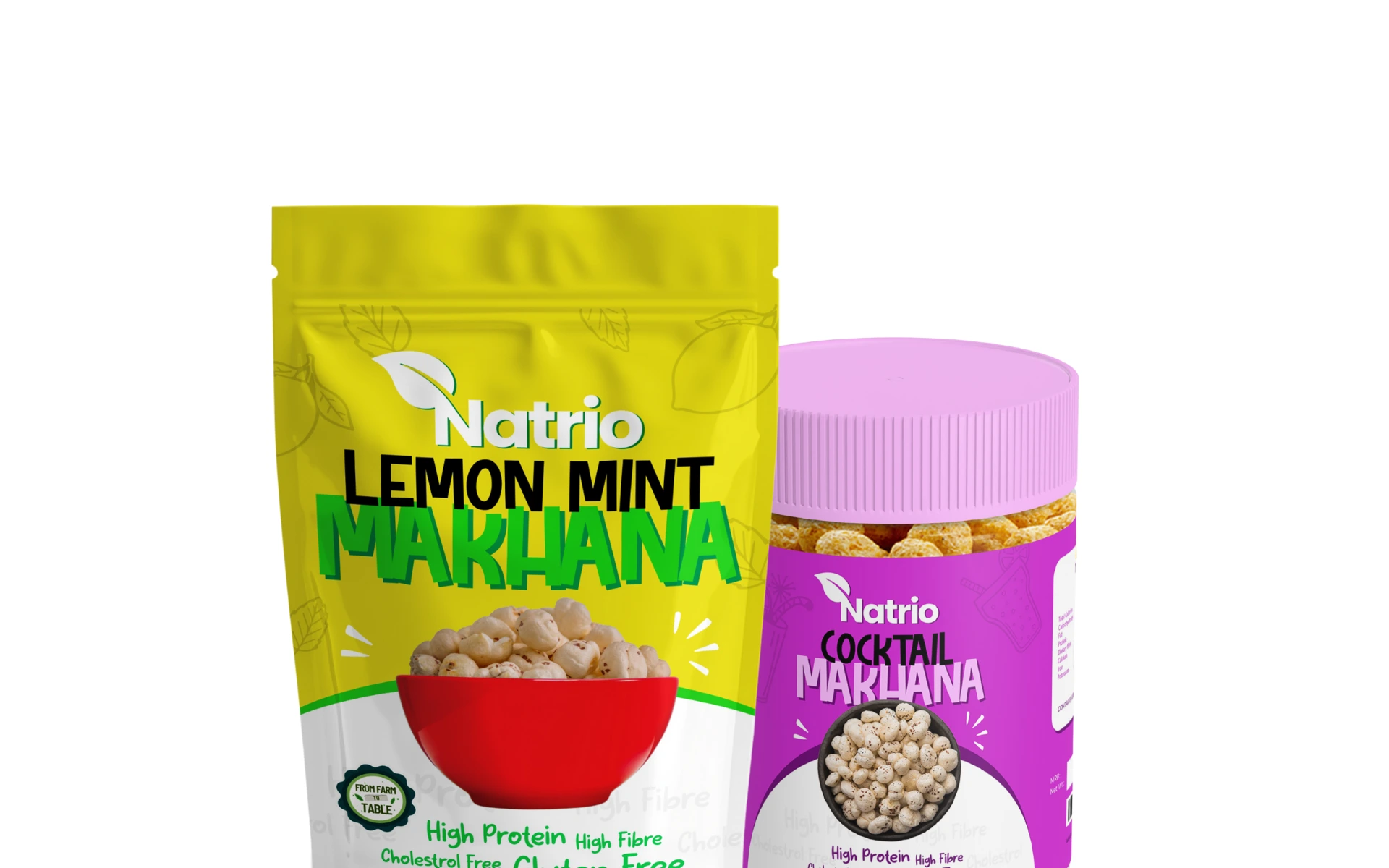
The logo had to be scalable across supermarket shelves and digital storefronts, while still standing for something deeper: a return to real food, grown right. Every curve, every hue was selected to reflect care, clarity, and a deep respect for nature.
The Natrio logo is nature, simplified.
It grows out of the very soil it represents—rooted in purpose, yet polished for the modern world. A clean identity for a clean-eating future.