Savoré
Logo Design
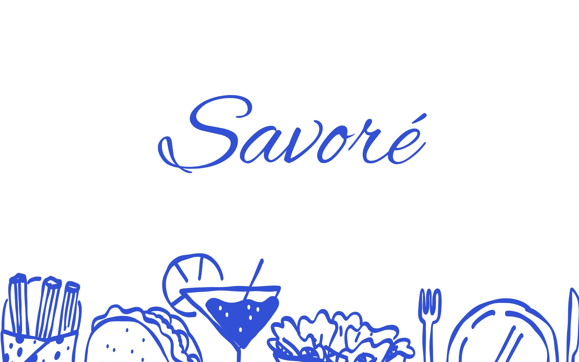
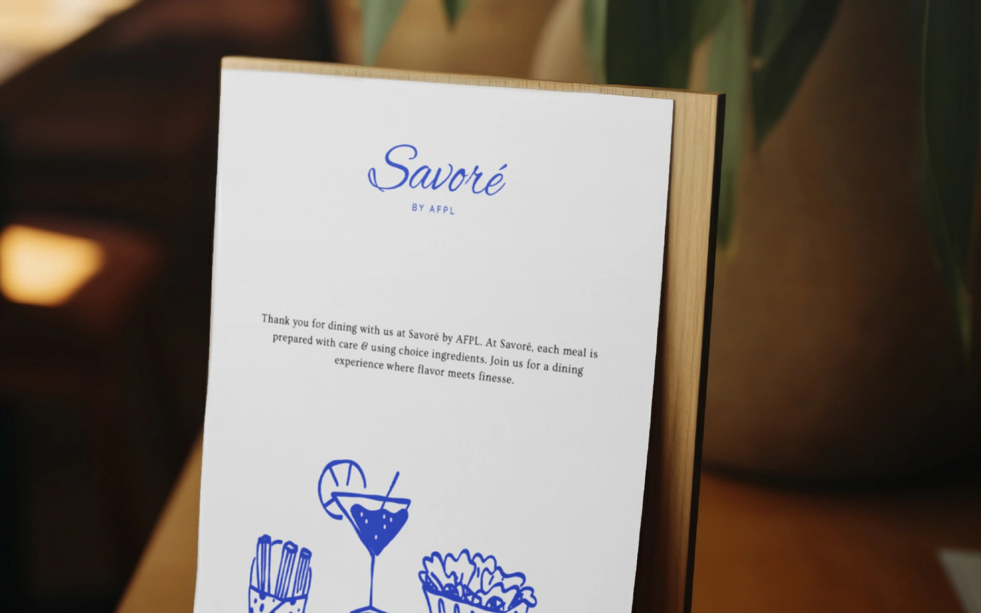
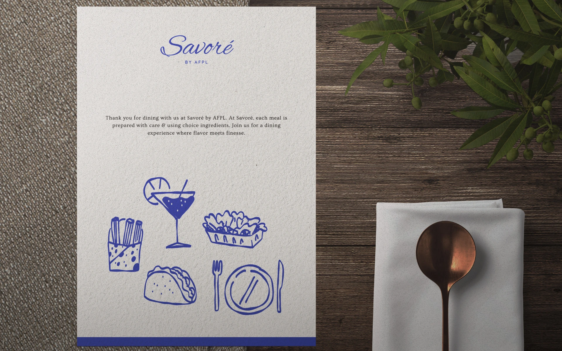


A logo that feels like a sip of espresso in Paris. Understated yet elegant, the identity for Savoré captures the warmth, charm, and sophistication of a European café—served with a side of modern minimalism.
Savoré is more than just a name—it’s a mood. A celebration of taste, leisure, and the little indulgences that make life beautiful. As a café concept rooted in European elegance, it needed a visual identity that didn’t shout—but whispered tastefully.
Our challenge was to build a logo that felt both timeless and fresh. That could sit comfortably on a croissant box or a café awning—and still feel distinctly Savoré.
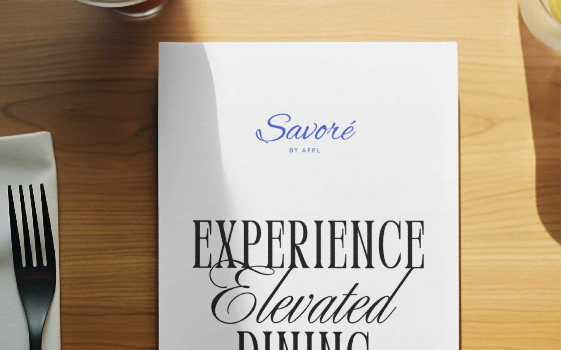
The logo blends European poise with modern clarity.
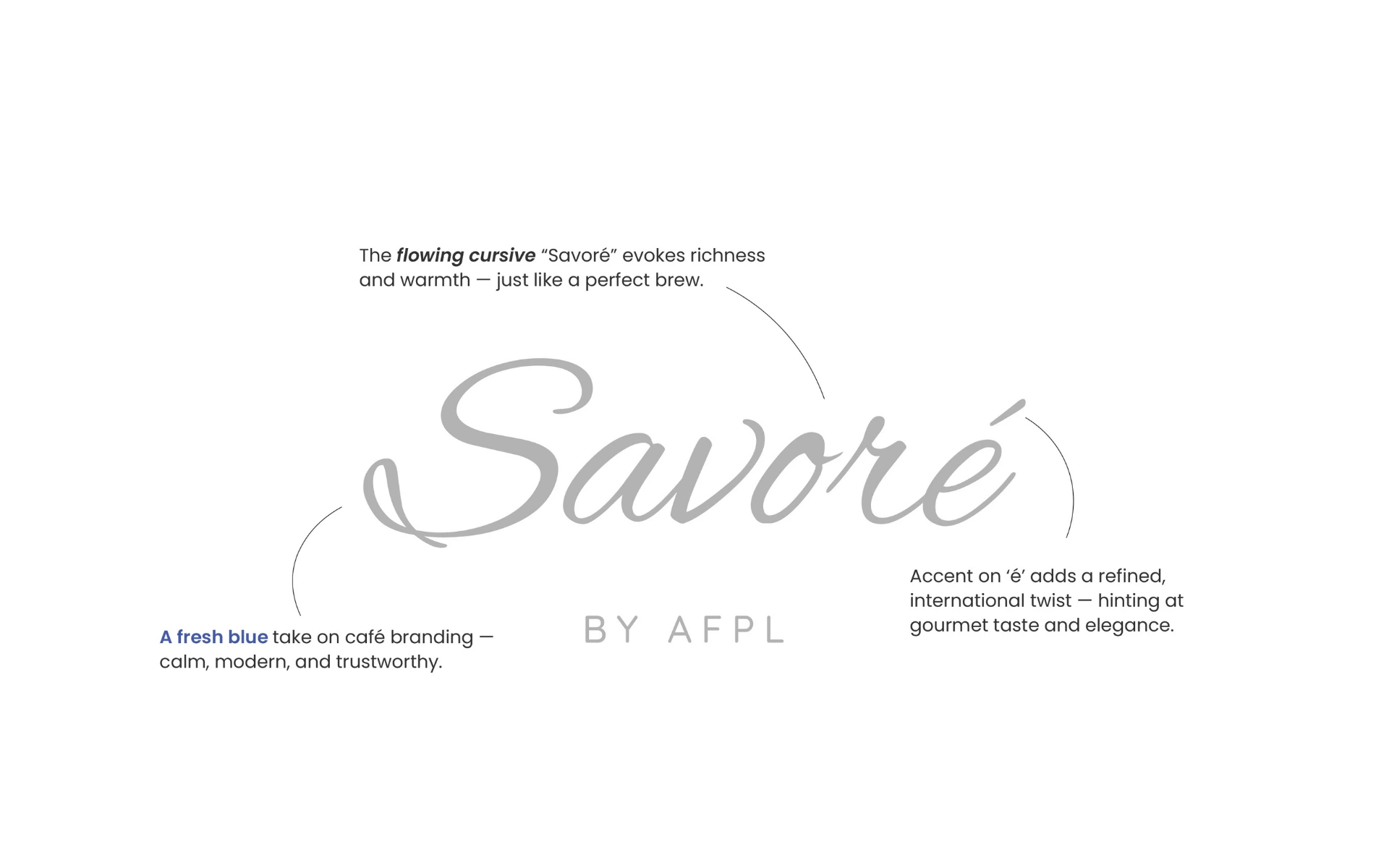
Accented Elegance
The accent on the ‘é’ isn’t just a stylistic flourish—it’s a quiet nod to the brand’s continental inspiration. Sophisticated, deliberate, and unapologetically European.
Typography with Taste
A custom serif wordmark grounds the identity in old-world charm, while its refined letterforms keep things light, airy, and contemporary—just like a well-made éclair.
Monogram Possibility
The ‘S’ in Savoré, paired with the accented ‘é’, creates natural room for a clean monogram or brand shorthand—perfect for packaging, coffee sleeves, and social media use.
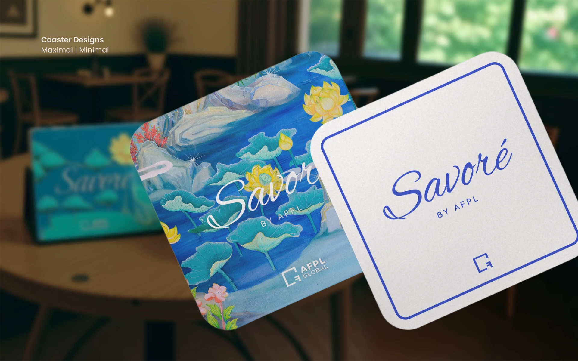
Black & White Palette
A monochrome palette lets the food, the interiors, and the experience do the talking—while ensuring timeless brand recall.
This wasn’t just café branding. This was culinary storytelling.
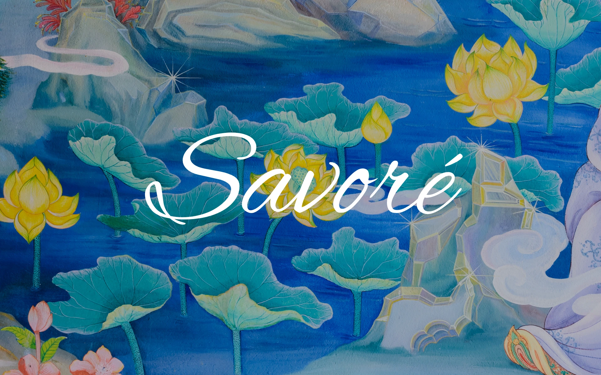
We looked at Savoré not as a food outlet, but as a cultural pause. A space where every detail—from the logo to the latte art—contributes to a feeling. The identity had to feel considered, but never contrived. Designed, but never decorative.
The Savoré logo is subtle by choice—and powerful because of it.
It doesn’t rely on gimmicks. It relies on grace. Built for a brand that’s as much about experience as it is about flavor, the identity sets the tone for what Savoré stands for: curated taste, timeless design, and a European café culture you’ll want to return to.