Love Ice
Logo Design
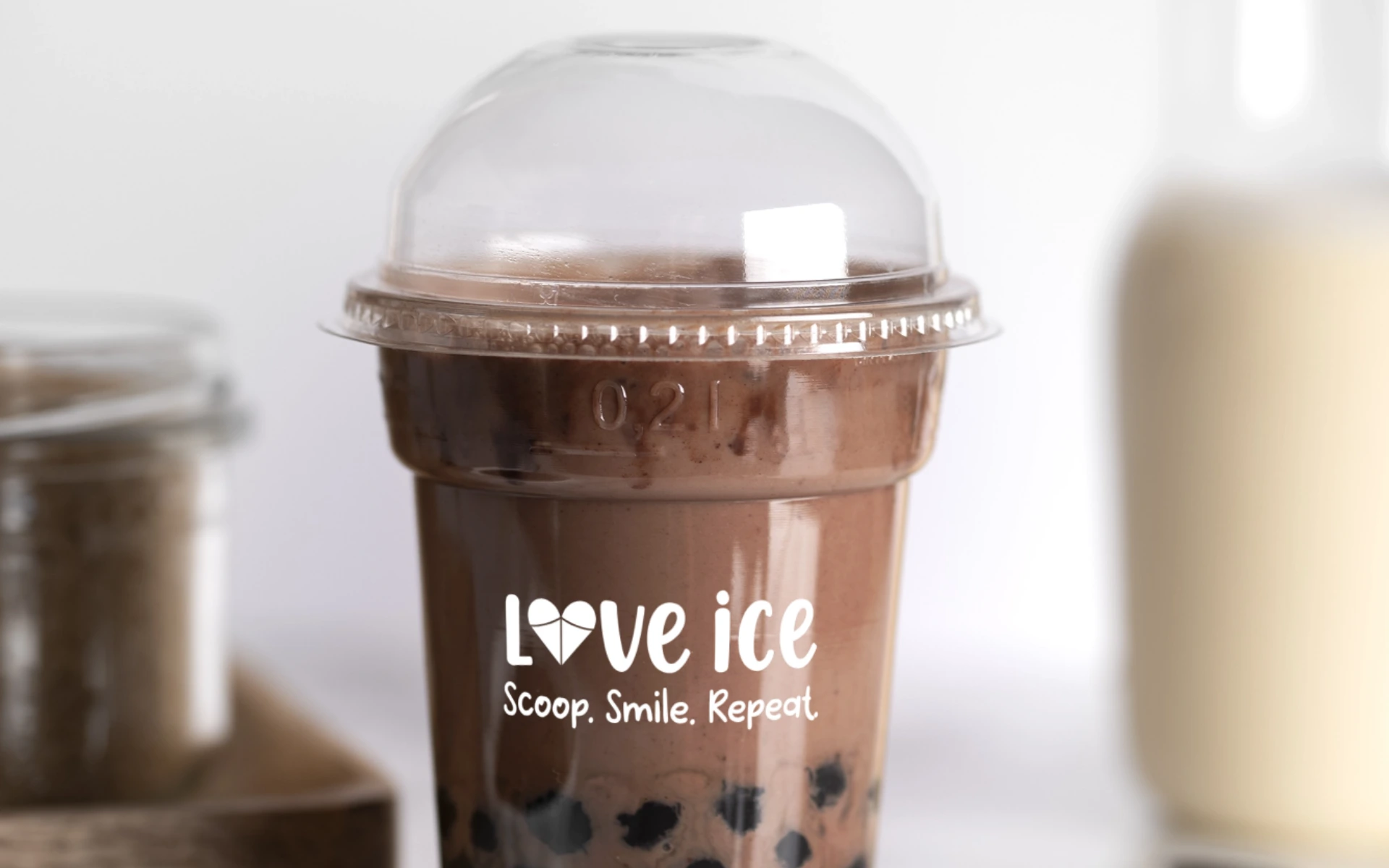


For a brand built on joy, indulgence, and a dash of romance—we didn’t just design a logo. We designed a mood. Love Ice isn’t just about frozen treats. It’s about sweet moments shared, smiles sparked, and hearts a little fuller with every scoop.
Love Ice wanted to bring a little more sweetness into the world—one scoop at a time.
With a name that felt like a hug and a promise, the identity needed to be playful, warm, and instantly endearing. Something that speaks to kids and kids-at-heart alike. Something that felt like a smile.
So, we designed a logo that melts hearts before the ice cream does.
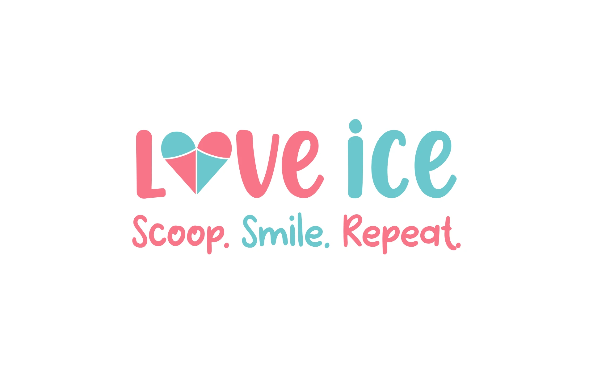
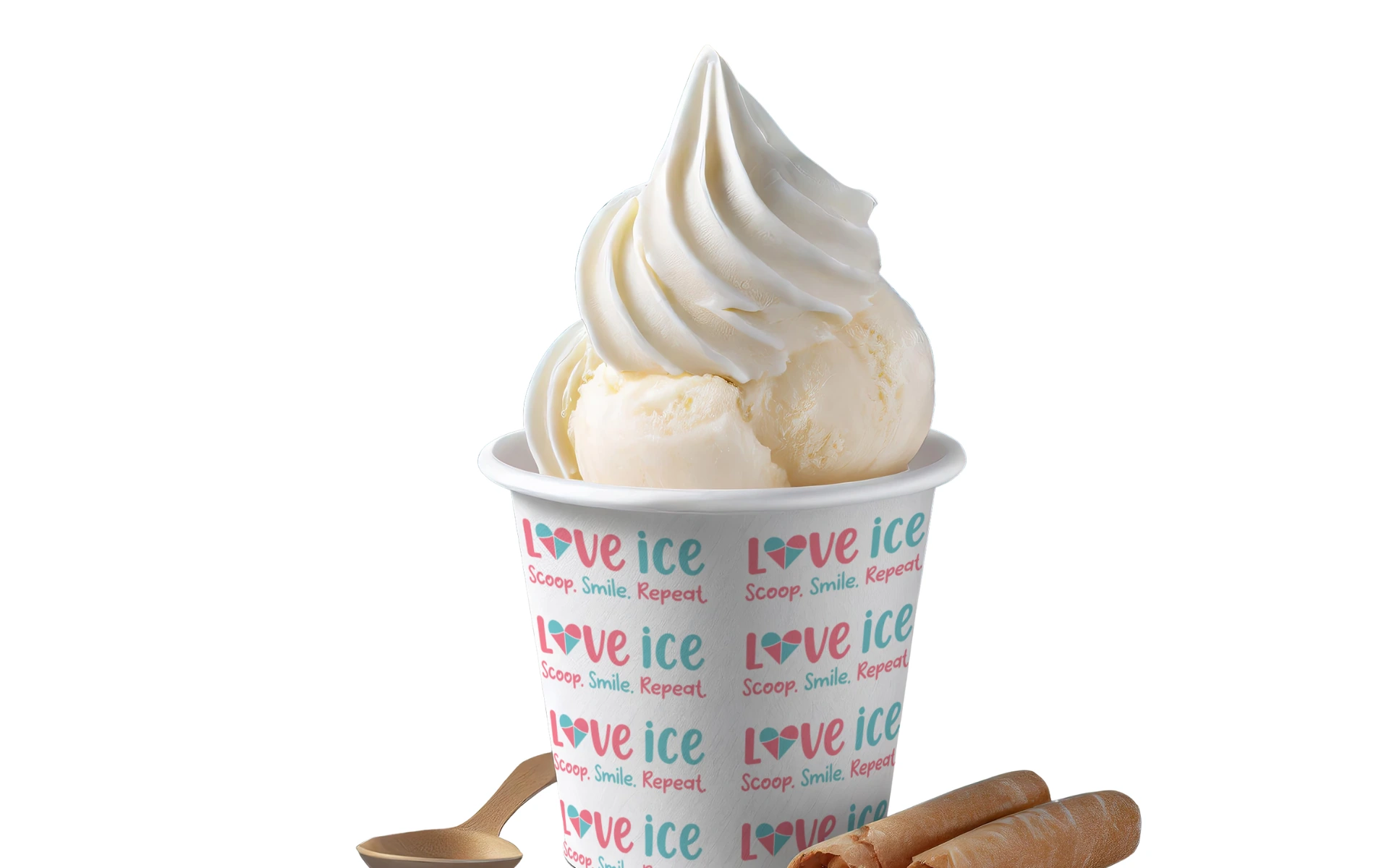
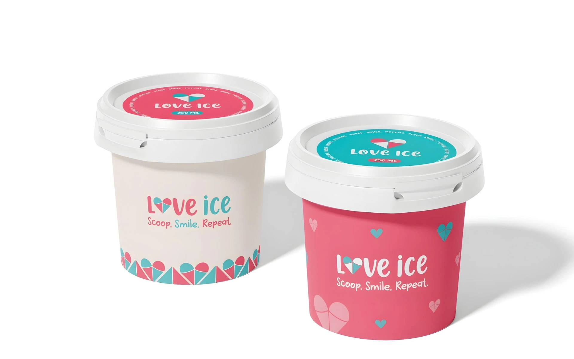
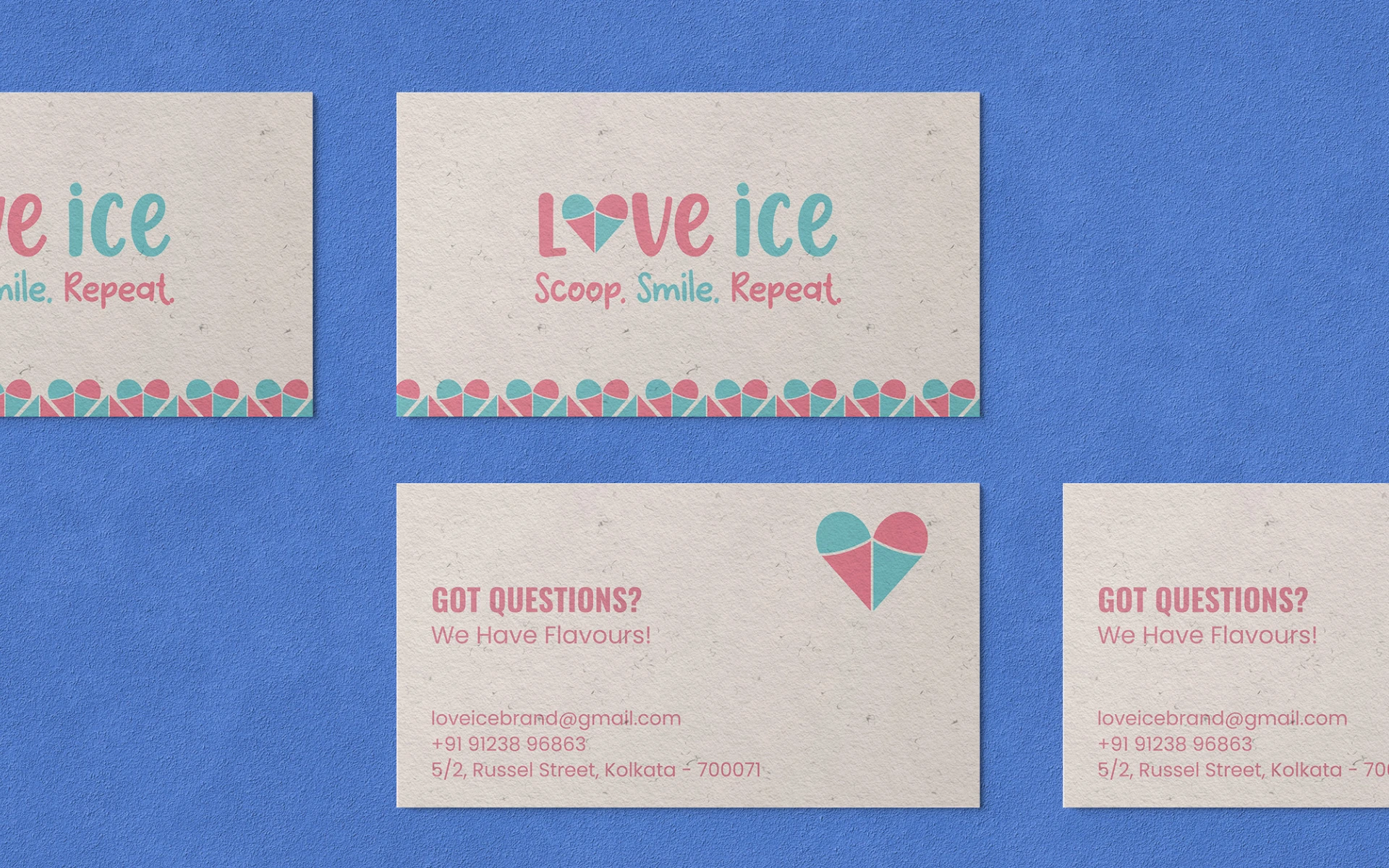
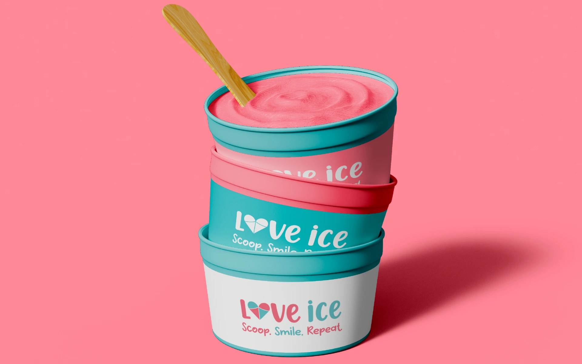
A logo built like a sundae—layered, colorful, and impossible not to love.
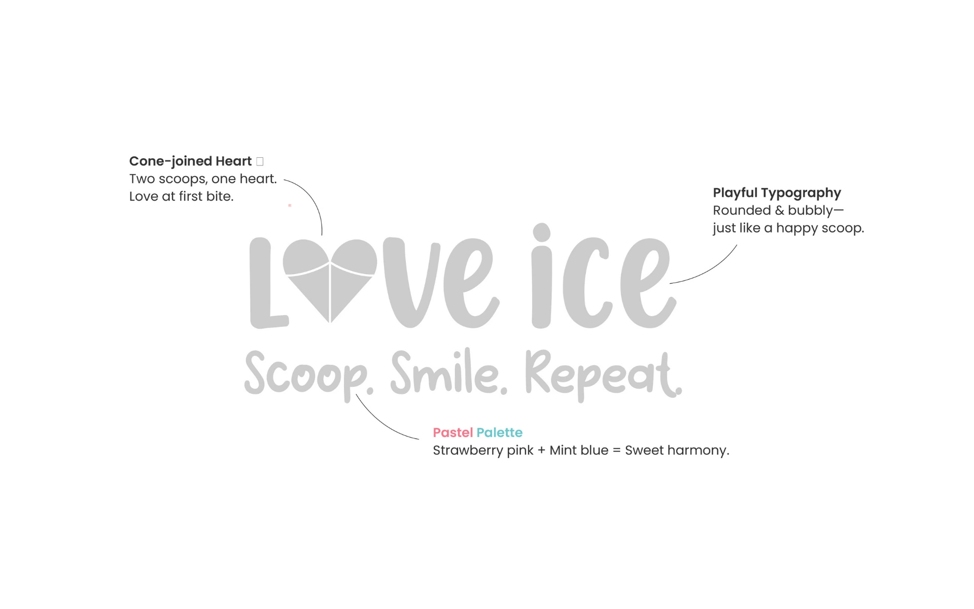
Cone-Joined Heart
The ‘O’ in Love becomes a stylized heart made from two ice cream scoops and a cone—visually merging romance with indulgence. Two scoops. One heart. Love at first bite.
Playful Typography
Rounded and bubbly, the typeface mirrors the joy of a happy scoop. It’s casual, inviting, and full of bounce—just like the brand experience.
Pastel Palette
Strawberry pink and mint blue—a perfect pairing. Sweet, soft, and instantly appetizing. Together, they create a visual harmony that tastes as good as it looks.
Tagline with Rhythm
“Scoop. Smile. Repeat.” isn’t just a tagline—it’s a ritual. A reminder that happiness can be that simple.
We approached this identity like you’d approach your favorite sundae—treating each layer with care.
This wasn’t about standing out in a loud, neon freezer aisle. It was about standing apart—with warmth, playfulness, and design that feels like dessert. Every visual element was crafted to feel soft, friendly, and absolutely delightful—just like the product it represents.
The Love Ice logo proves that simple pleasures deserve thoughtful design.
It doesn’t shout. It sings. With a spoonful of charm and a scoop of joy, it’s an identity that brings people closer—with color, curves, and a little heart right at the center.
Because love isn’t just in the name. It’s in every bite.