Achintya
Logo Design
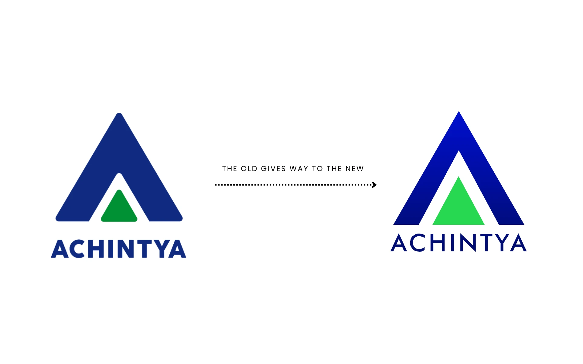
At the intersection of legacy and modernity, the new Achintya identity marks more than just a design upgrade—it’s a shift in how finance is felt, understood, and experienced. Bold yet stable, approachable yet authoritative, Achintya’s new look embraces the new era of investing—millennial, mobile, and mindset-first.
Achintya is a diversified financial brand rooted in trust, performance, and forward-thinking. With a deep legacy in Indian financial services, the brand recognized a need to evolve—visually and strategically—for a younger, more dynamic audience.
This rebrand wasn’t about letting go of the past. It was about building a bridge—between traditional market wisdom and tomorrow’s trading habits. Between institutional gravitas and consumer-first accessibility. Achintya needed to retain its foundation while becoming relevant, intuitive, and inspiring for the next generation.
Srrishti is more than a residential space—it’s a philosophy of living. Inspired by the quiet power of the sun and the rhythm of nature, it embodies balance, growth, and intentional design. Developed by Unicorn Terraces, the project is a tribute to mindful architecture and grounded luxury.
The name means ‘creation’, and that’s exactly what the brand seeks to offer: a new world to come home to.

To modernize without alienating. To stand out without being loud.
Here’s how the brand evolution was structured:
Minimalist Wordmark, Maximal Impact
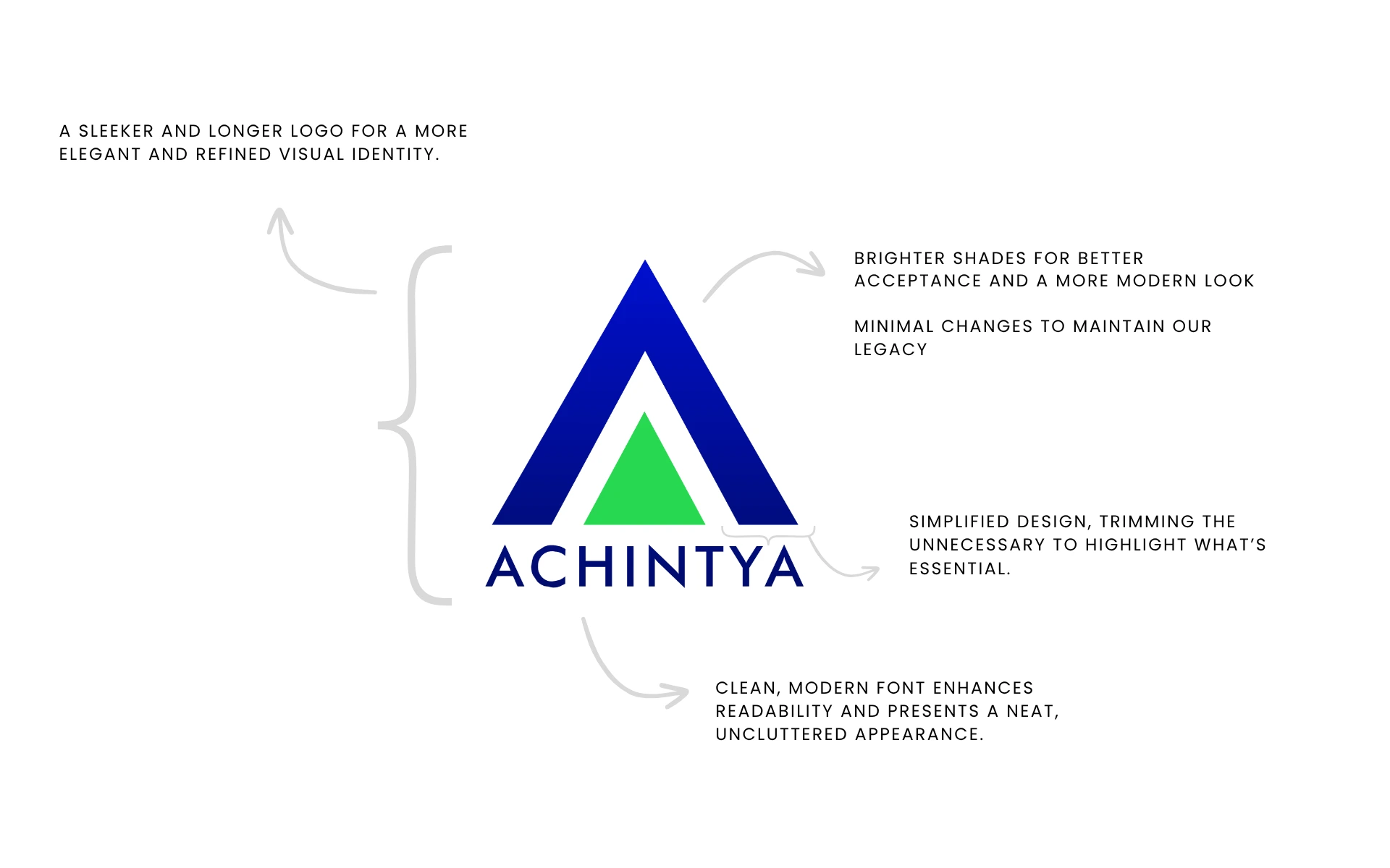
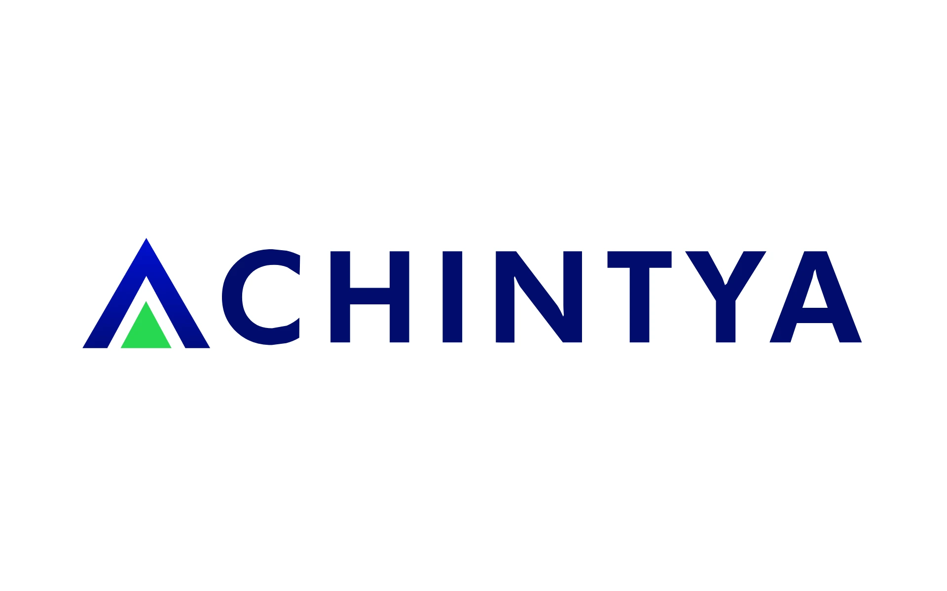
The sleeker, longer logo delivers a refined visual identity—designed for clarity, elegance, and digital versatility.
Legacy, Recut
Small yet deliberate tweaks to the original structure ensure the logo honors its past while confidently stepping into the future.
A Future-Facing Palette
A strong primary base (deep blue and lime green) anchors the brand in trust and credibility, while millennial pastel tones (butter yellow, mint, and peach) add energy and modernity—ensuring relevance across investor personas.
A Language That Resonates
The communication tone blends confidence with curiosity. It educates without intimidating, and inspires without overselling. Achintya speaks like a mentor, not a salesman.


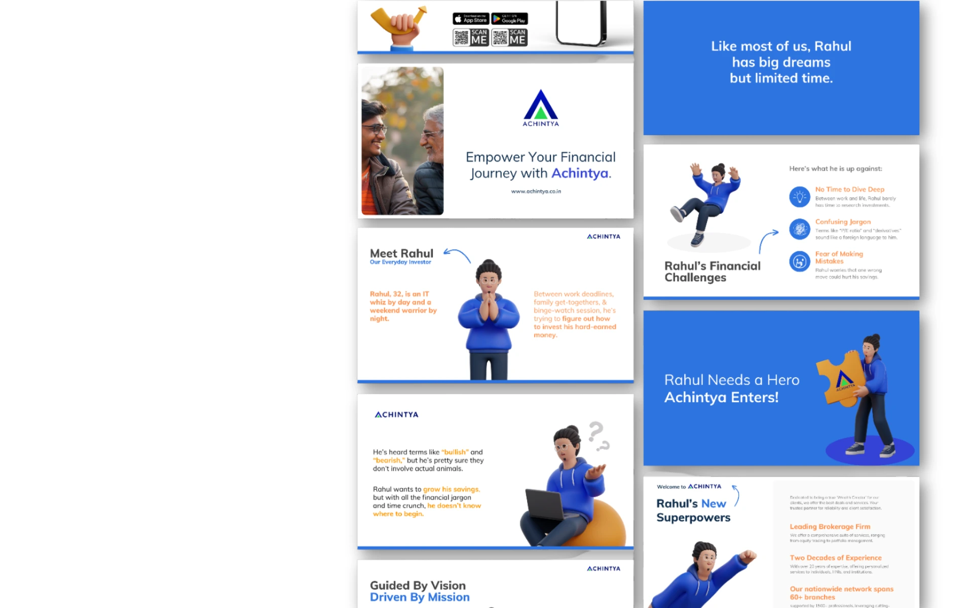
We approached the rebrand like an algorithm:
The result? A brand that looks as smart as it is secure. Clean. Cohesive. Culturally aware.
This is more than a facelift. This is Achintya 2.0—built not just for where finance has been, but for where it’s headed.
A brand that doesn’t just speak the language of numbers, but of people.
That doesn’t just enable transactions—but empowers transformation.
Because in a world of volatility, Achintya is a constant.
Old wisdom. New skin. Future-first.