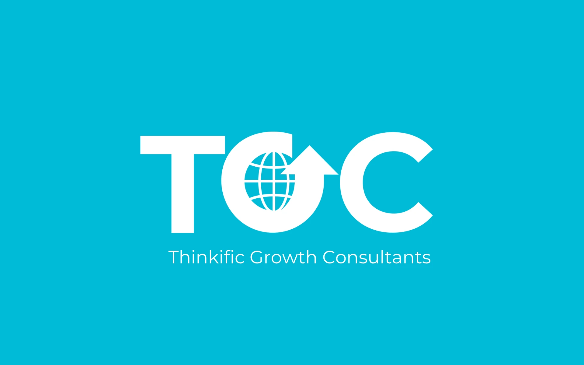
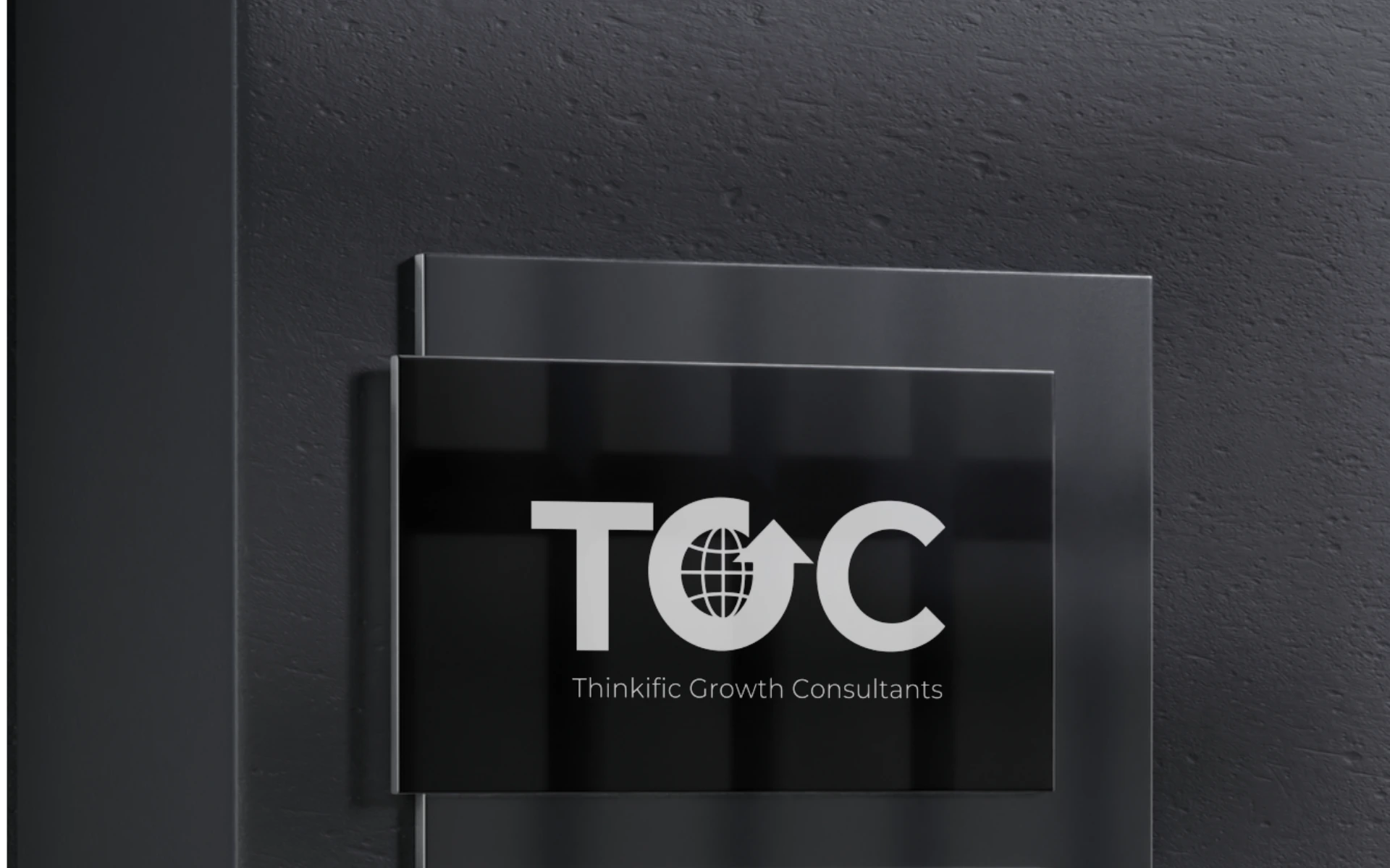
TGC
Logo Design
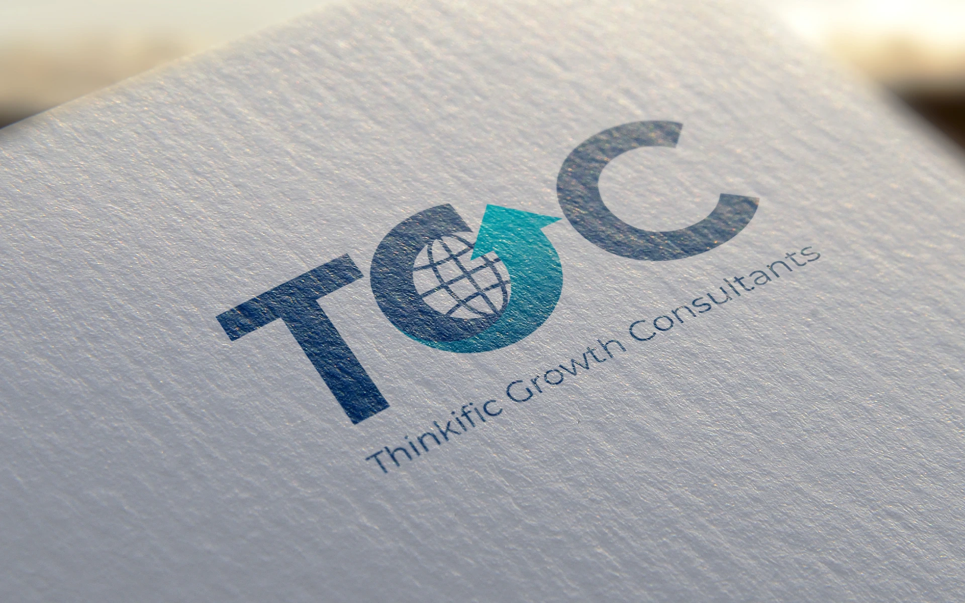


For a brand that champions business transformation, we built a logo that quite literally points upward. Thinkific Growth Consultants needed an identity that was bold, modern, and built for trust—while staying global in outlook and sharp in execution.
Thinkific Growth Consultants isn’t just another advisory firm. It’s a partner in possibility—helping businesses scale, solve, and succeed.
The logo had to reflect this ambition. It needed to symbolize forward momentum, global thinking, and strategic clarity. Something that would work equally well in boardrooms and on pitch decks.
We anchored the logo around a singular, integrated symbol.
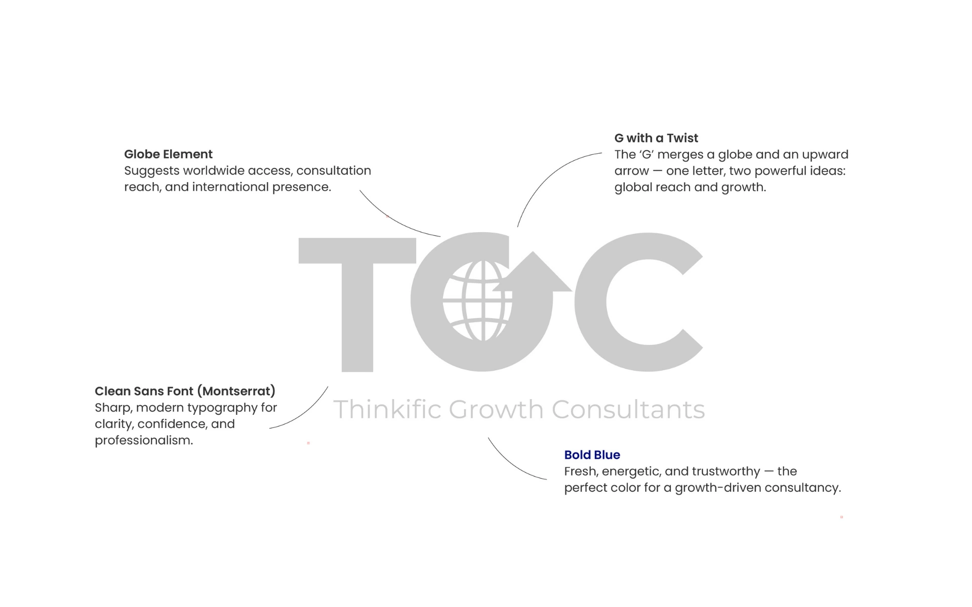
The ‘G’ Reimagined
The core idea was to embed meaning directly into the brand’s initial. Inside the ‘G’, we shaped two core elements:
Minimal, Powerful Composition
The symbol and wordmark were designed to be sleek, modern, and versatile—fitting the brand’s digital-first, professional tone.
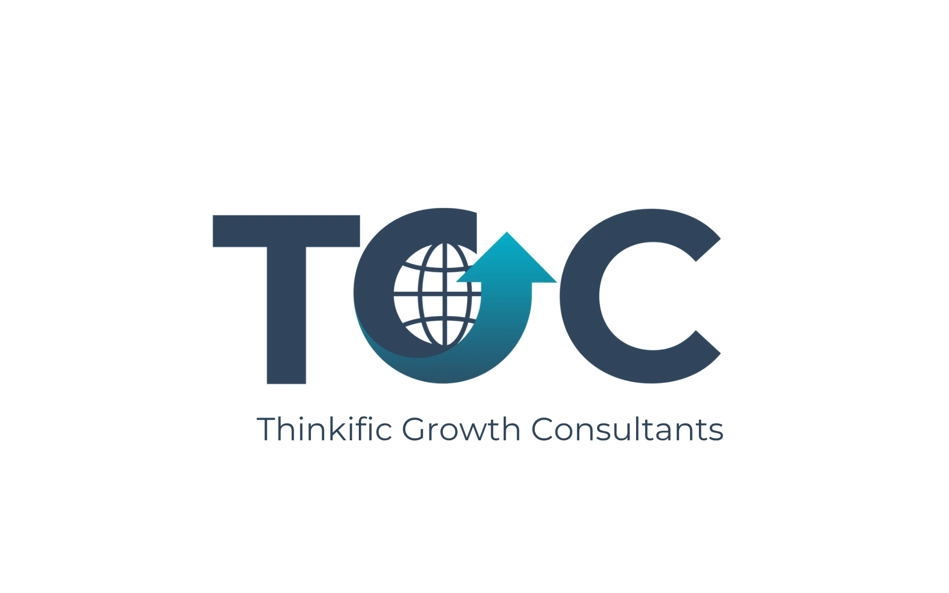
Color Psychology
The bright teal (#00bbd7) energizes and evokes trust, while the deep slate (#2F455C) balances it with credibility and seriousness. Together, they form a palette that speaks of ambition and stability.
We took a symbol-first approach—ensuring the logo wasn’t just visually striking, but inherently meaningful. The goal was to create a mark that could become shorthand for strategic thinking and transformative growth.
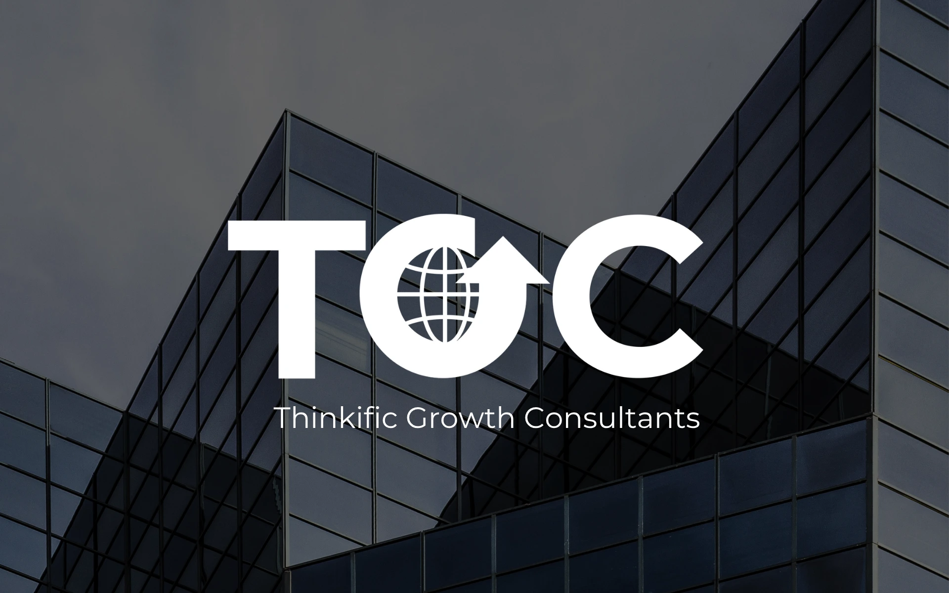
Whether used on pitch documents, social channels, or large-scale event graphics, the logo adapts—always carrying its story of global potential and upward drive.
The Thinkific Growth Consultants logo doesn’t just say growth—it shows it.
It’s compact, clever, and built to scale—just like the businesses the brand works with. With every appearance, it reinforces the firm’s promise: to turn potential into performance, and ambition into action.