Aerth
Logo Design
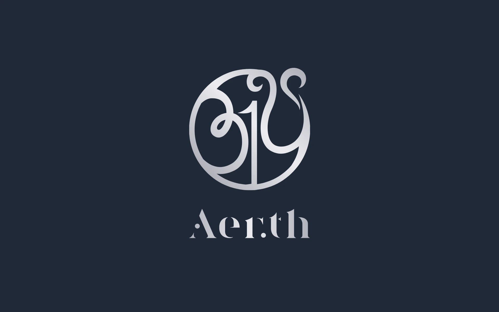
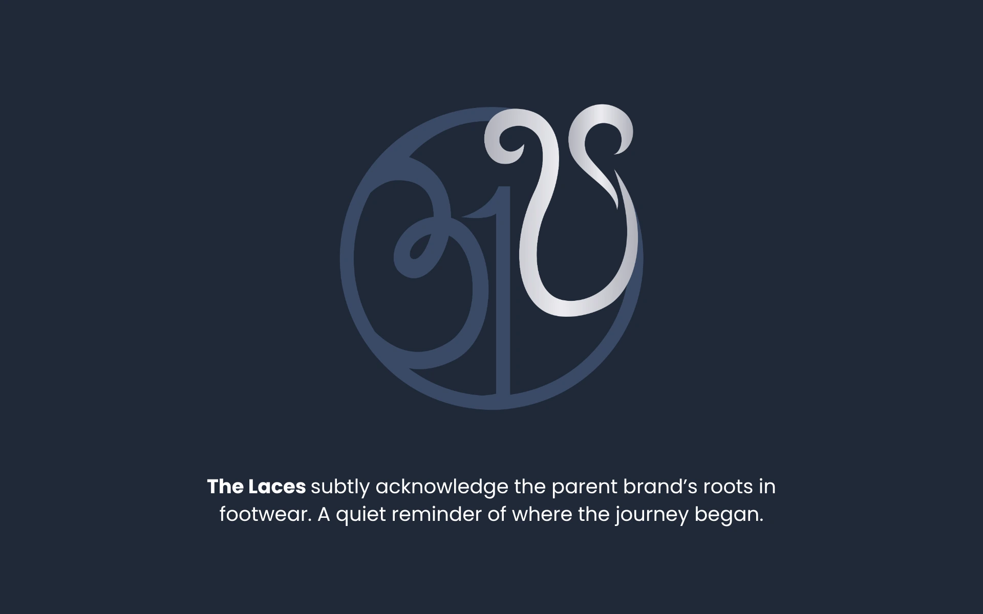


A logo where every curve has a conscience—and every element has meaning. That’s what we built for Aerth, a mindful fashion and lifestyle brand rooted in Indian values, yet looking ahead globally.
Aerth wasn’t just a brand name. It was a philosophy. It meant Earth. It meant Heart. It meant Meaning. And it needed a visual identity that could hold all of that—while staying elegant, versatile, and memorable.
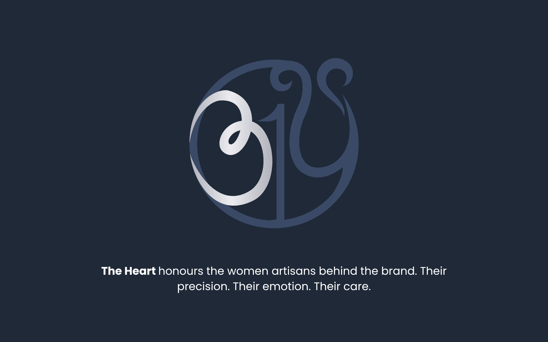
This was a brand born from intention. Built on the pillars of sustainability, circularity, and craftsmanship—especially of the women-led workforce that powered it. Our challenge was to create a logo system that distilled these ideals without trying too hard.
We treated Diame not as a startup, but as a legacy in the making.
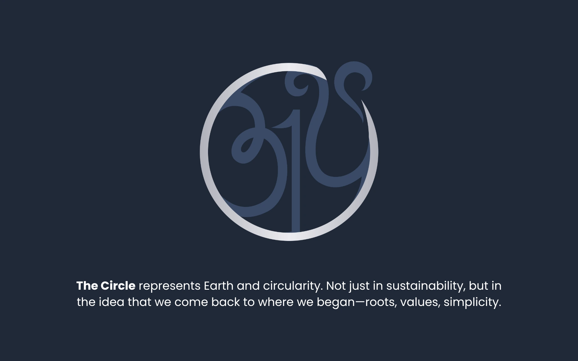
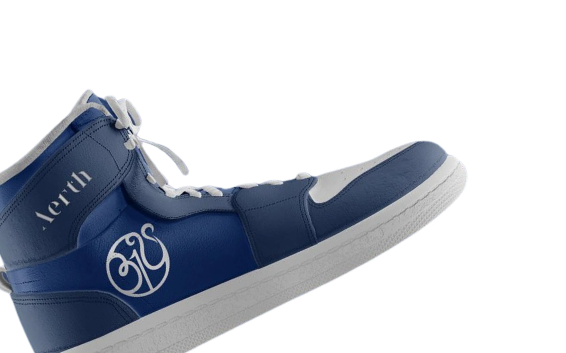
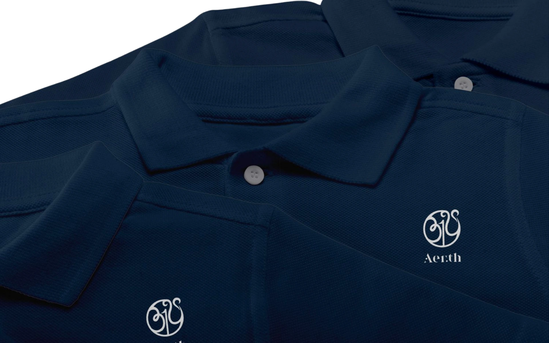
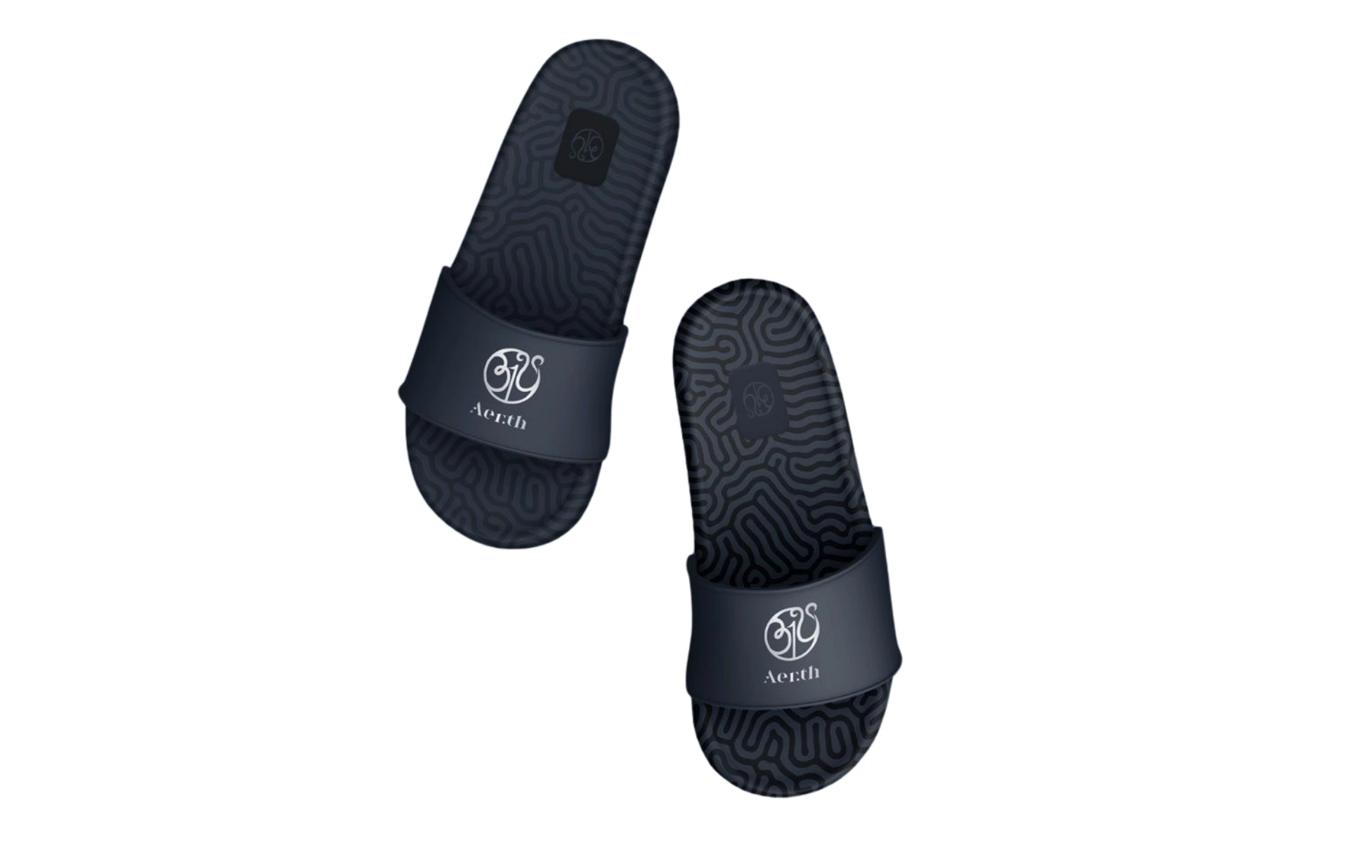
The visual identity was designed to last—one that feels native in a luxury store in Paris and equally at home in a designer showcase in Jaipur. Every curve, counterspace, and accent in the identity was guided by a single principle: “Create Your Reality.” Not just as a tagline, but as a design philosophy.
The Aerth logo is proof that elegance can have meaning.
And meaning can be beautifully designed.
It doesn’t shout. It stays. It belongs—on a shelf, on a screen, or stitched into fabric. It reminds the buyer and the brand: style and sustainability can speak the same language. You just have to design like you mean it.