Clleco
Logo Design
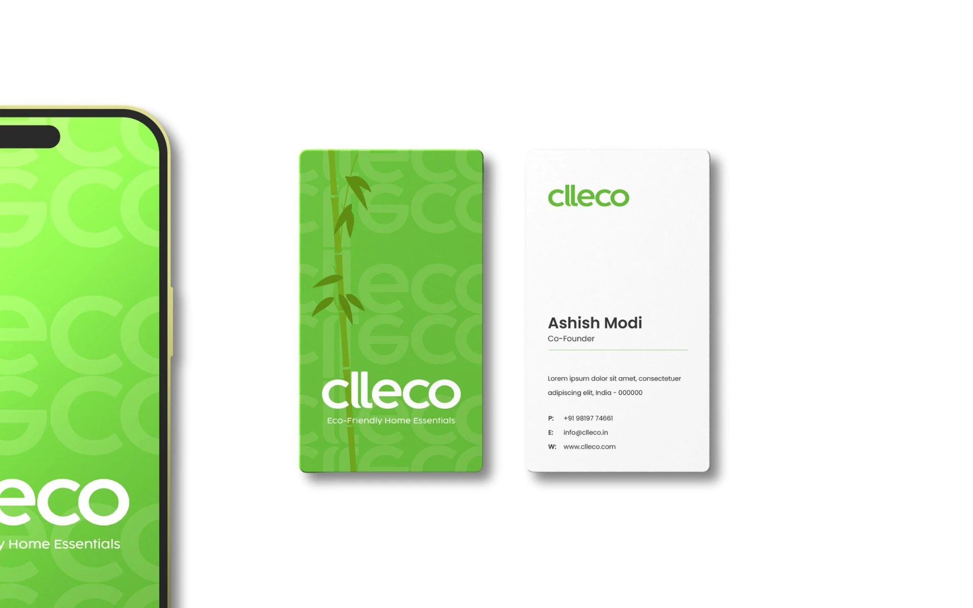
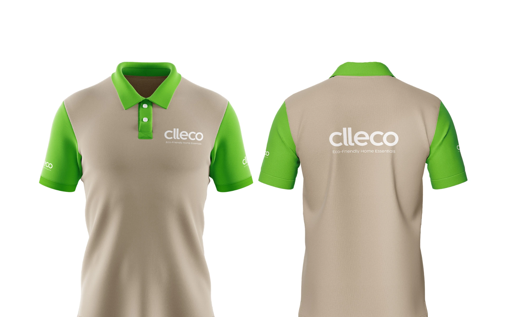


For a brand driven by sustainability and simplicity, we created a logo that felt just as clean as the products it represented. Balanced, approachable, and planet-forward—Clleco’s identity is built to inspire everyday eco choices.
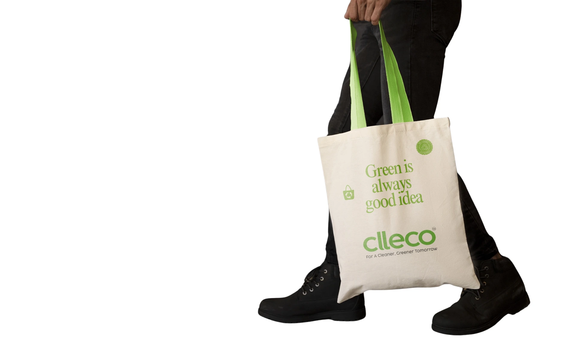
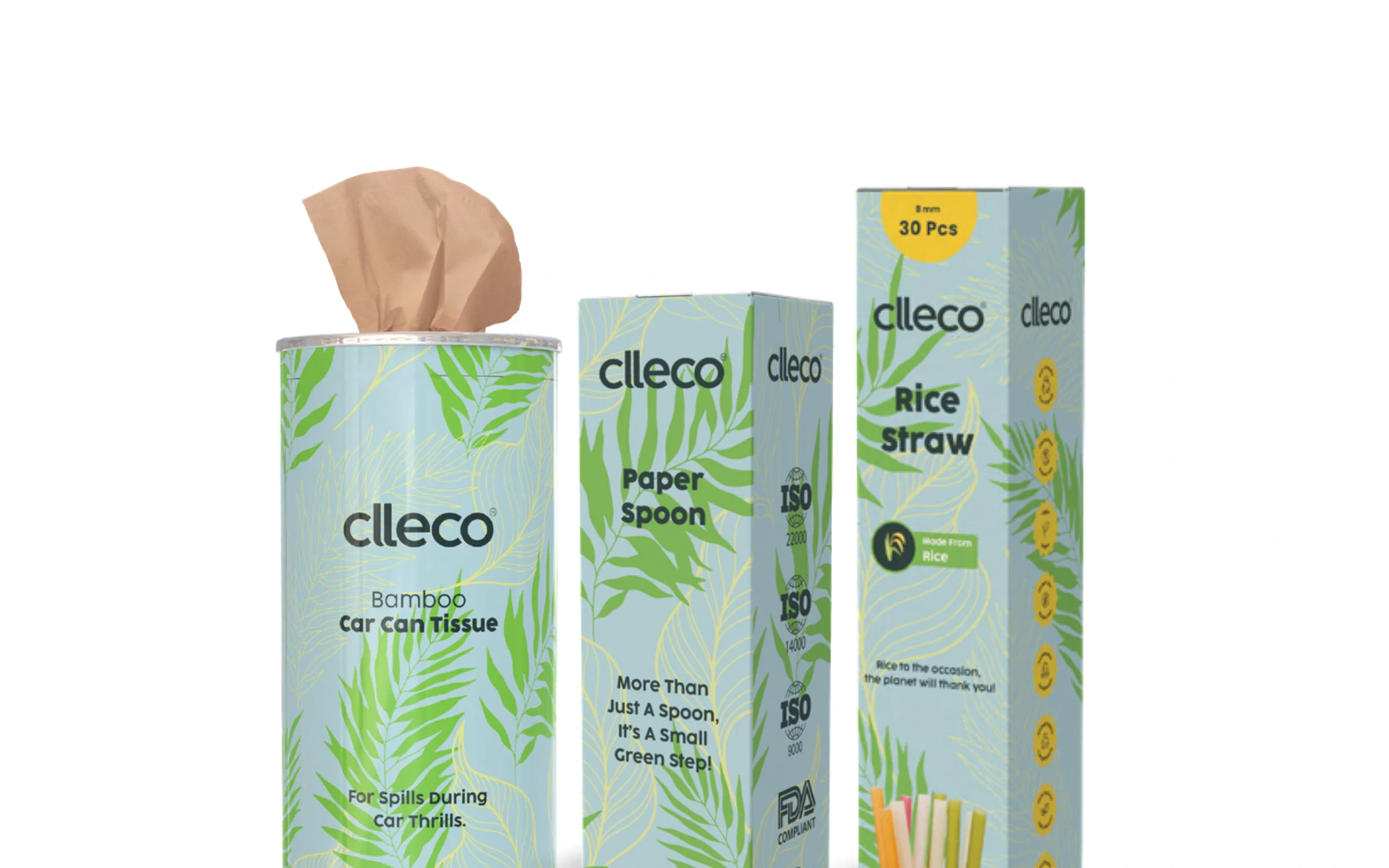
Clleco is not just a brand; it’s a quiet revolution in conscious living. From compostable bags to bamboo tissues, it makes sustainable living accessible, without compromise.
The visual identity had to reflect this balance—modern yet rooted in nature, minimal yet unmistakably green in its intent.
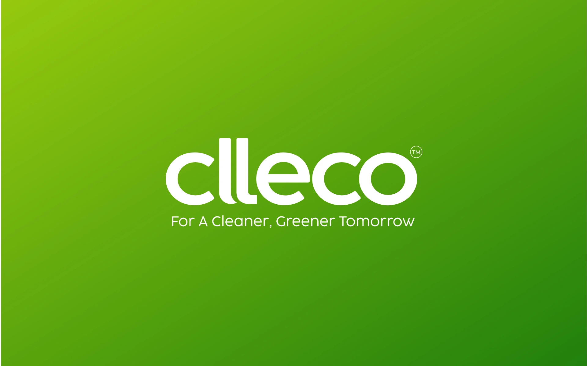
A future-forward logo that’s as thoughtful as the brand it represents:
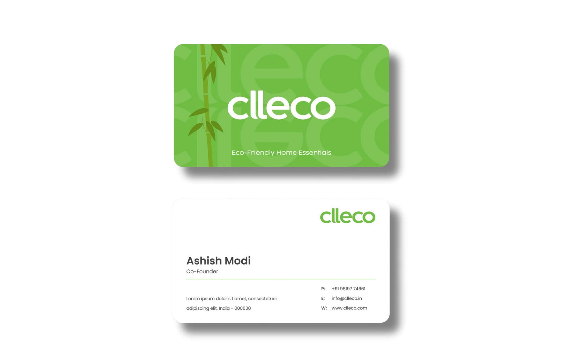
Lowercase, Rounded Typeface
The soft, circular letterforms feel warm and inclusive—evoking friendliness, humility, and everyday accessibility. It’s a brand you can trust, not just admire.
Subtle Symmetry
The double ‘l’ anchors the mark visually—stable and strong—while also doubling down on Clleco’s commitment to balance: between people and planet, design and utility.
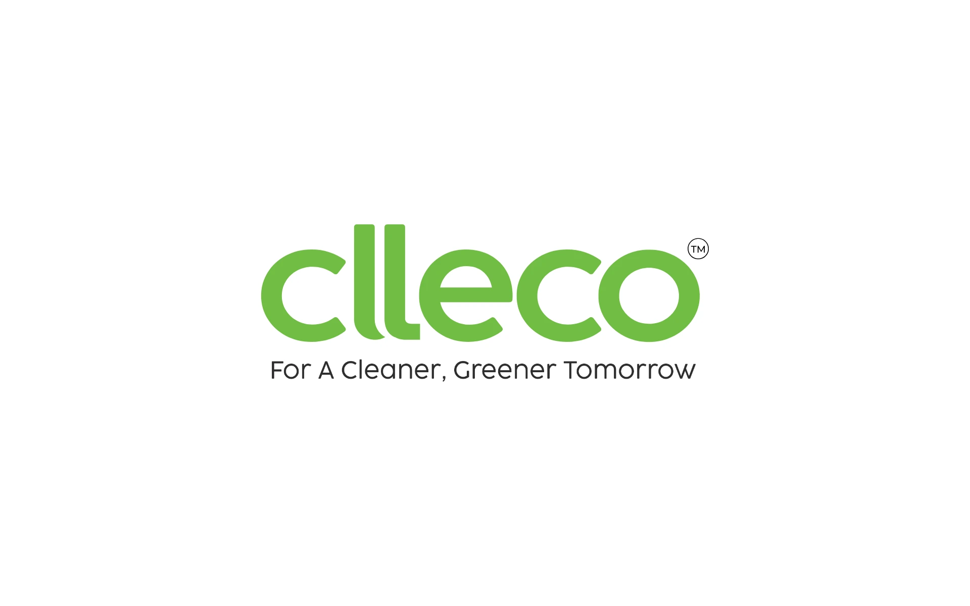
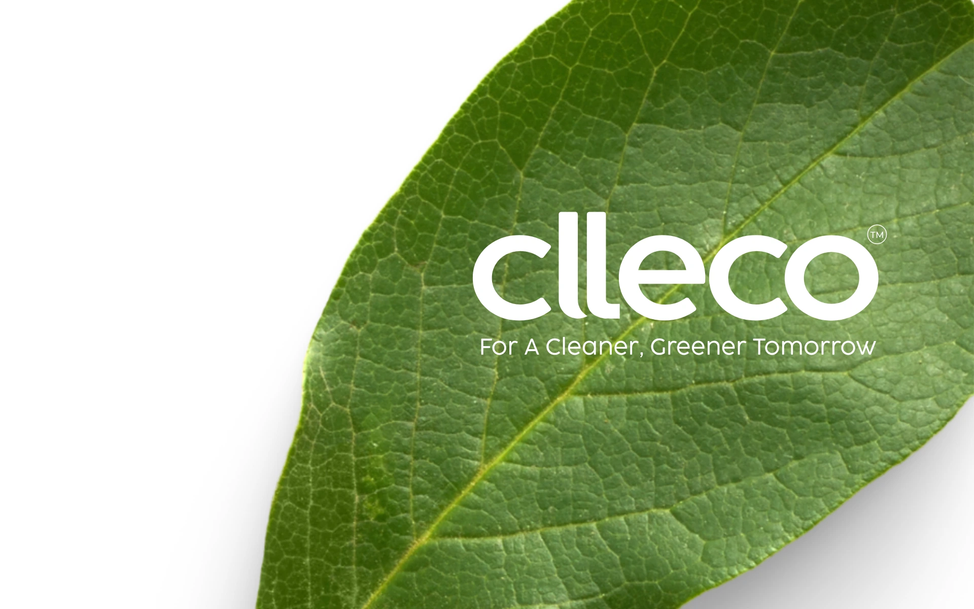
Fresh Green Hue
A vibrant, natural green that instantly signals the brand’s environmental promise. It’s not just color—it’s commitment.
Tagline Integration
“For A Cleaner, Greener Tomorrow” isn’t a slogan—it’s a mission baked into the identity. It grounds the logo and elevates its purpose with clarity.
We treated the logo not as decoration, but as a symbol of quiet leadership in sustainability. It needed to feel clean without being cold, modern without being sterile.
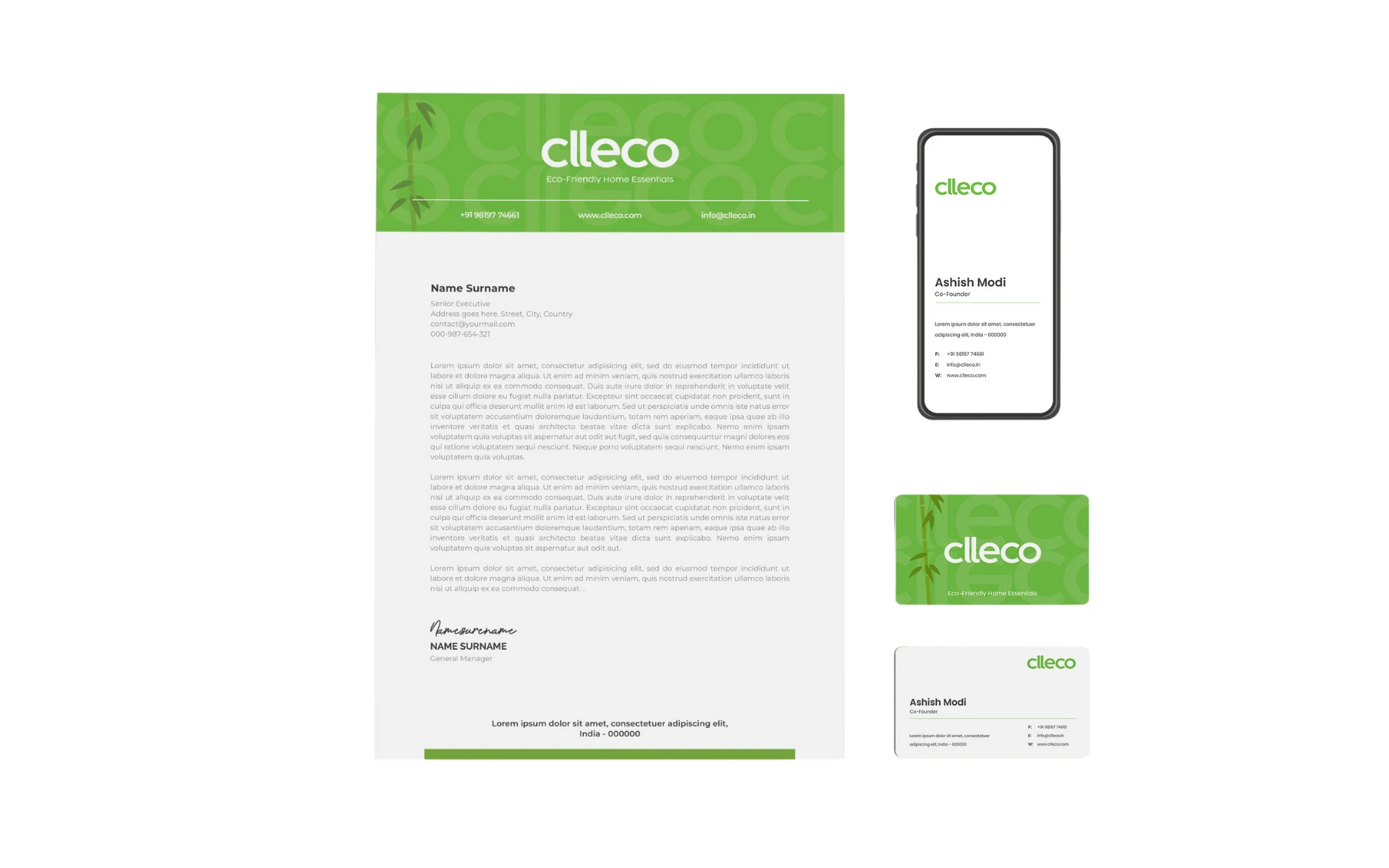
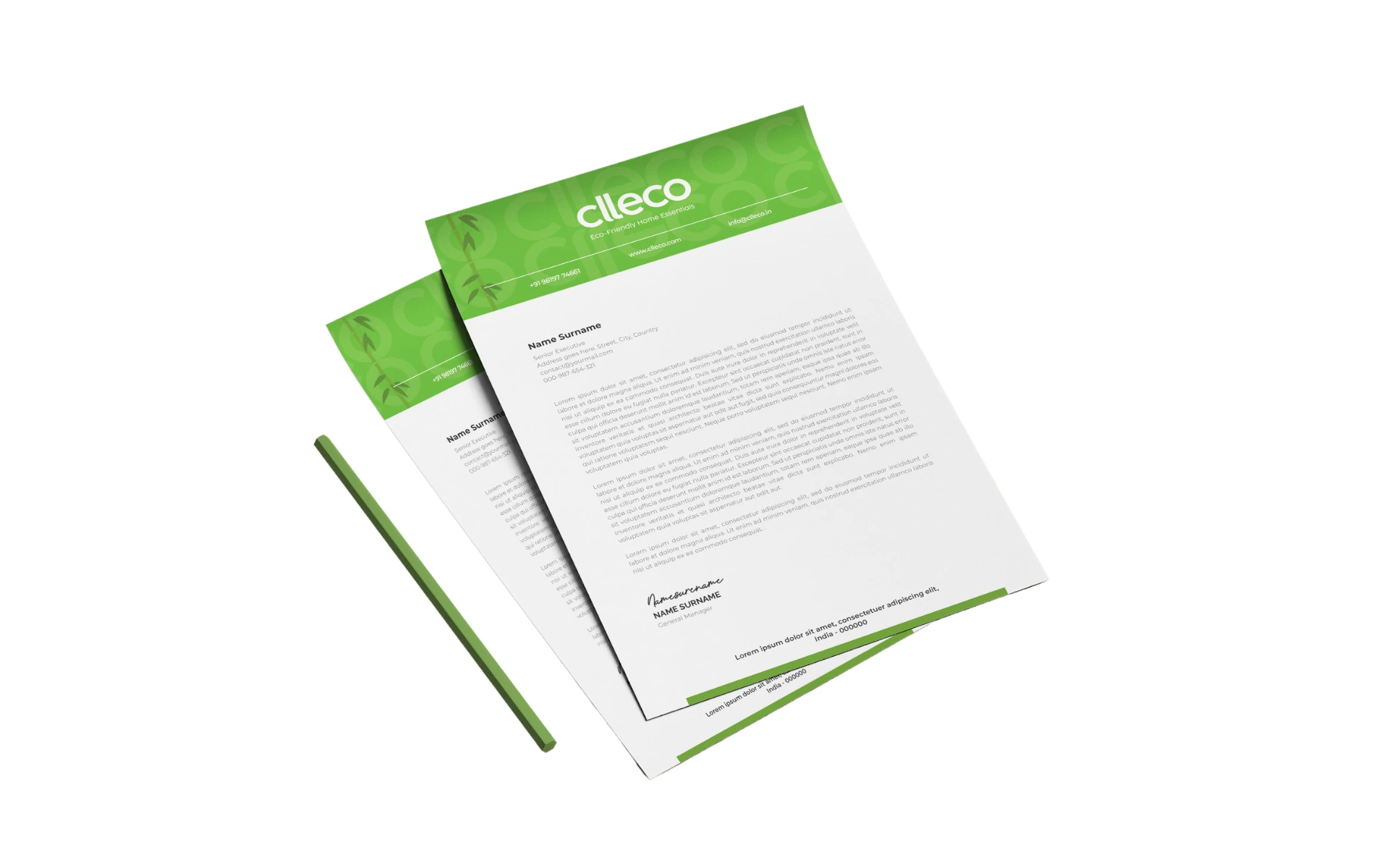
The identity flexes effortlessly across packaging, retail, and digital—with a clarity that stands tall in a crowded category.
The Clleco logo is proof that good design doesn’t shout—it simplifies.
It’s the kind of identity that lives in harmony with the world it wants to protect. Bold in its softness, powerful in its restraint, and honest to the core.
A logo for a brand that’s not just selling sustainability—but shaping it.