Cloud12
Packaging system for a mindful CBD wellness brand.


Cloud12 creates premium, plant-based CBD oils derived from Vijaya extract — tailored for pain relief, sleep support, and stress recovery. As the brand prepared to scale, it needed a packaging system that could resonate across two distinct markets:
D2C consumers exploring wellness routines.
B2B distributors operating in clinical and retail channels.
The challenge?
Design a cohesive system that can express personality on the shelf — while staying compliant, scalable, and category-relevant.
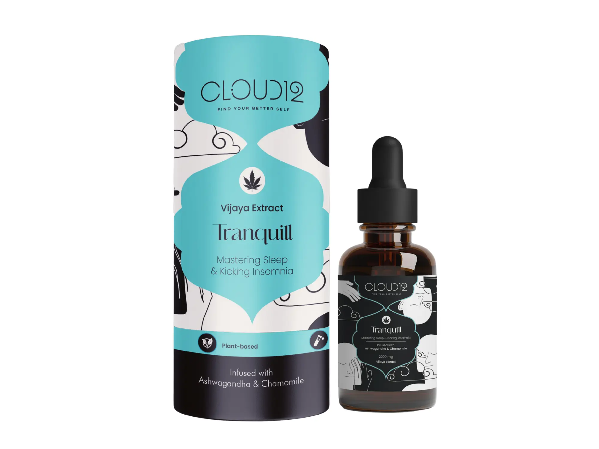
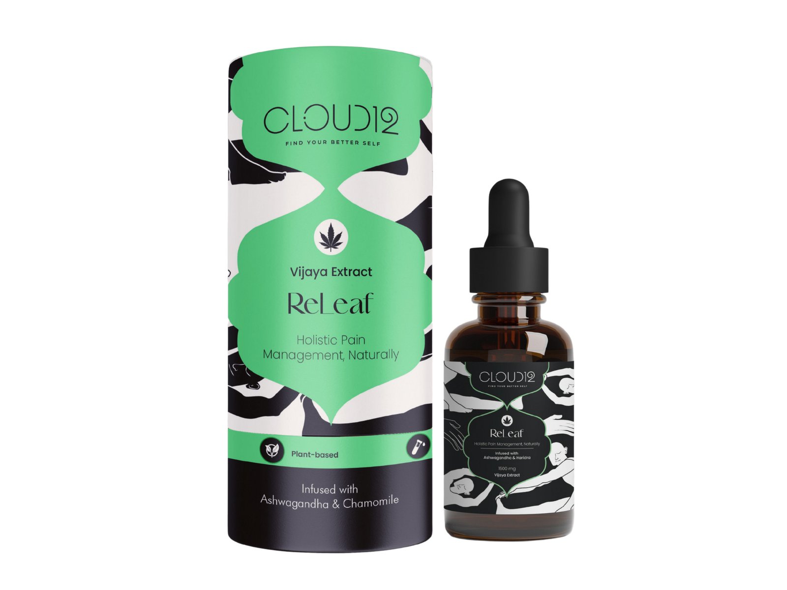
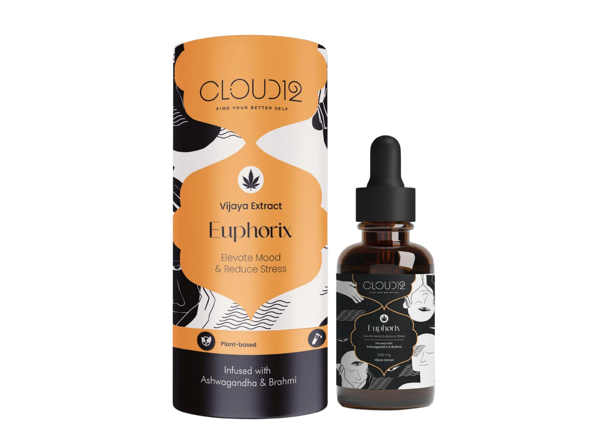
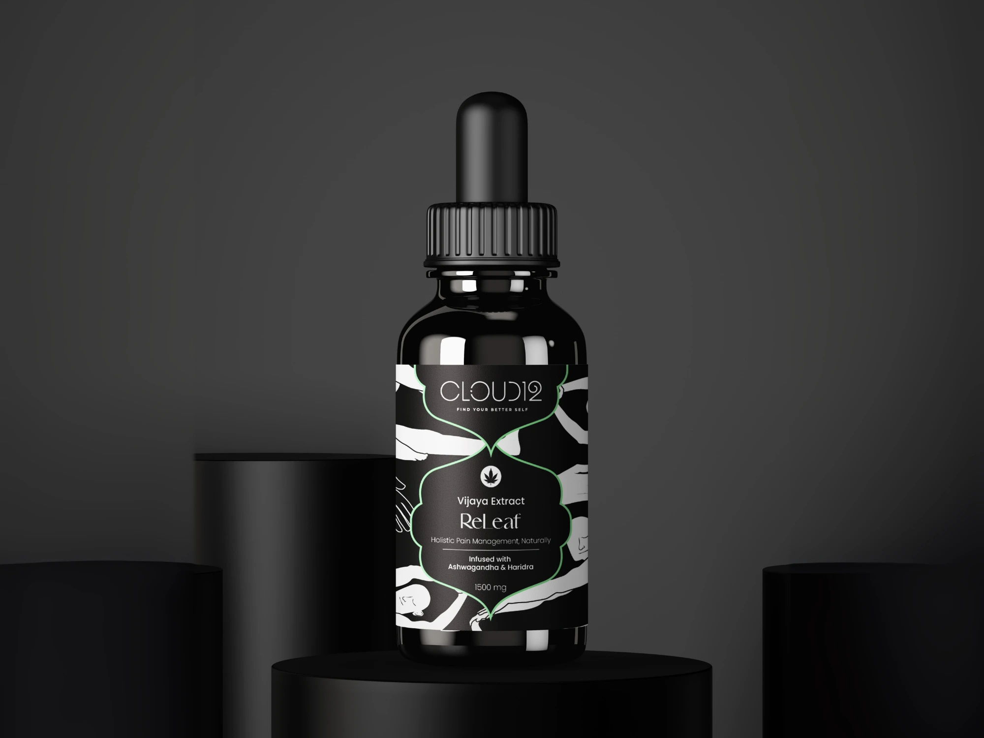
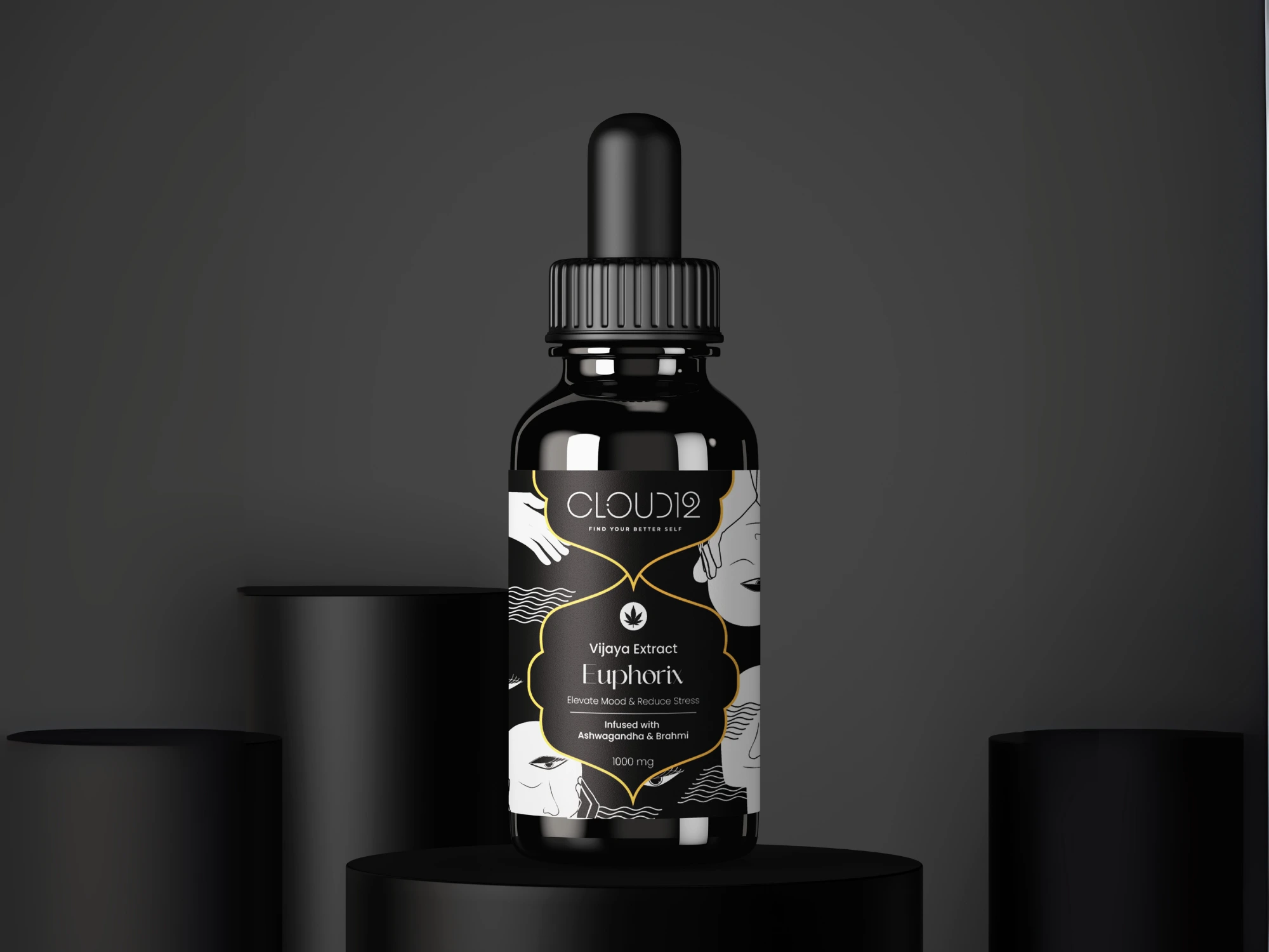
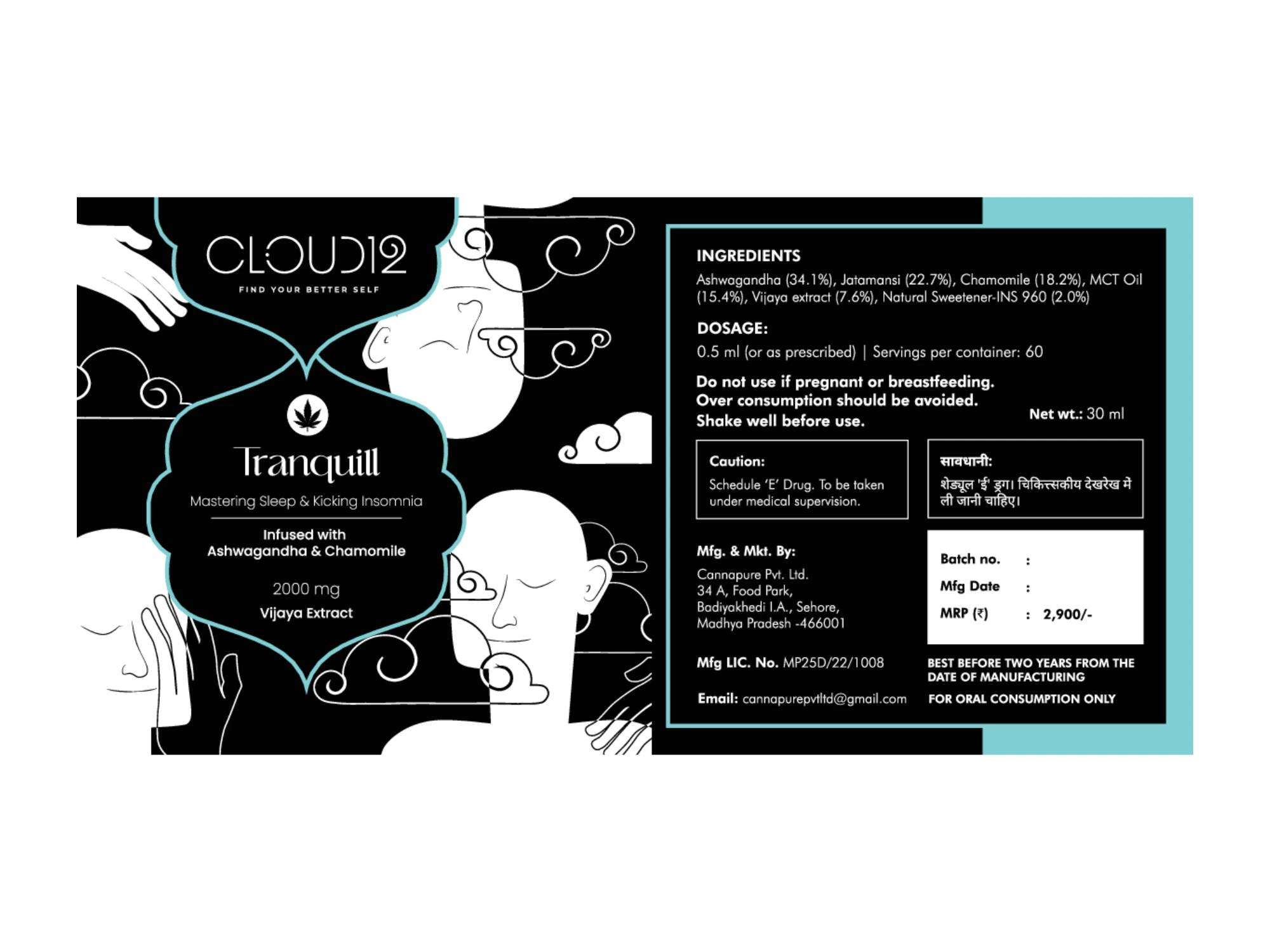
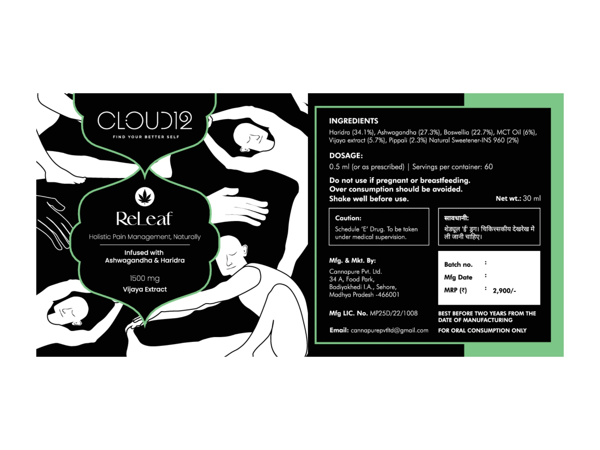
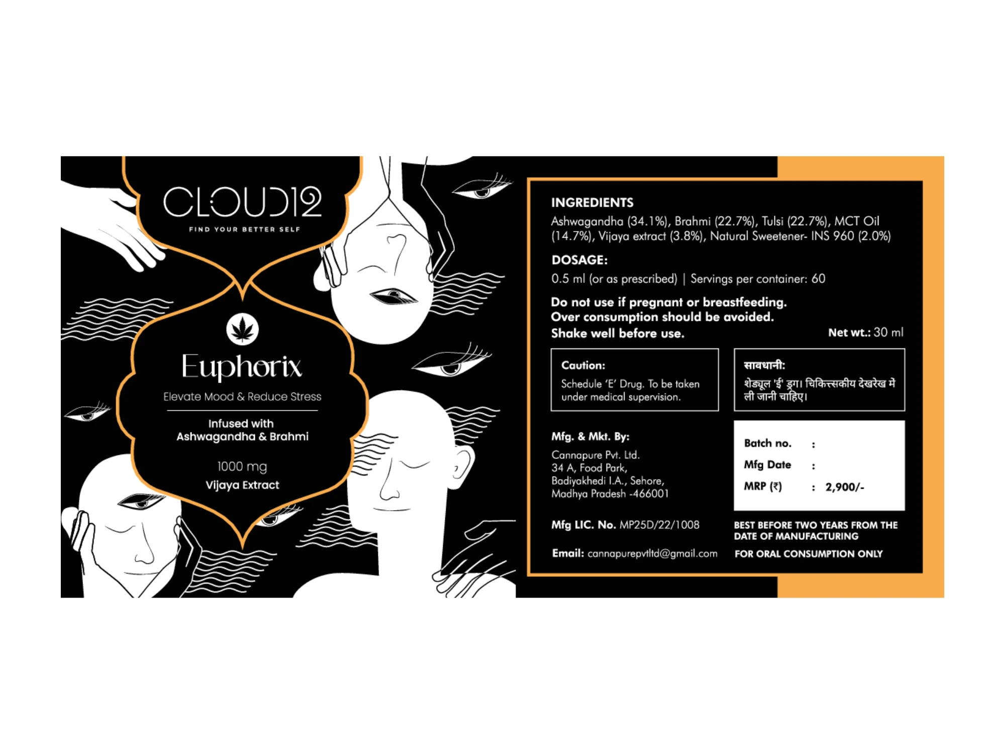
Designed for emotion. Built to signal relief.
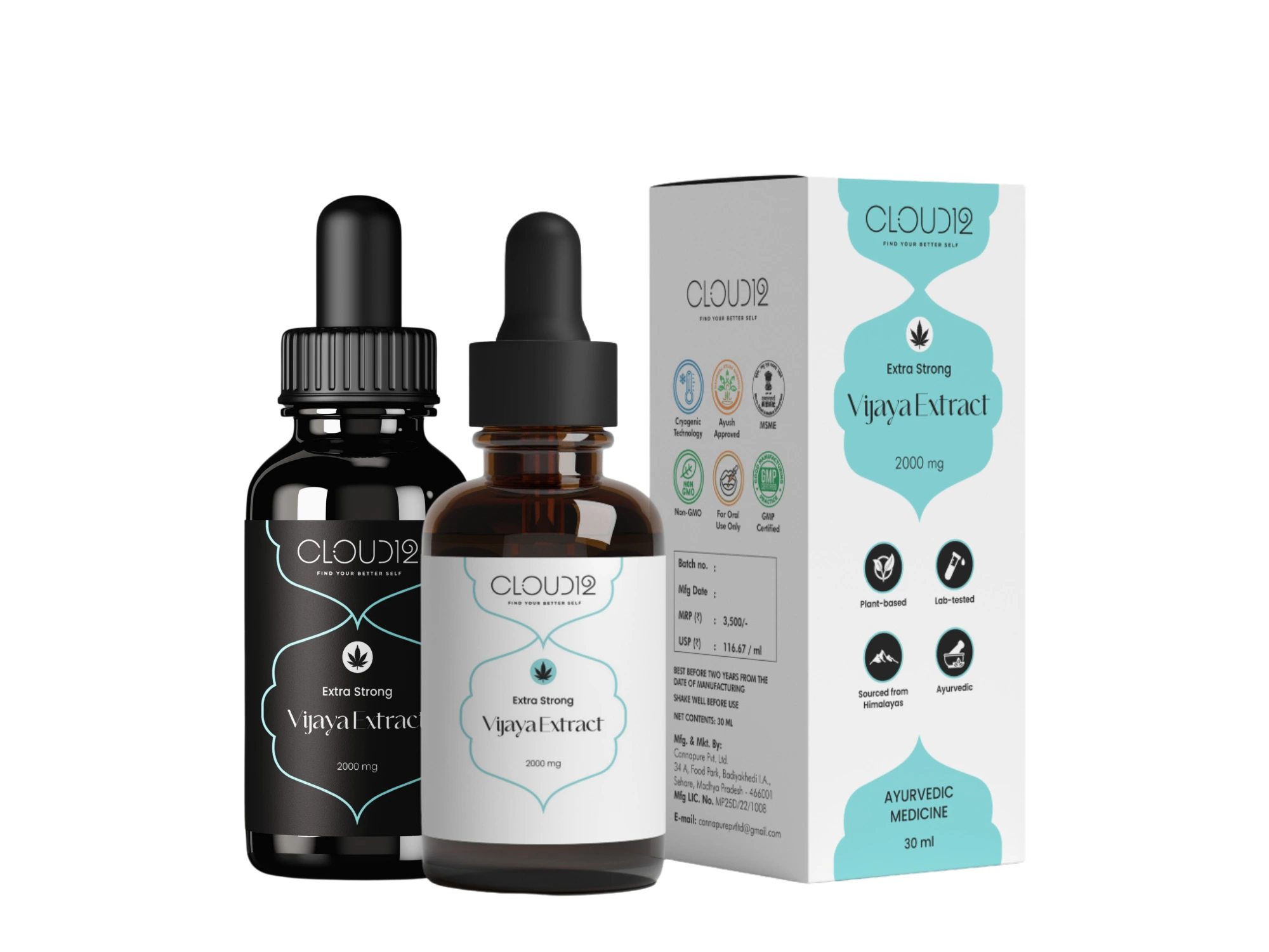
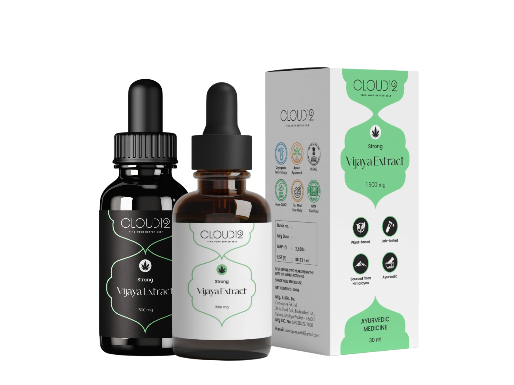
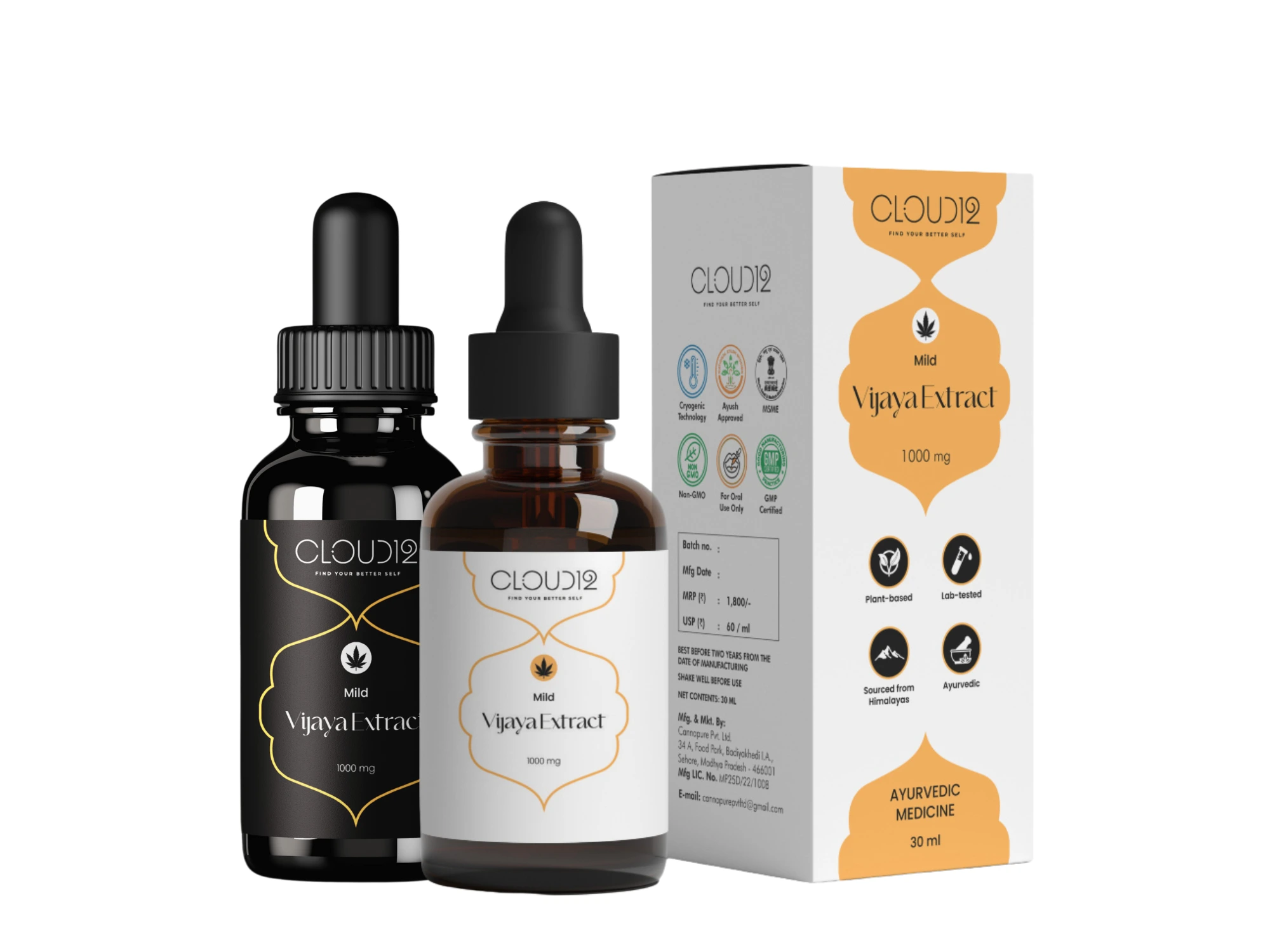
For the direct-to-consumer line, we created three SKUs:
Each variant features an abstract, slightly trippy illustration — not psychedelic, but expressive enough to hint at the emotional state it supports.
Color coding, fluid forms, and a soft-edged layout system allow the packaging to feel modern, therapeutic, and non-intimidating.
We used matching tones across the dropper label, tube box, and monocarton, creating a modular system that can expand into future categories like skin, food, or tinctures.
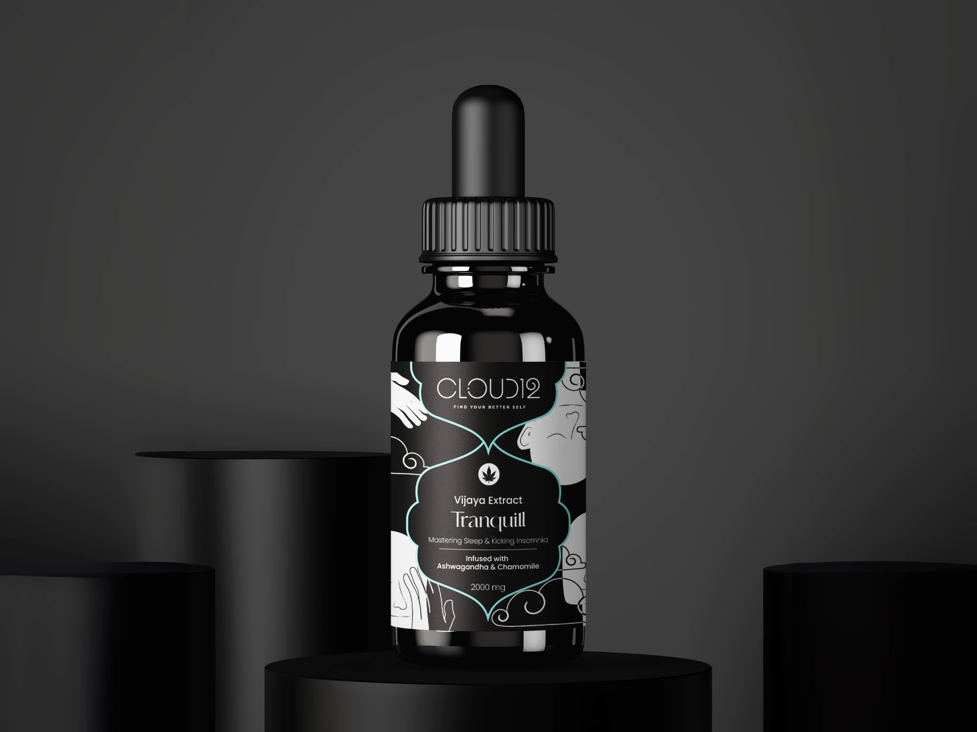
Stripped back.
Ready for shelf, clinic, and export.
For B2B channels — where compliance, clarity, and credibility are paramount — we built a clean and professional packaging set.
Minimal branding. Flat colors. Structured layout. Still identifiable by SKU colors (mint, amber, aqua) — but with hierarchy focused on key details: dosage, ingredients, certifications.
This version is equally modular, able to fit international standards, white-label setups, or pharmacy-facing channels.
What it loses in visual storytelling, it gains in sharp legibility and trust cues.