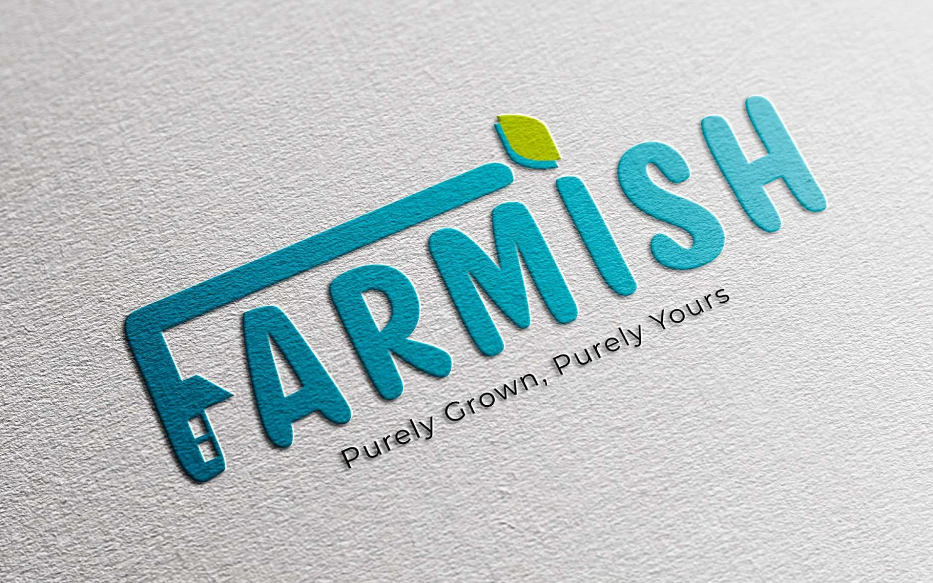
Farmish
Logo Design


A logo that captures what hydroponics stands for—purity, precision, and produce with purpose.
Farmish isn’t just a hydroponic brand. It’s a movement toward cleaner, smarter ways to grow what we eat. The logo needed to carry that clarity. To signal trust. And to stay fresh—on a box, a bottle, a bag of greens, or a retail shelf.
This wasn’t about looking organic. It was about feeling honest. Scientific. Yet still rooted in nature.
We kept the design minimal—but full of meaning.
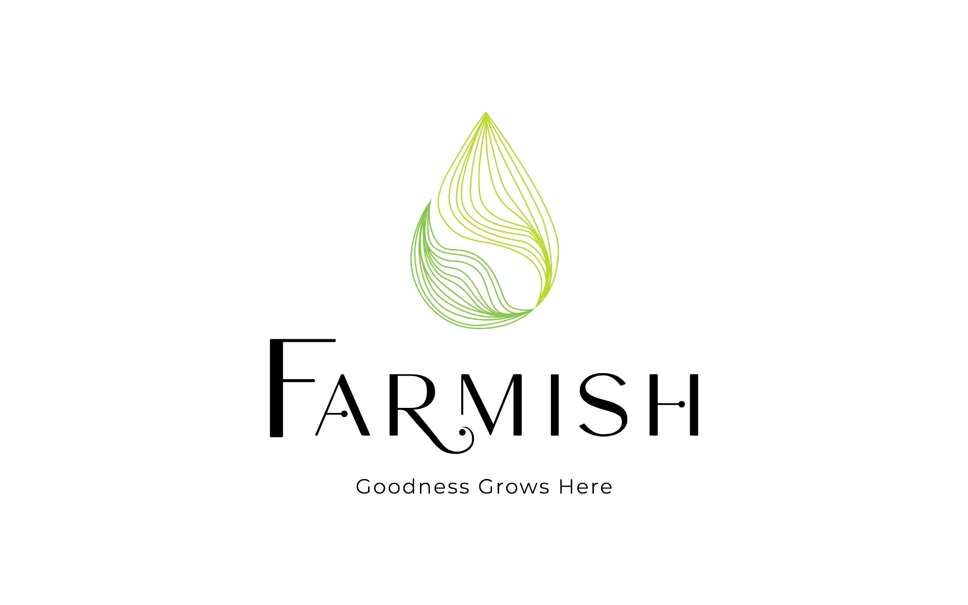
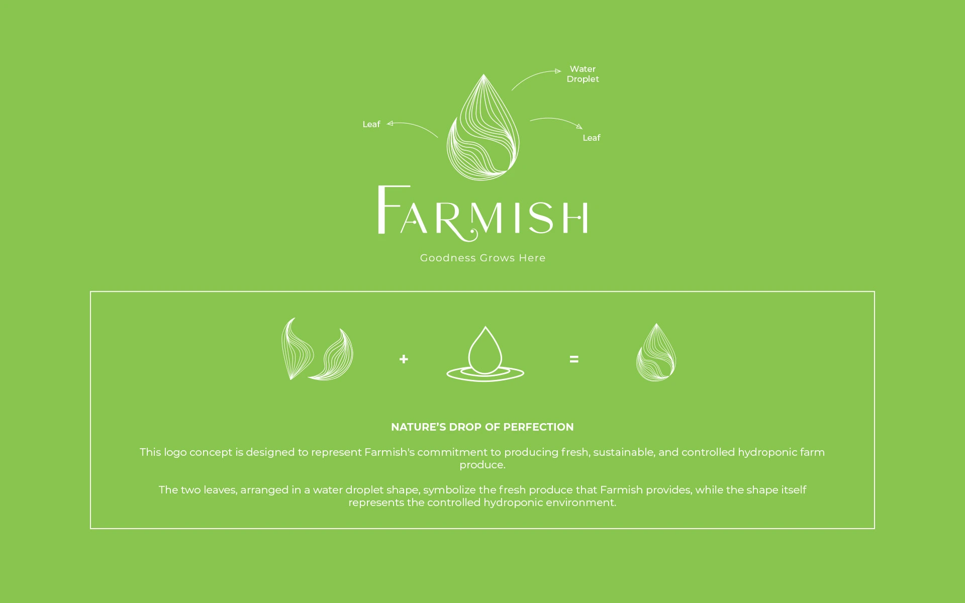
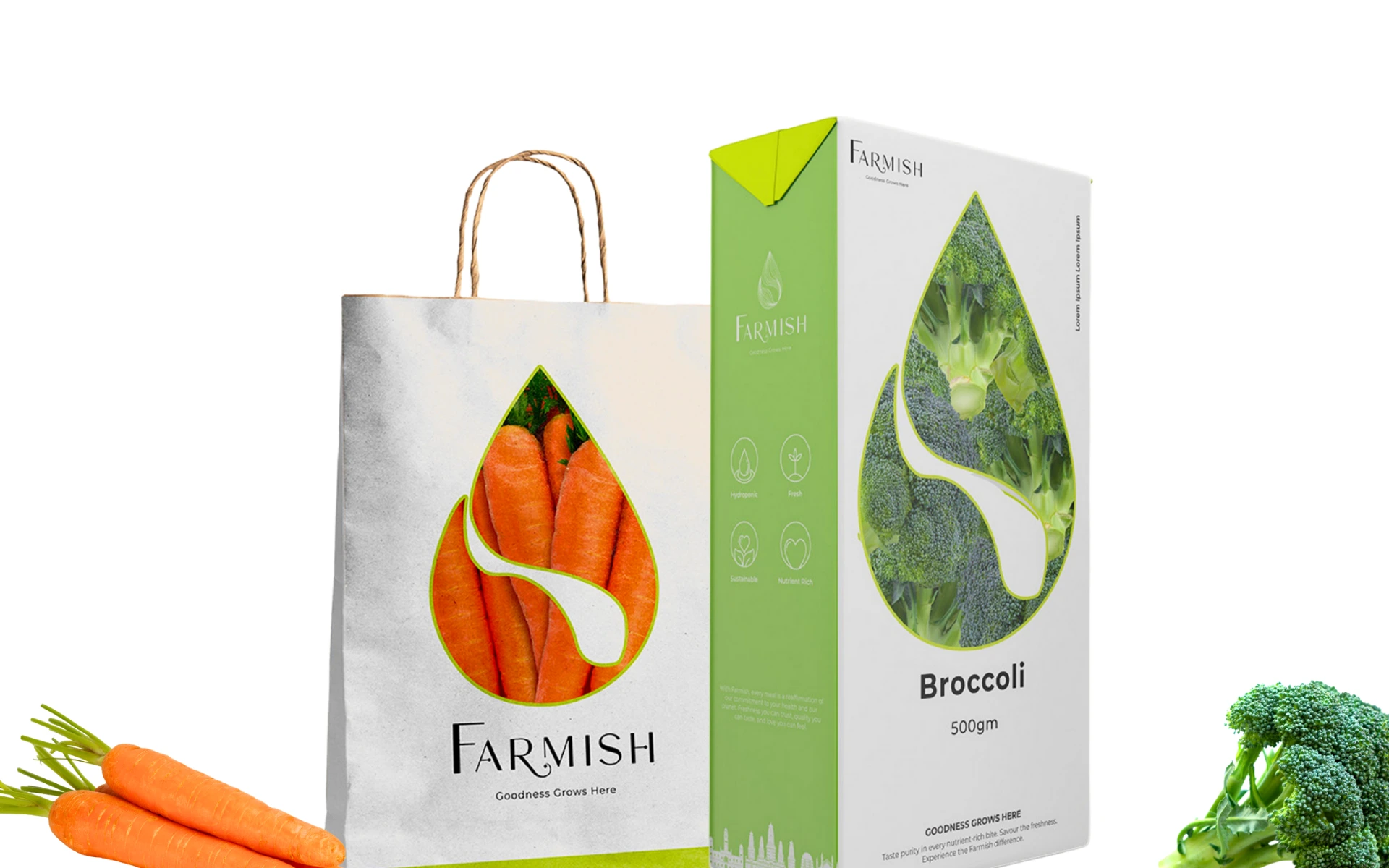
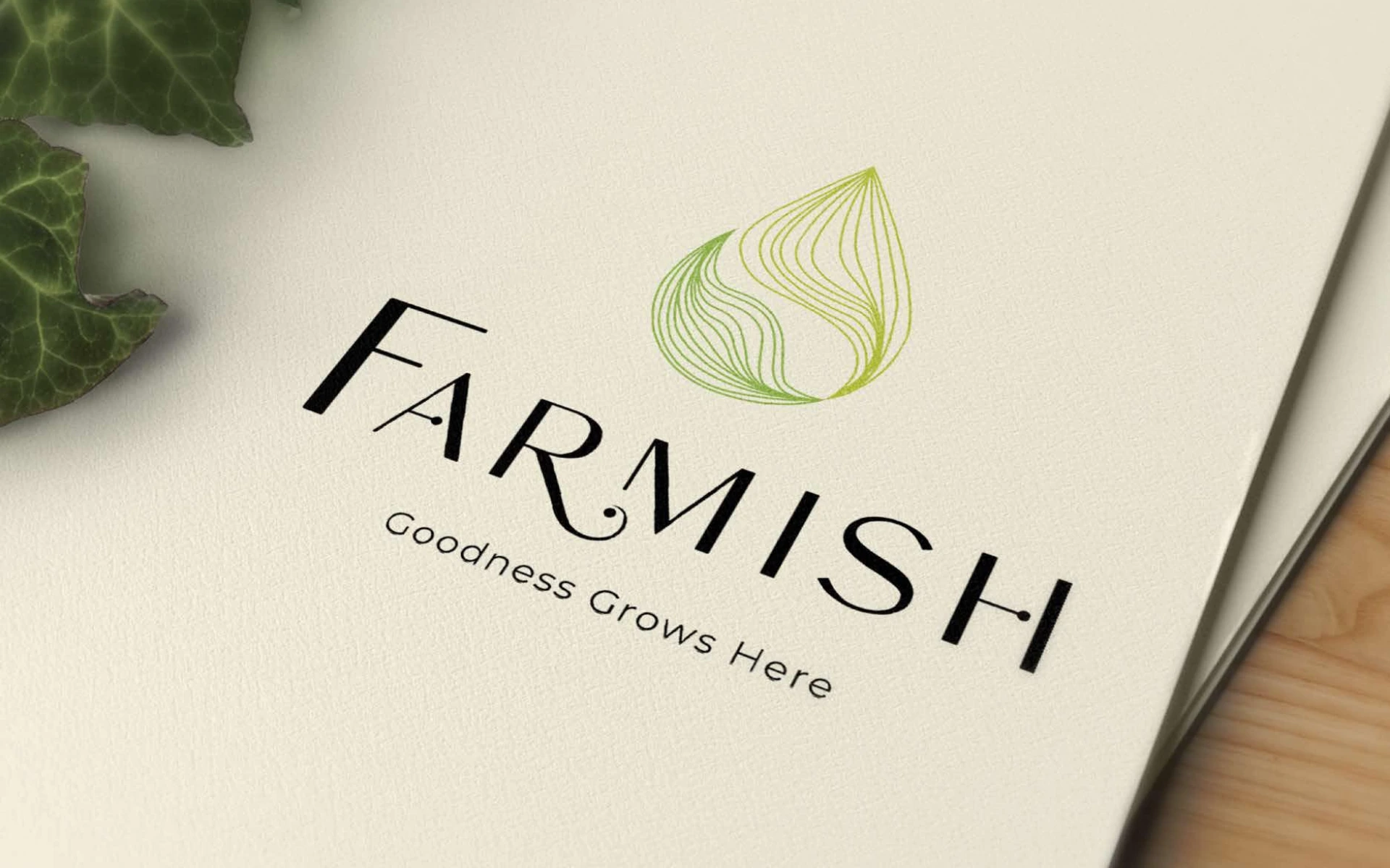
Water meets leaf: At the core of the mark is a water droplet formed by two leaves—signifying hydroponics at a glance. It’s nature, nourished by science.
Precision in every curve: The symmetry and gentle tapering of the shape suggest control and care—two things central to hydroponic farming.
Typography that breathes: The wordmark is soft and rounded with a human touch, but never unserious. A clean, modern typeface that feels accessible without losing credibility.
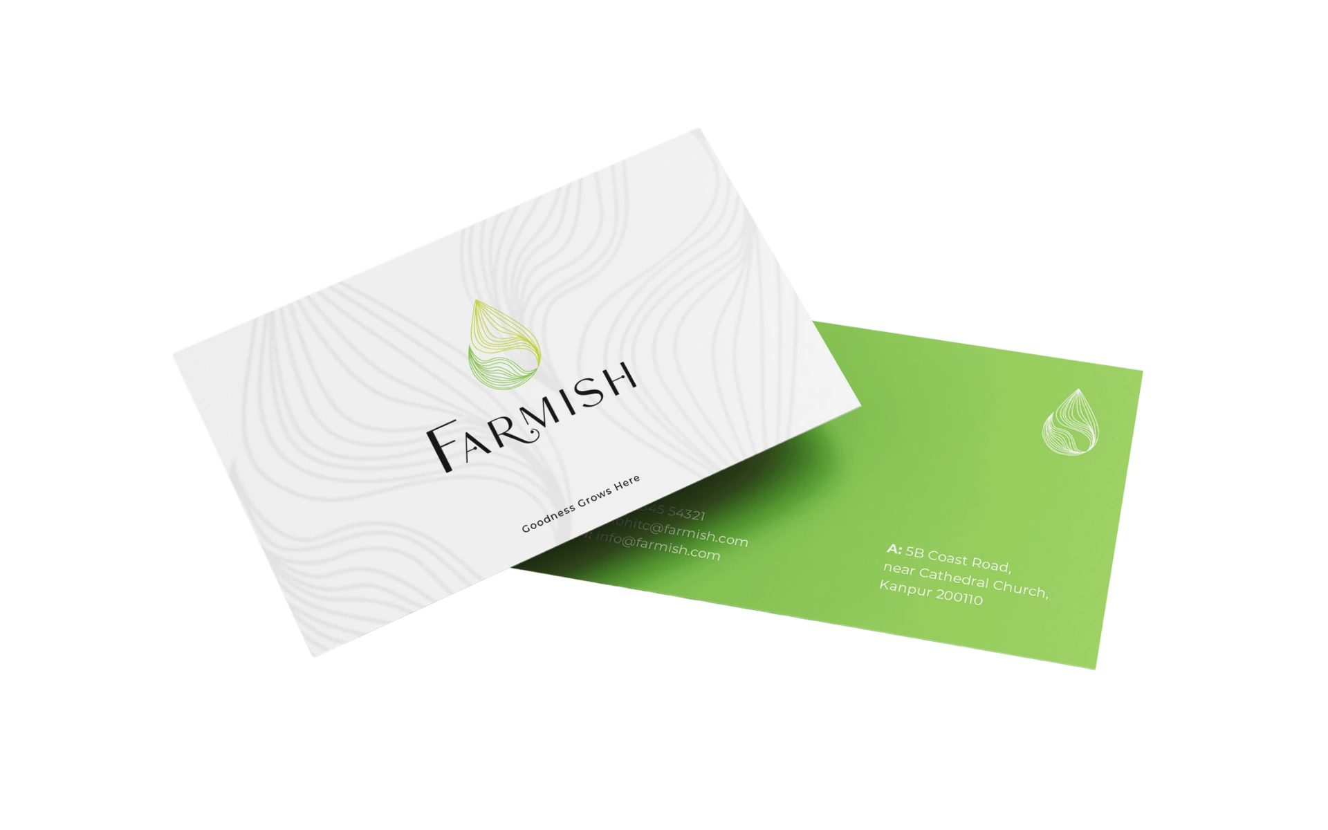
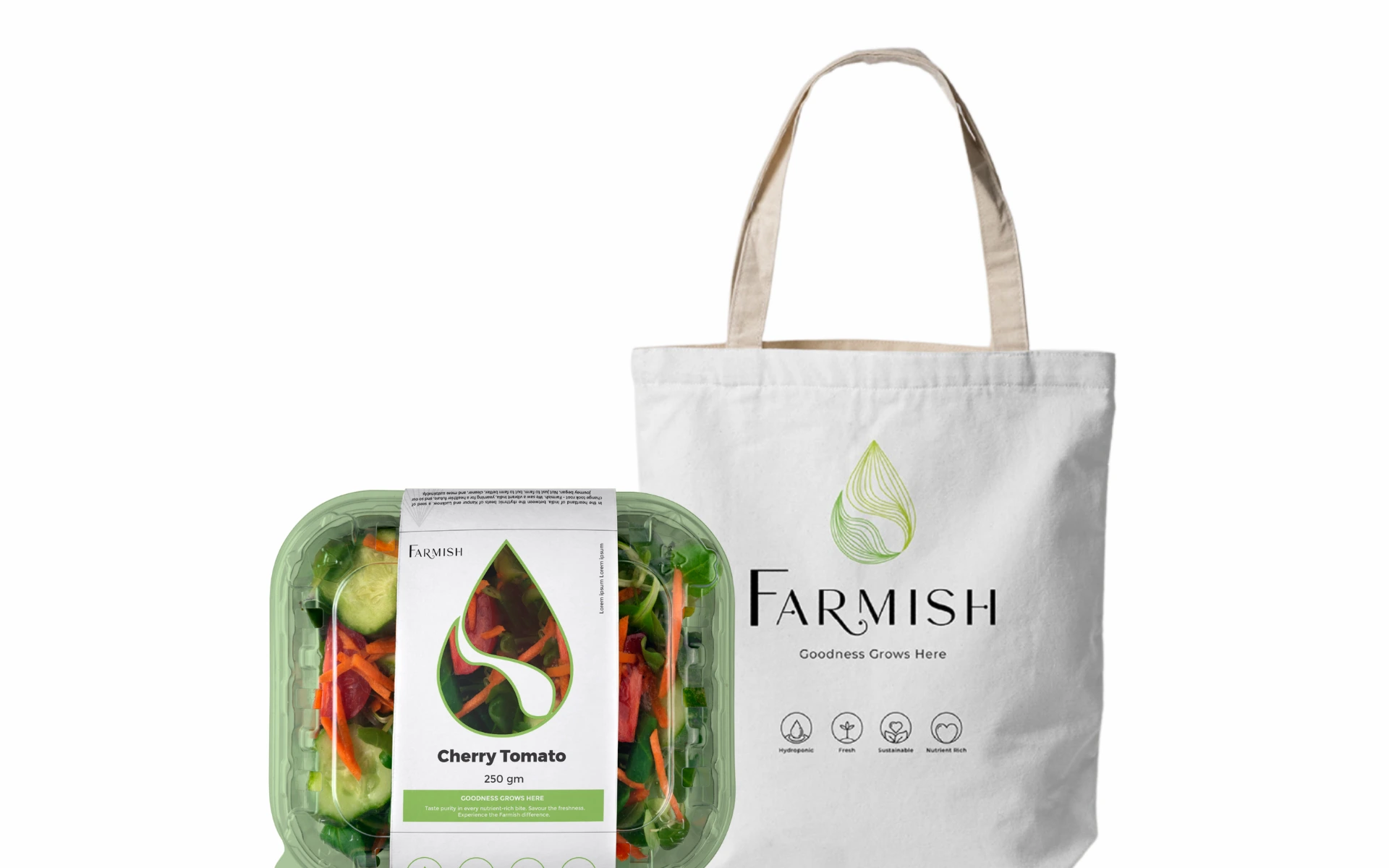
A system, not just a symbol: The logo was designed to adapt. Whether as a window on packaging or a pattern across stationery, it always tells the same story—of purity and transparency.
We didn’t just design a farm-fresh logo. We designed trust.
Farmish stands for clean food, grown differently. Our job was to build an identity that felt as intentional as the process behind it. So we anchored the design in one idea: clarity. In shape, message, and execution.
The Farmish logo is simple—but never generic. Every element works harder than it looks. And that’s what makes it work—across print, digital, and product. It feels like a fresh start. Because that’s exactly what Farmish offers.
The Farmish logo is simple—but never generic. Every element works harder than it looks. And that’s what makes it work—across print, digital, and product. It feels like a fresh start. Because that’s exactly what Farmish offers.