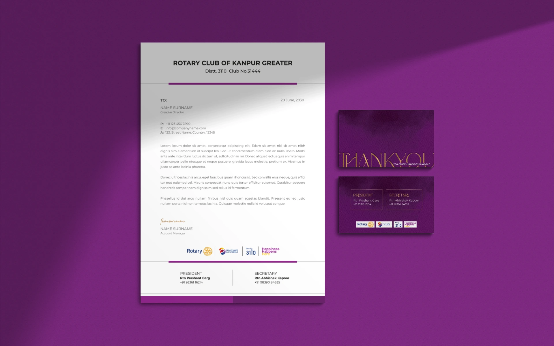
Happiness Happens Here
Logo Design


Alogo that lifts—visually and emotionally. That’s what we built for Happiness Happens Here, a Rotary initiative focused on community upliftment and social good. Where joy isn’t just an outcome—it’s a mission.
The name said it all: Happiness Happens Here. But it needed a visual identity that could carry the weight of that promise.
Rooted in Rotary’s vision of service and shared progress, the initiative was designed to bring people together, spread joy, and create lasting impact. The logo had to be more than a mark. It had to be a movement.
We transformed a phrase into a powerful visual system.
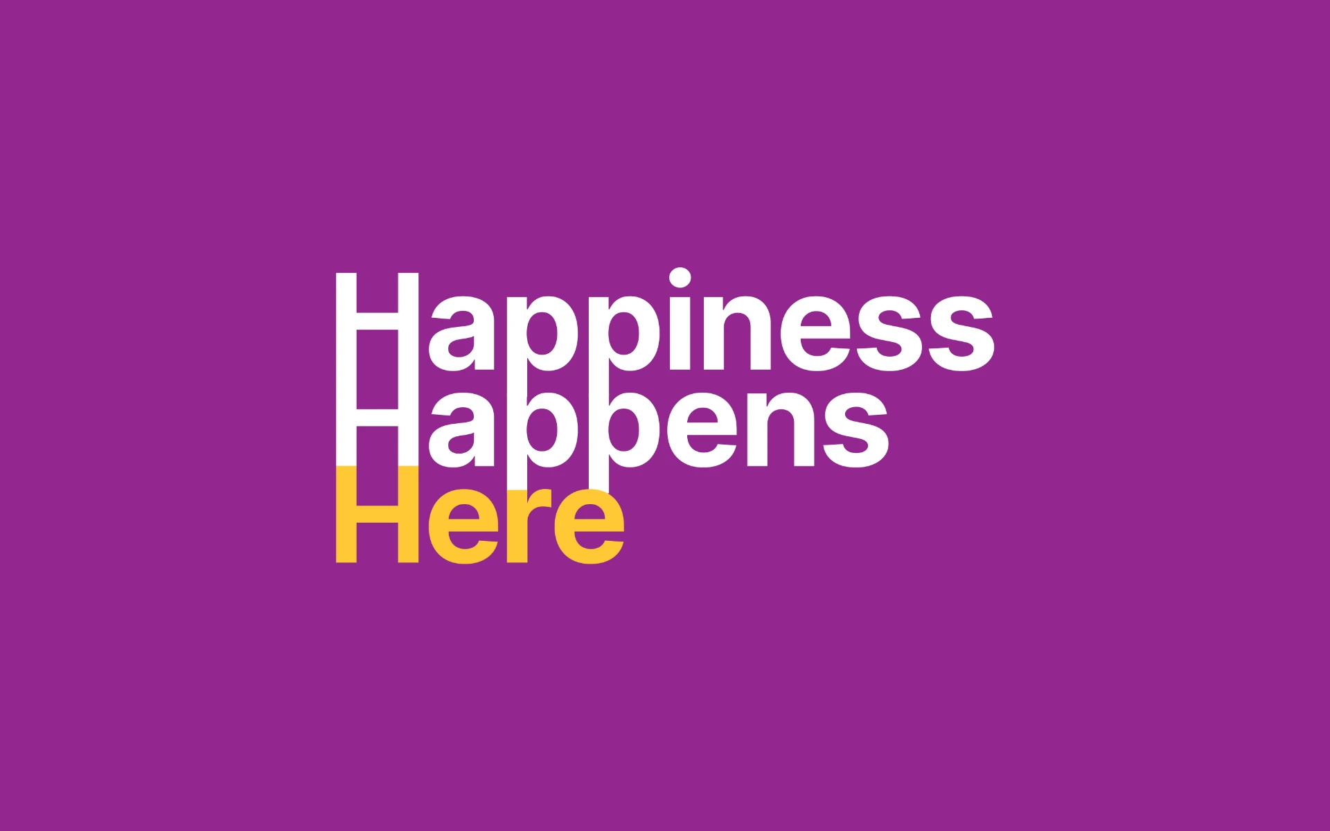
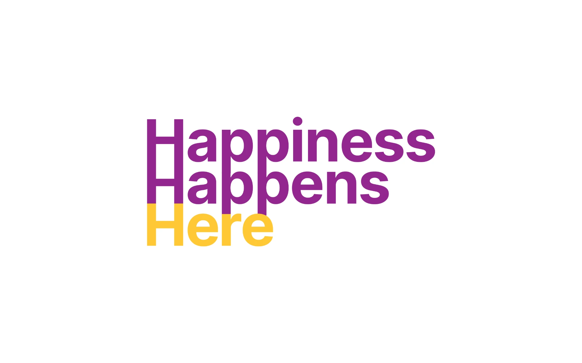
The Happiness Ladder:
The three H’s from the motto were stacked into a symbolic upward ladder—signifying growth, elevation, and collective ascent. A simple gesture that captured a larger idea: joy as progress.
Purple & Yellow Palette:
Purple represents ambition and wisdom—qualities at the heart of every Rotary initiative. Yellow brings in warmth, positivity, and the sense of shared celebration.
Typography That Speaks to All:
Friendly yet firm, the type is inclusive and welcoming—evoking community over corporate.
The result is a mark that doesn’t just look happy—it feels like momentum.
We approached this not just as designers, but as storytellers of optimism.
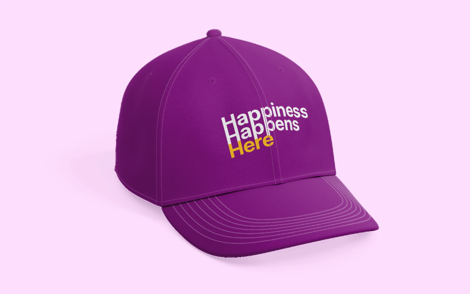
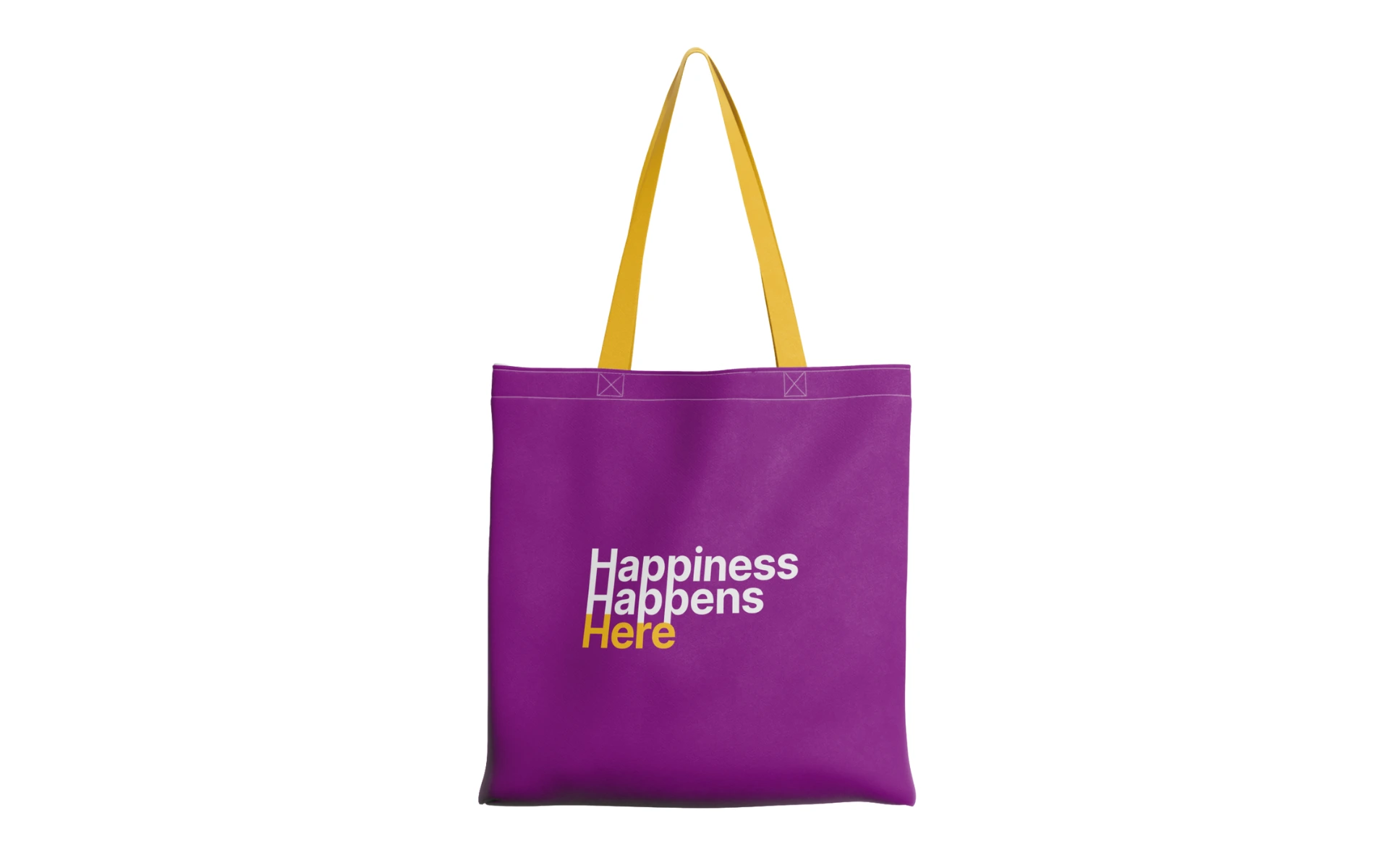
Every line, every element had to serve a greater purpose: to reflect Rotary’s ethos of service and the spirit of transformation. From event banners to social media and t-shirts, the identity flexes beautifully—while always staying grounded in its message of hope.
The Happiness Happens Here logo proves one thing:
Upliftment can have a visual language.
It reminds us that joy isn’t accidental. It’s something we rise into—together. Backed by Rotary’s legacy and designed for forward momentum, the identity is built to inspire, include, and ignite a little more happiness wherever it goes.