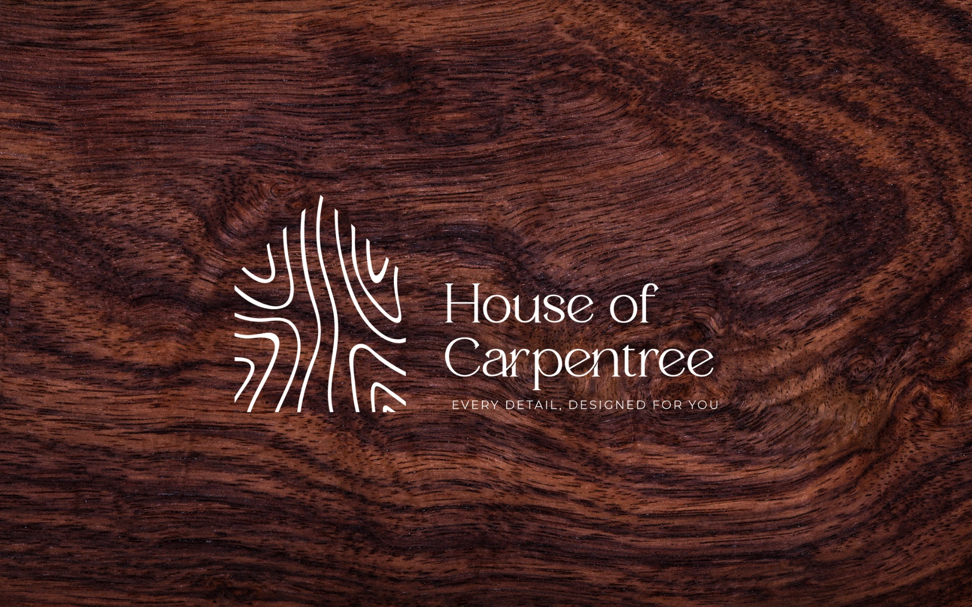
House of Carpentree
Logo Design
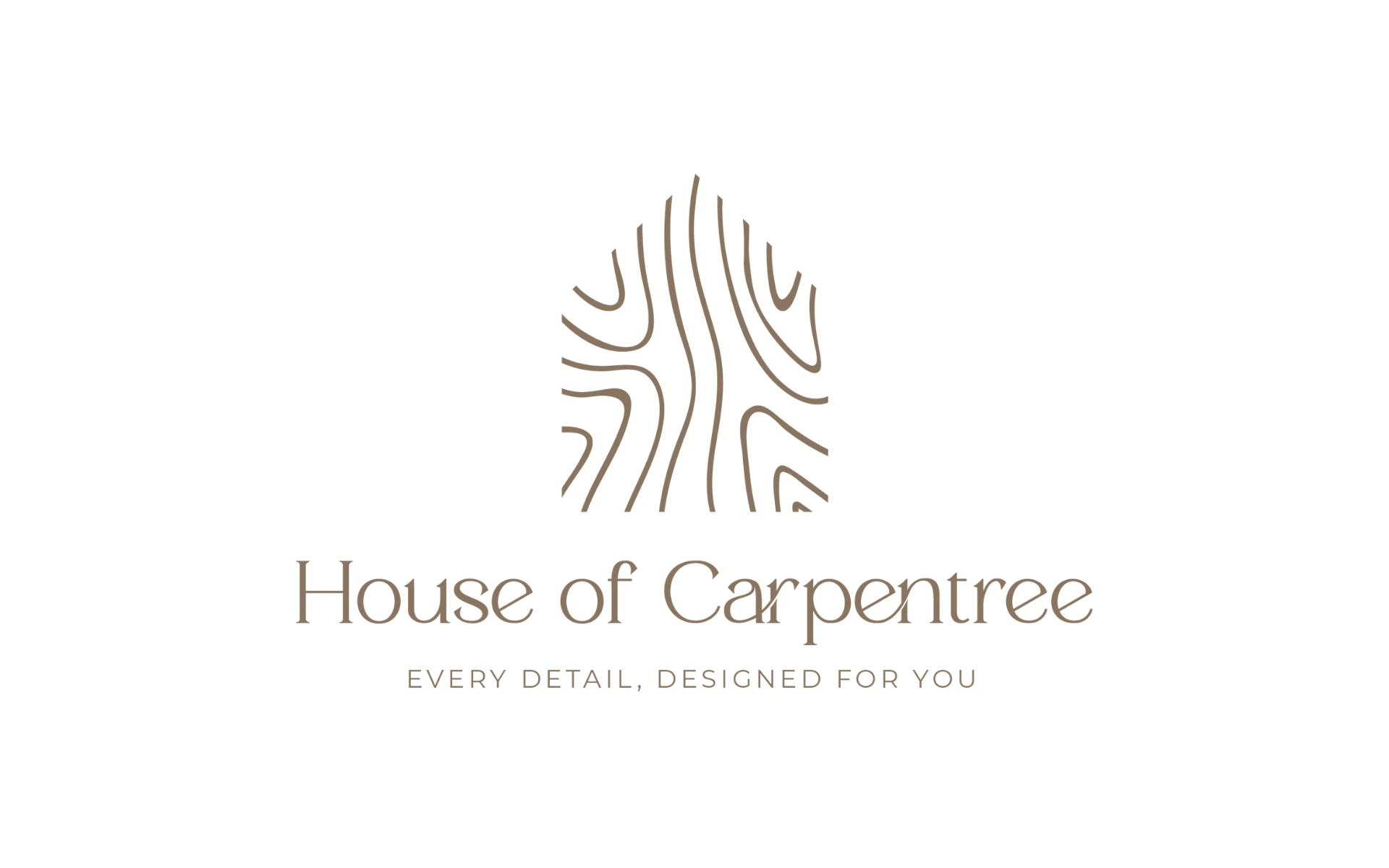
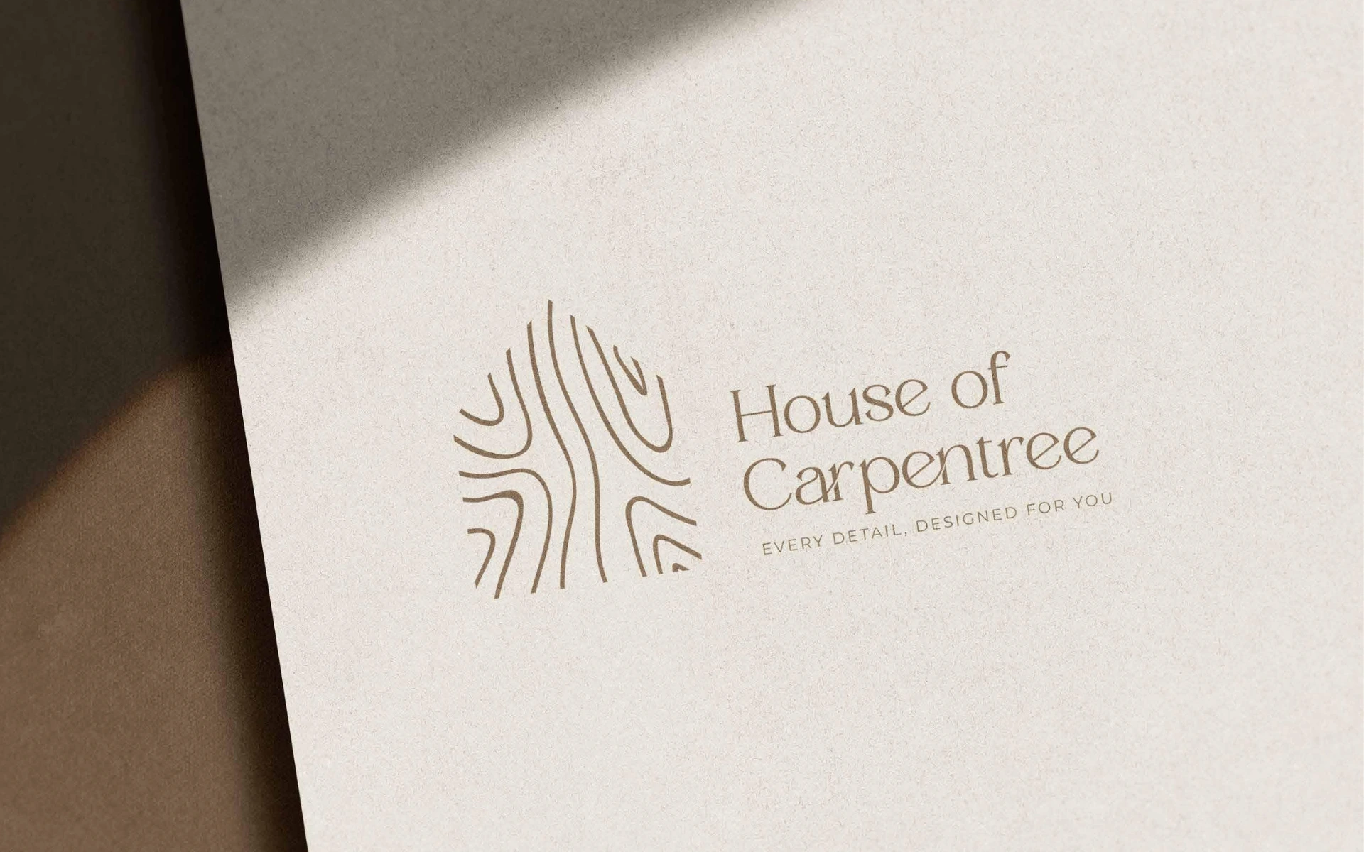


The House of Carpentree logo isn’t just a mark—it’s craftsmanship made visible. Built for a furniture brand where design meets devotion, the identity captures the tactile beauty of wood and the elegance of well-made spaces.
House of Carpentree was born from a singular belief: good furniture is personal. It should feel custom, considered, and crafted with care.
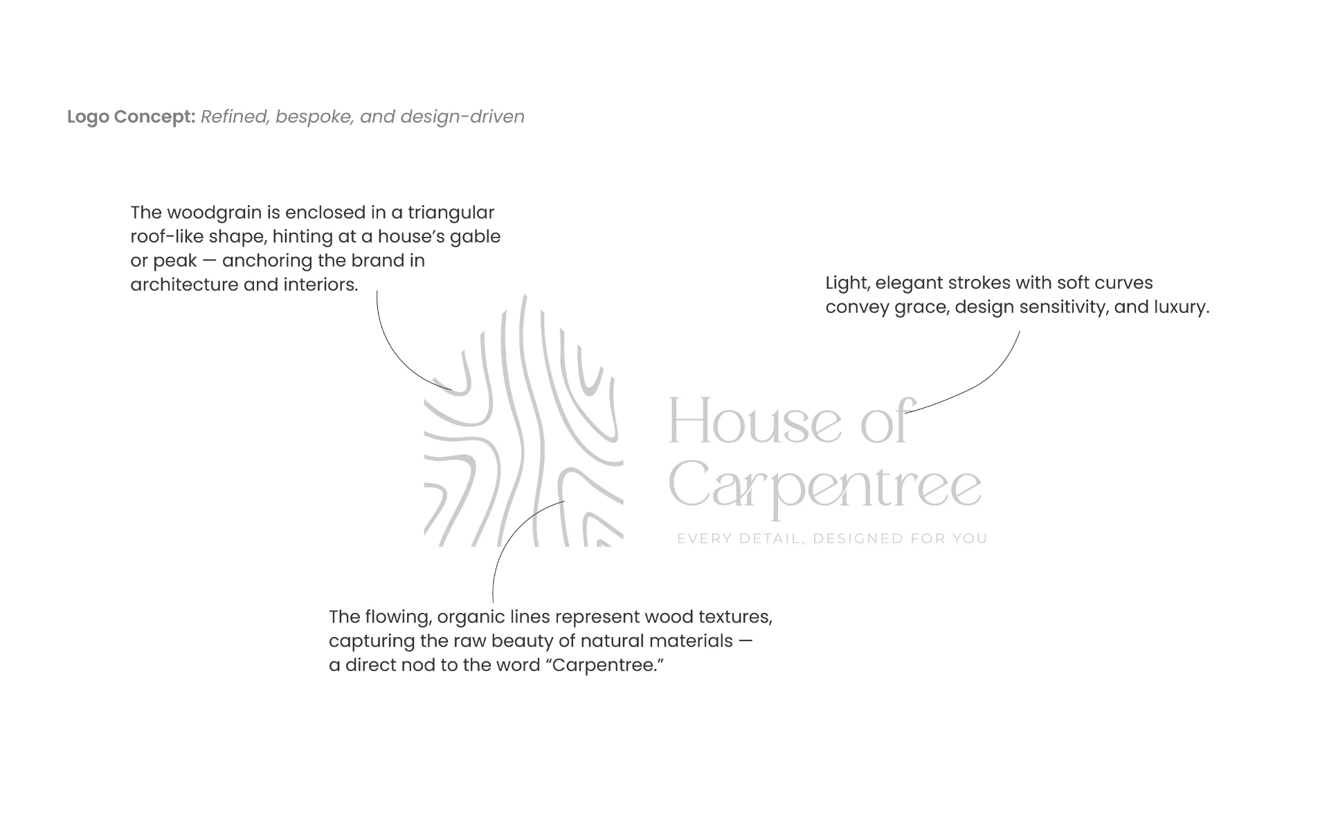
To express this, the logo needed to be both grounded and graceful—evoking natural textures while reflecting design precision. Quite literally, it became a present-day representation of the brand’s name: a house built with carpentry.
We carved intention into every curve.
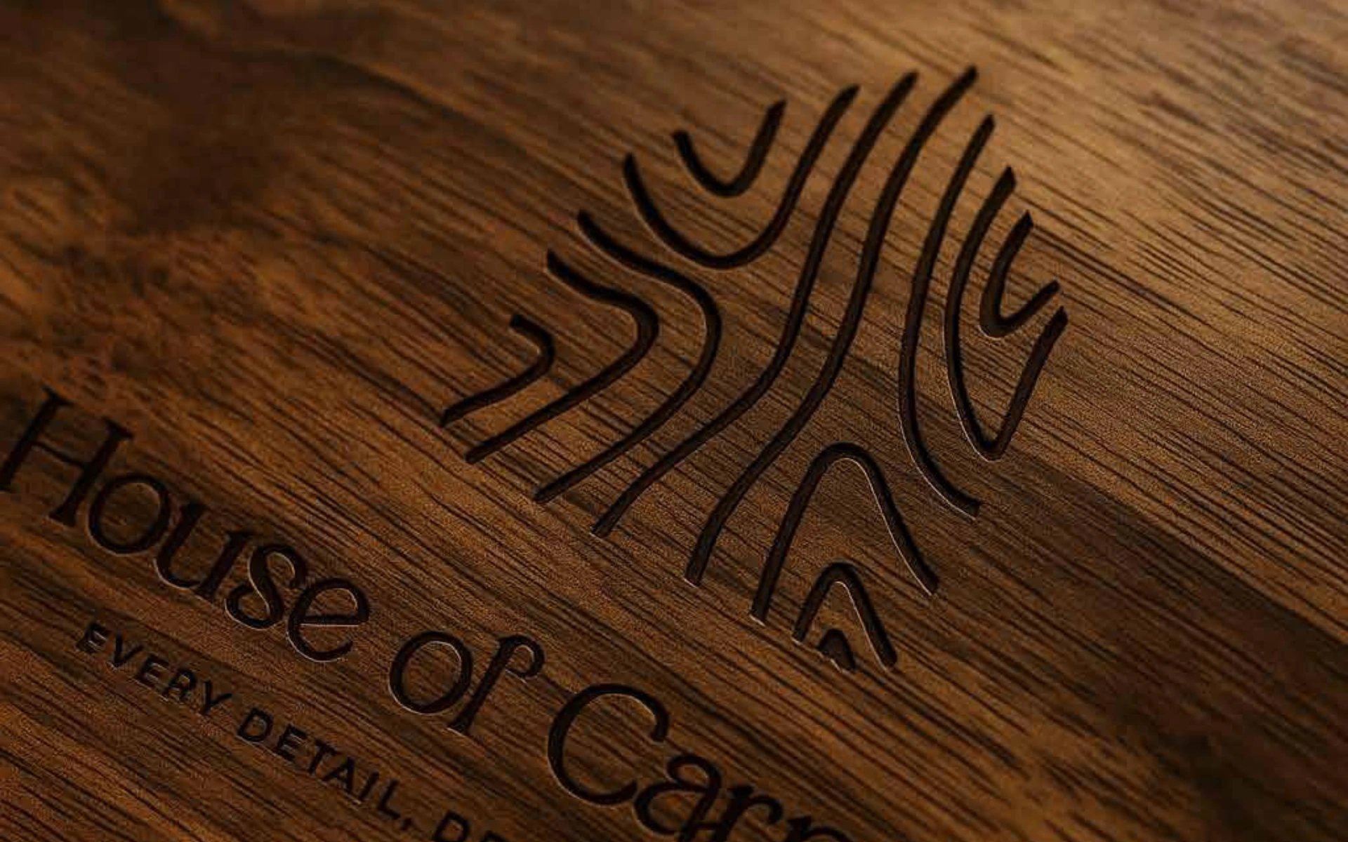
Woodgrain-Inspired Lines
Flowing strokes bring to life the essence of real wood—fluid, raw, and warm. This organic movement nods to the material at the heart of the brand.
Architectural Framing
The logomark sits within a triangular outline—suggestive of a house’s roofline. Together with the wood-like strokes, it visually embodies the phrase “House of Carpentry”—not just in spirit, but in form.
Elegant Letterforms
Soft, sans-serif typography with smooth arcs evokes modern luxury and quiet confidence. It whispers refinement, not ostentation.
A Name That Grows on You
“Carpentree” blends “carpentry” with “tree”—a poetic merger of craftsmanship and nature. The visual identity amplifies that synergy.
We approached this logo like we would a piece of heirloom furniture—meticulously, and with meaning behind every stroke.
From the contours to the framing device, everything is designed to mirror what House of Carpentree stands for: detailed craftsmanship, organic beauty, and bespoke design.
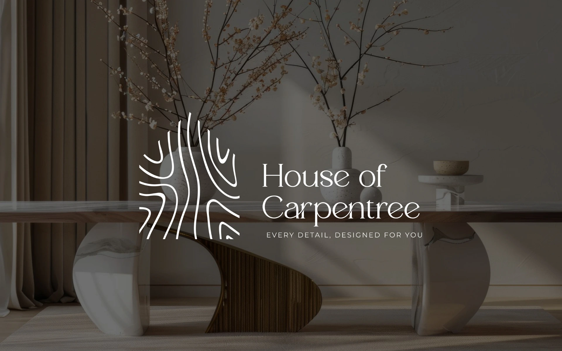
A brand rooted in wood deserves an identity that feels alive.
The House of Carpentree logo speaks to customers who seek more than just furniture—they seek spaces that tell stories. It’s a mark built to age gracefully, just like the pieces it represents.