Juhi Asthana
Logo Design


Some designers fill rooms. Others shape atmospheres. Juhi Asthana belongs to the latter. Her brand needed an identity that wasn’t just aesthetic—it had to echo her interior philosophy: minimal, warm, intentional.
We built a mark that does just that. Quietly bold. Thoughtfully personal. A space within a space.
Designs by Juhi Asthana is a premium interior design practice that blends refined aesthetics with human warmth. Think airy spaces, modern lines, and just enough character to feel like home.
This logo wasn’t just about initials. It was about identity. The intersection of form, function, and feeling.
This wasn’t a monogram. It was a moodboard in motion.
Here’s how we translated Juhi’s sensibility into a timeless symbol:
Initials with Intent
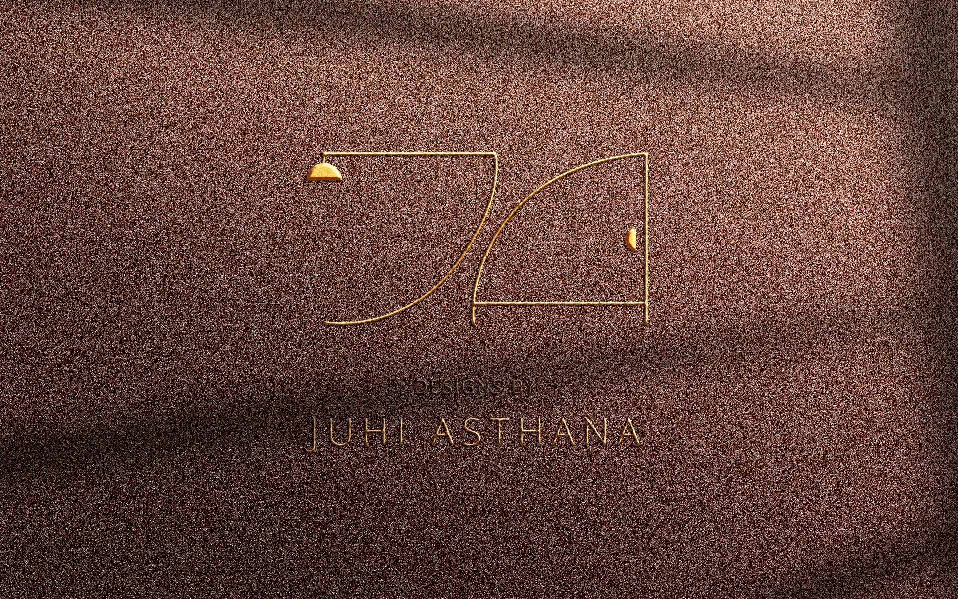
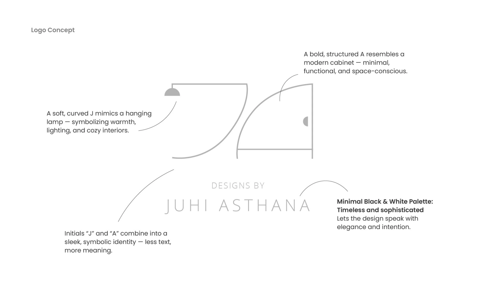
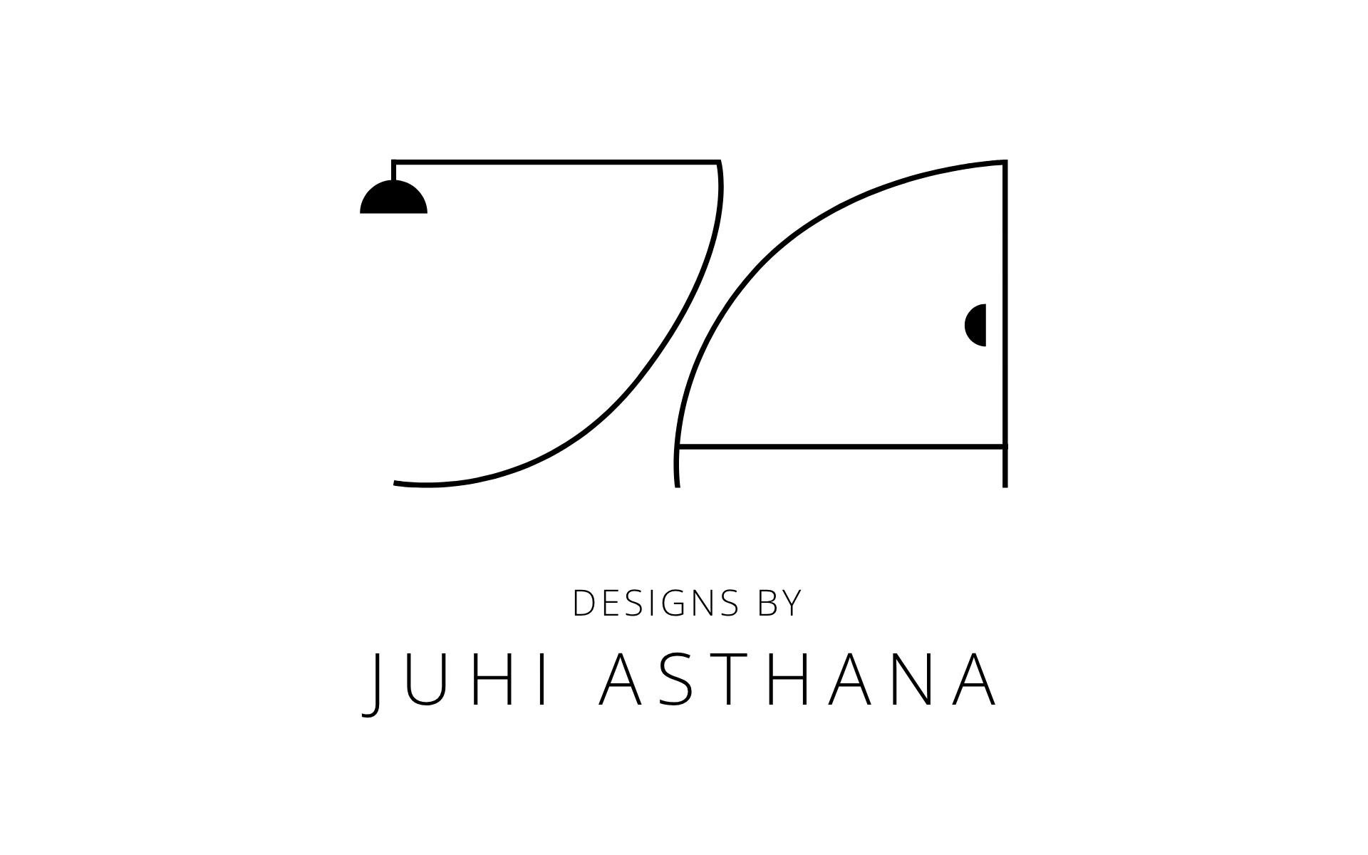
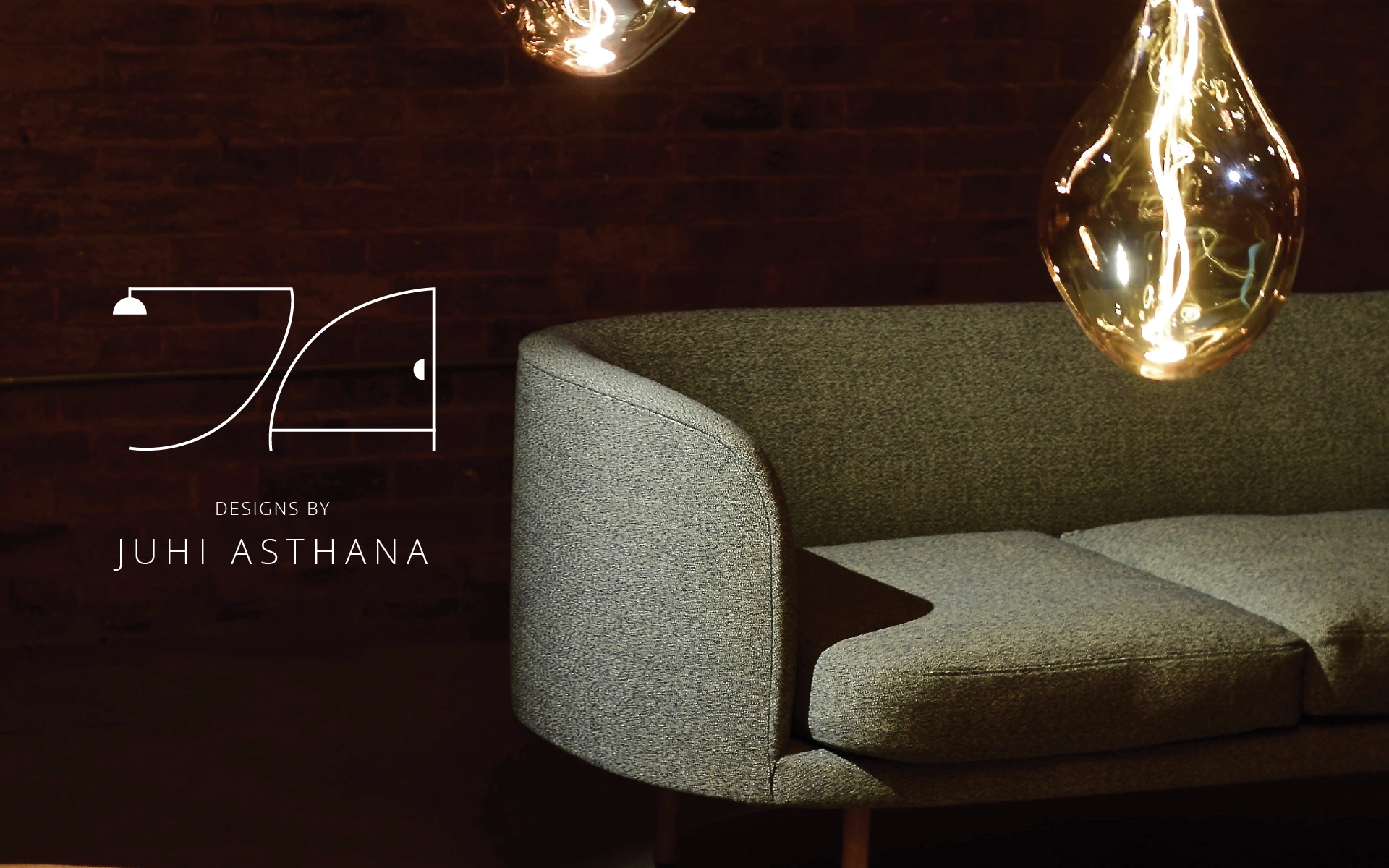
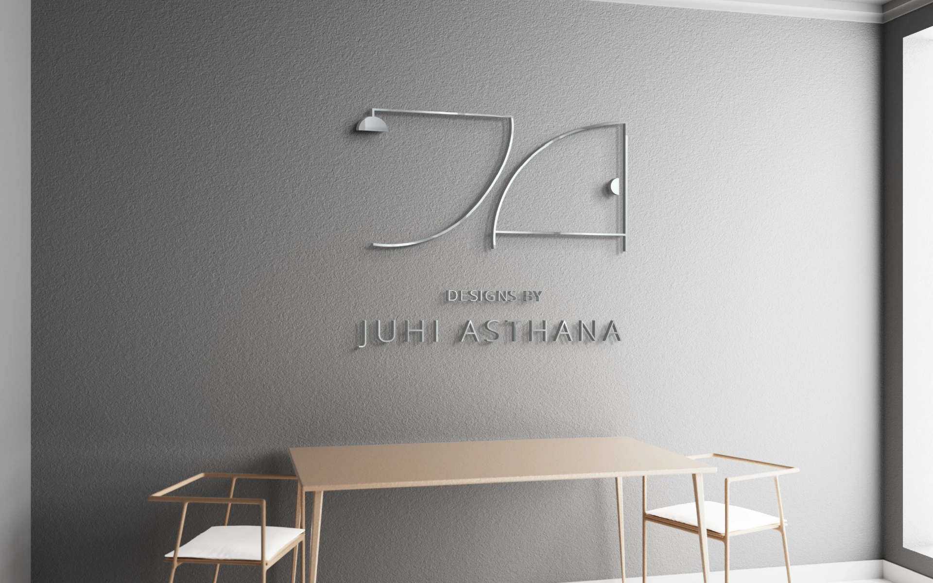
The brand mark fuses the initials “J” and “A” into a minimal, modern structure—forming a shape that’s both memorable and meaningful.
J as a Hanging Lamp
A soft, sweeping curve forms the “J,” transforming into a stylized ceiling lamp. It speaks of ambiance, warmth, and well-lit interiors—an essential touch in every space Juhi crafts.
A as a Cabinet
The “A” is reimagined as a compact, architectural form—mirroring a modular cabinet. Practical yet elegant. Minimal yet expressive.
Monoline Precision
A single-line drawing style evokes the elegance of architectural sketches—clean, intentional, and inviting interpretation.
We designed the identity like we’d design a room: nothing excess, everything considered.
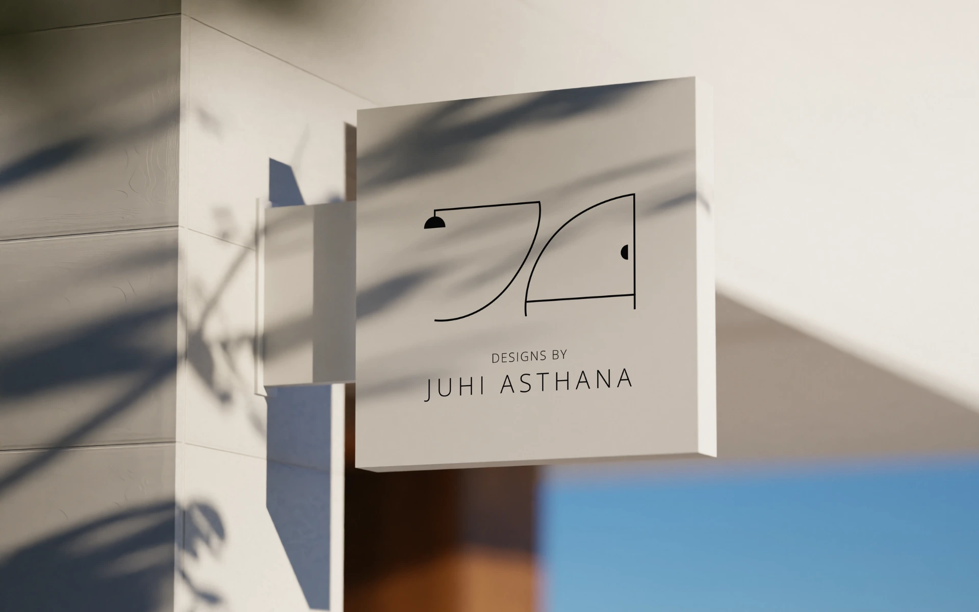
From printed collaterals to site footers, the mark acts as a quiet signature—a promise of taste, craft, and personality. It never screams. It simply belongs.
This isn’t just a logo. It’s an interior in miniature.
It captures the soul of Juhi’s work—part architectural, part emotional. Whether embossed on a project dossier or shining on the corner of a moodboard, it speaks of spaces that feel lived-in, loved, and deeply designed.