Lazy Farm
Logo Design
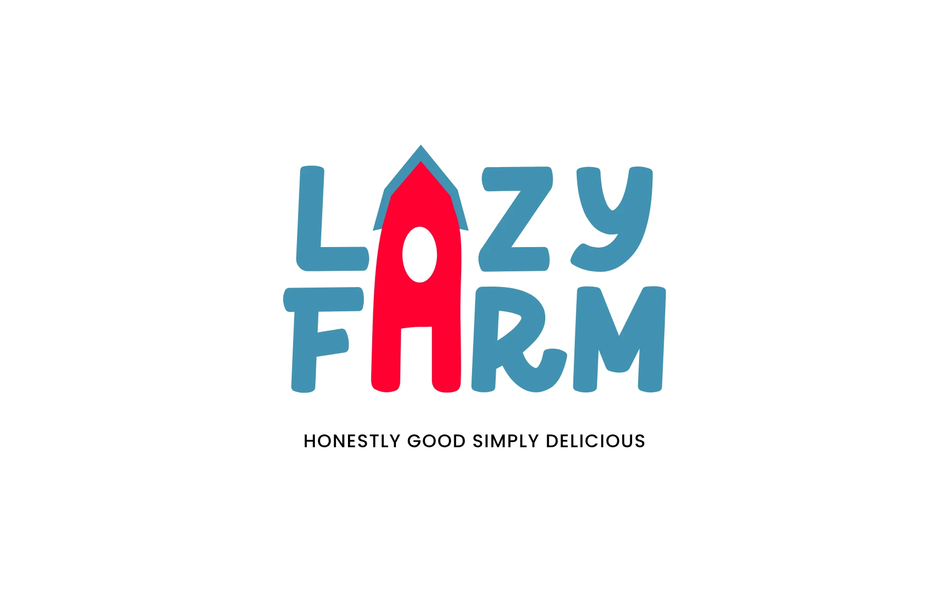


A logo that grows trust the way Lazy Farm grows food—naturally.
Lazy Farm isn’t your typical health food brand. It’s a promise—of transparency, of joy, and of nutrition that doesn’t compromise on taste. The identity needed to carry that promise in one bold, approachable mark.
Our challenge? Make it honest, make it playful, and make it unmistakably Lazy Farm.
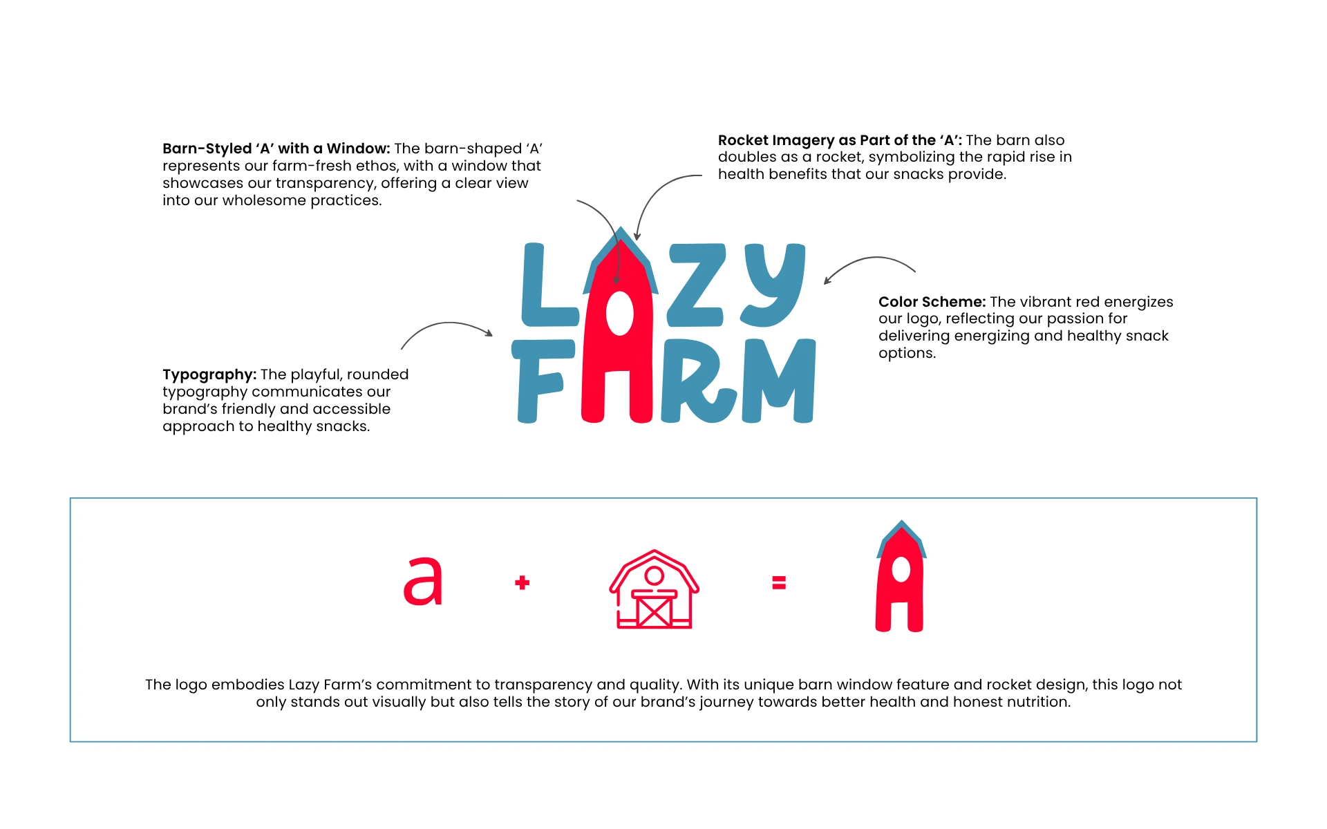
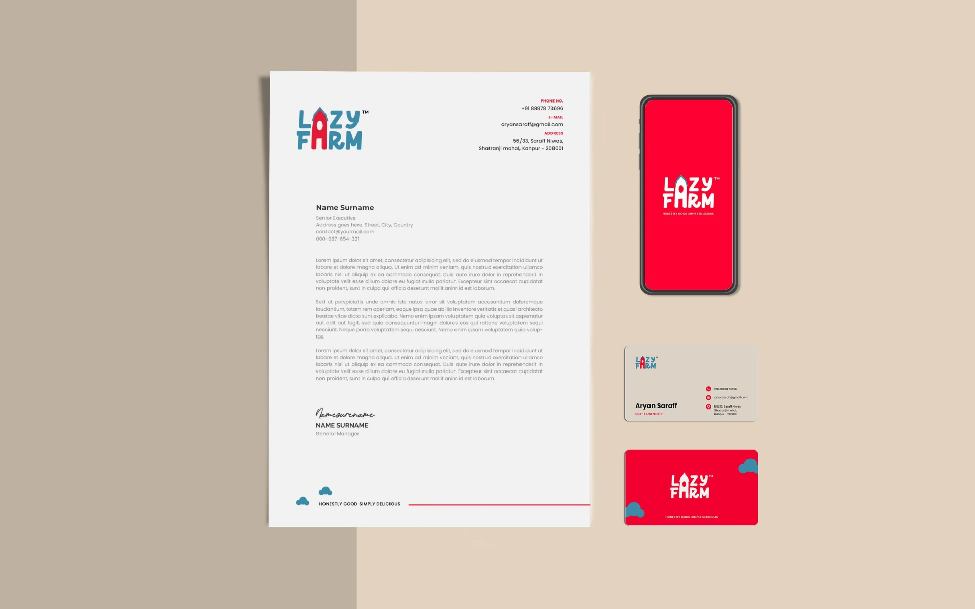
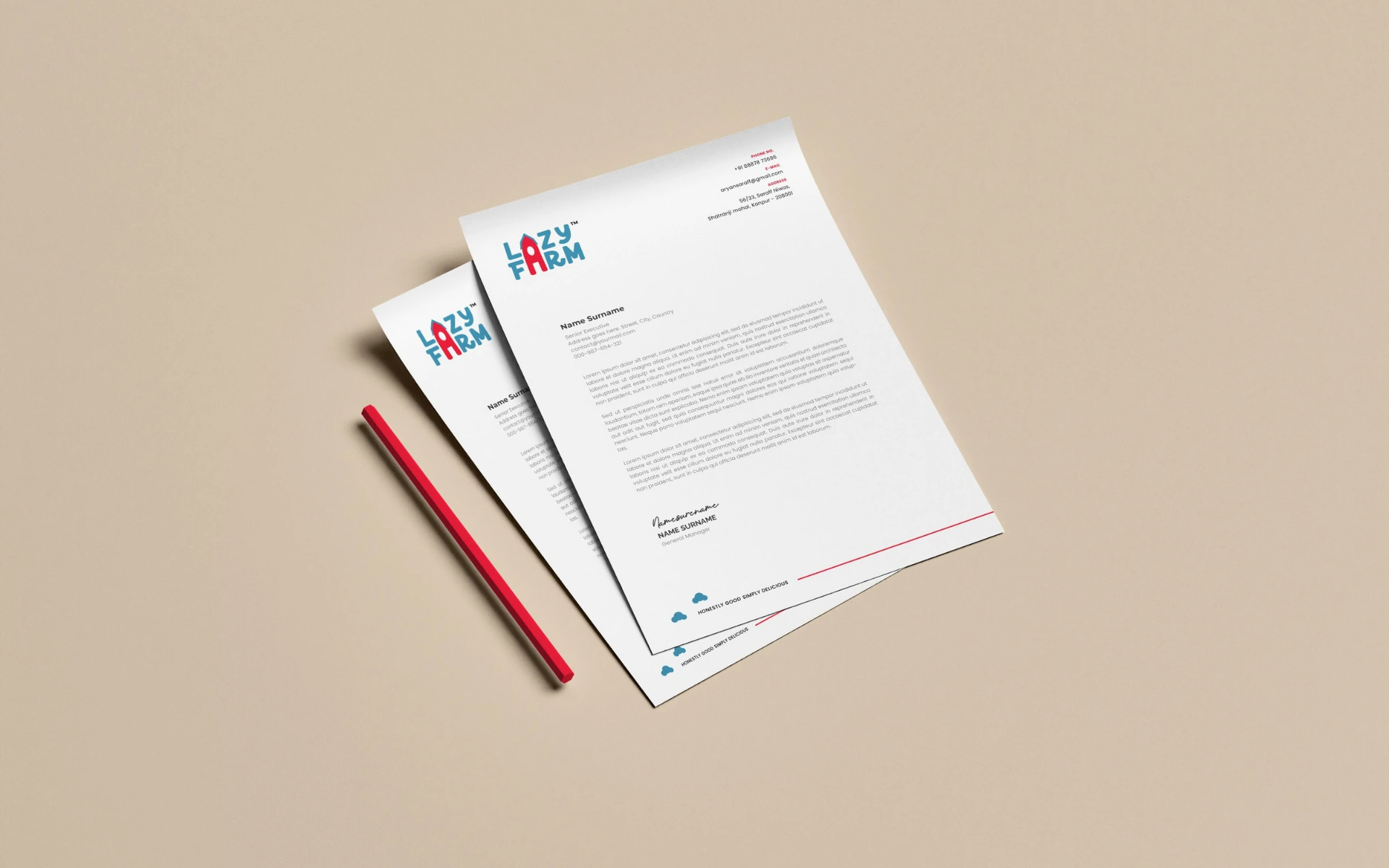
The logo doesn’t just say Lazy Farm. It shows it.
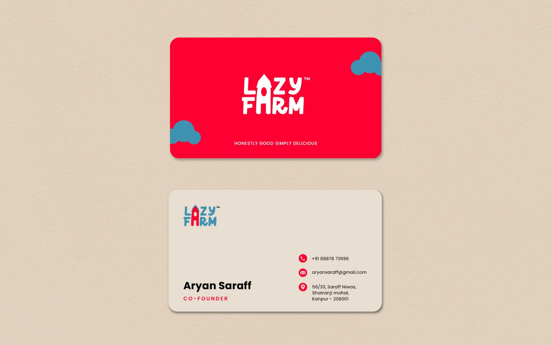
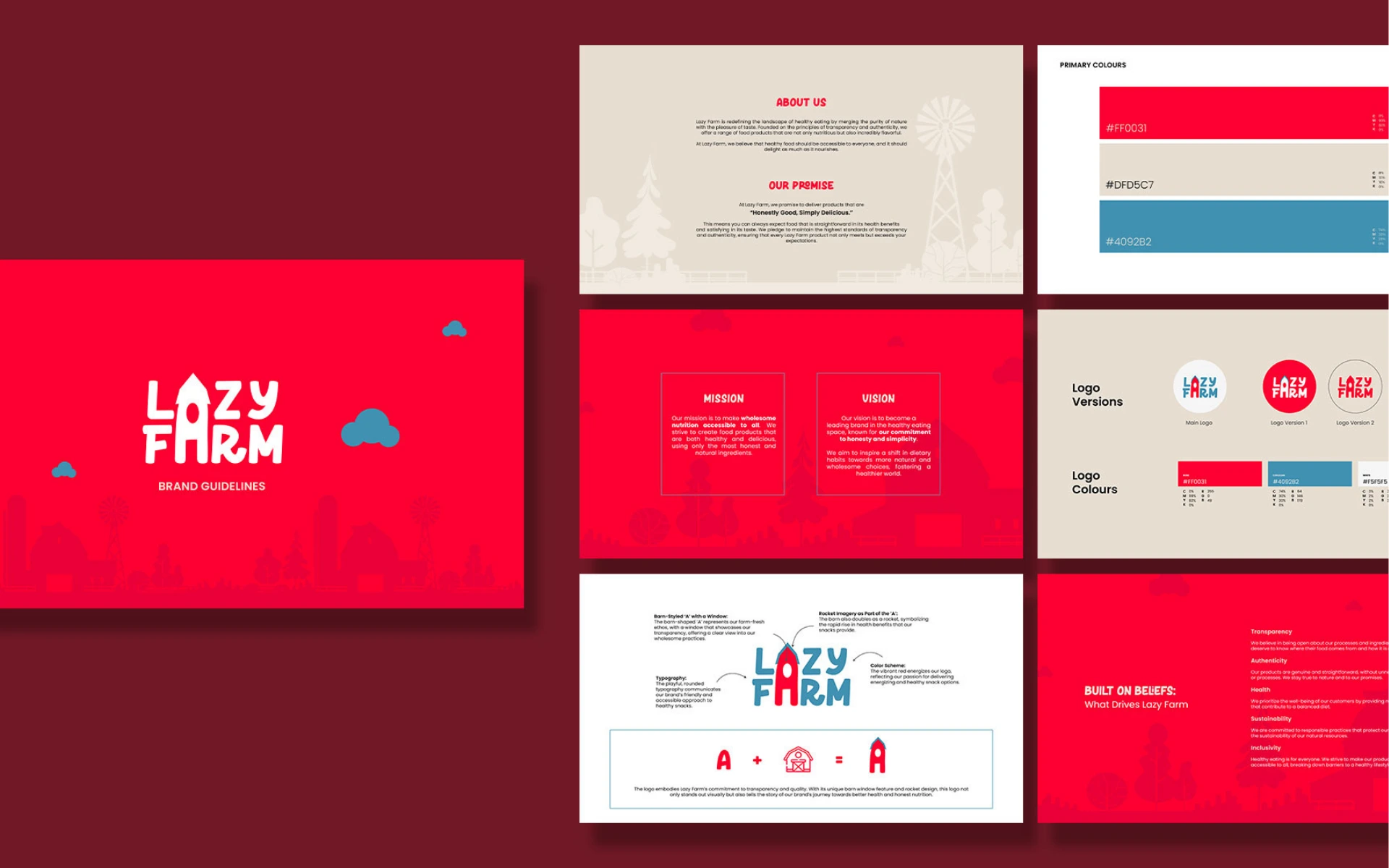
The ‘A’ that does double duty: We transformed the letter ‘A’ into a barn—grounding the brand in its farm-first values. The little window inside? A nod to transparency. You can see exactly what you’re getting.
Lift-off, but make it wholesome: We reimagined the barn’s silhouette as a rocket. Because Lazy Farm isn’t just wholesome—it’s fast-moving, future-forward, and ready to take healthy food to new heights.
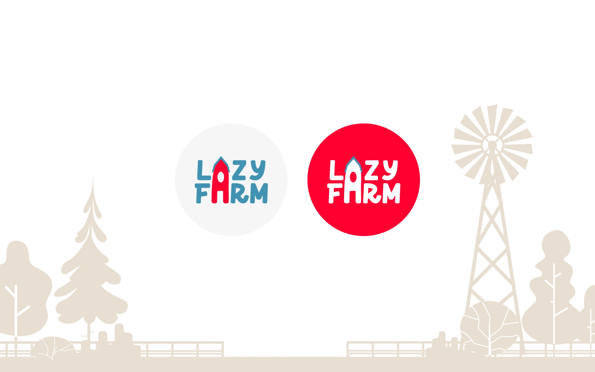
Color with clarity: A bold, energizing red leads the palette—immediately appetizing and full of life. Paired with a fresh cerulean blue, the brand balances taste appeal with trust.
A font that speaks human: Playful, round typography brings in warmth and approachability. It feels like a friendly wave from a neighbor—not a cold corporate brand.
This wasn’t about following trends. It was about growing something real.
We worked from the ground up—starting with Lazy Farm’s beliefs. The result is a logo that doesn’t just look good—it feels good. Because it tells a story: one of clean eating, transparent sourcing, and a brand that makes better choices easy for everyone.
The Lazy Farm logo is deceptively simple—just like the brand itself.
But within that simplicity lies layered meaning, clever symbolism, and a design that can grow with the brand.