MidJune
Logo Design
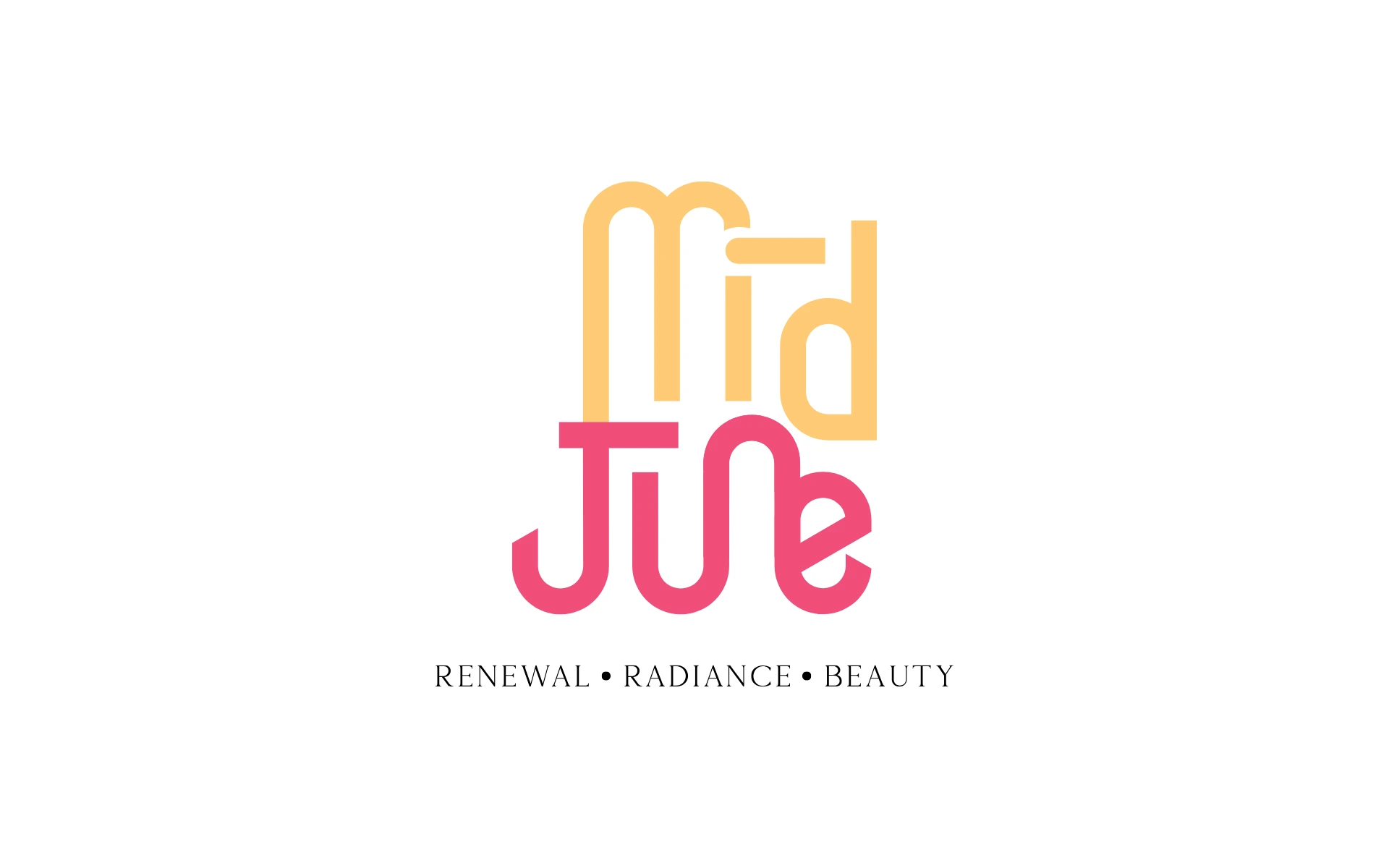


For a brand that lives where glow meets ritual, we built a logo that radiates warmth, rhythm, and renewal. Bold yet playful, Mid June’s identity is rooted in tropical beauty and everyday self-care.
Mid June is a skincare brand inspired by the vibrancy of tropical life. Think sun-kissed skin, balmy air, and the quiet ritual of taking care of yourself.
The identity had to evoke exactly that: not just the beauty of a product, but the feeling of a moment. Mid June isn’t just a name—it’s a season, a state of mind.
The logo needed to feel like summer on skin—soft, flowing, and bold in its own rhythm.
Here’s how we brought it to life:
Stacked Letterforms
A distinctive vertical composition reflects balance and modernity, while adding a sculptural, editorial presence. The brand reads like a design object—eye-catching and iconic.
Custom Wordmark
A seamless blend of rounded and structured elements creates movement. It’s geometric without being cold. Fluid without being chaotic. Just like skin—structured and soft.
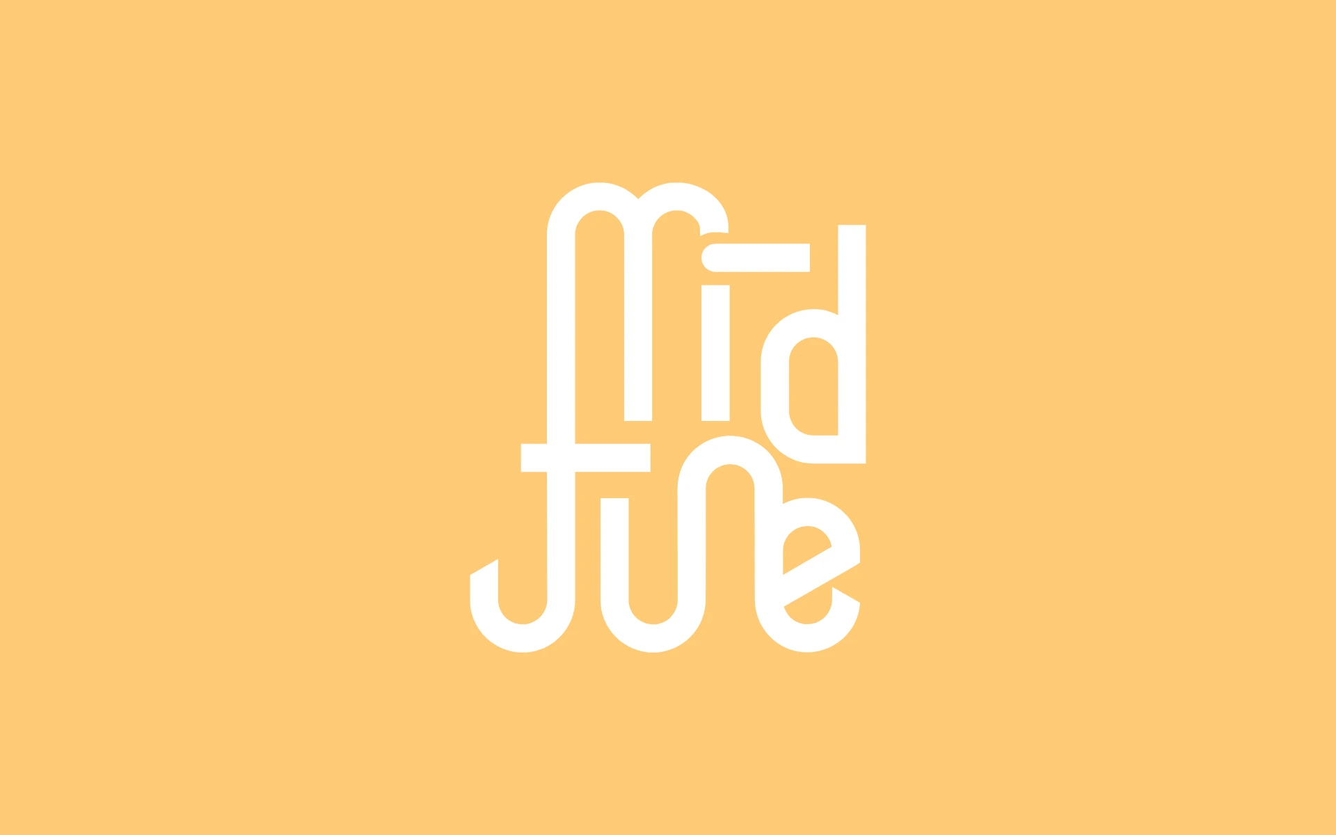
Two-Tone Tropical Palette
A sunny mango yellow meets a lush hibiscus pink. Together, they suggest radiance, health, and the tropical optimism the brand embodies.
Tagline Placement
Positioned with poise, “Renewal. Radiance. Beauty.” becomes both a mantra and a mission—adding timeless elegance to a playful mark.
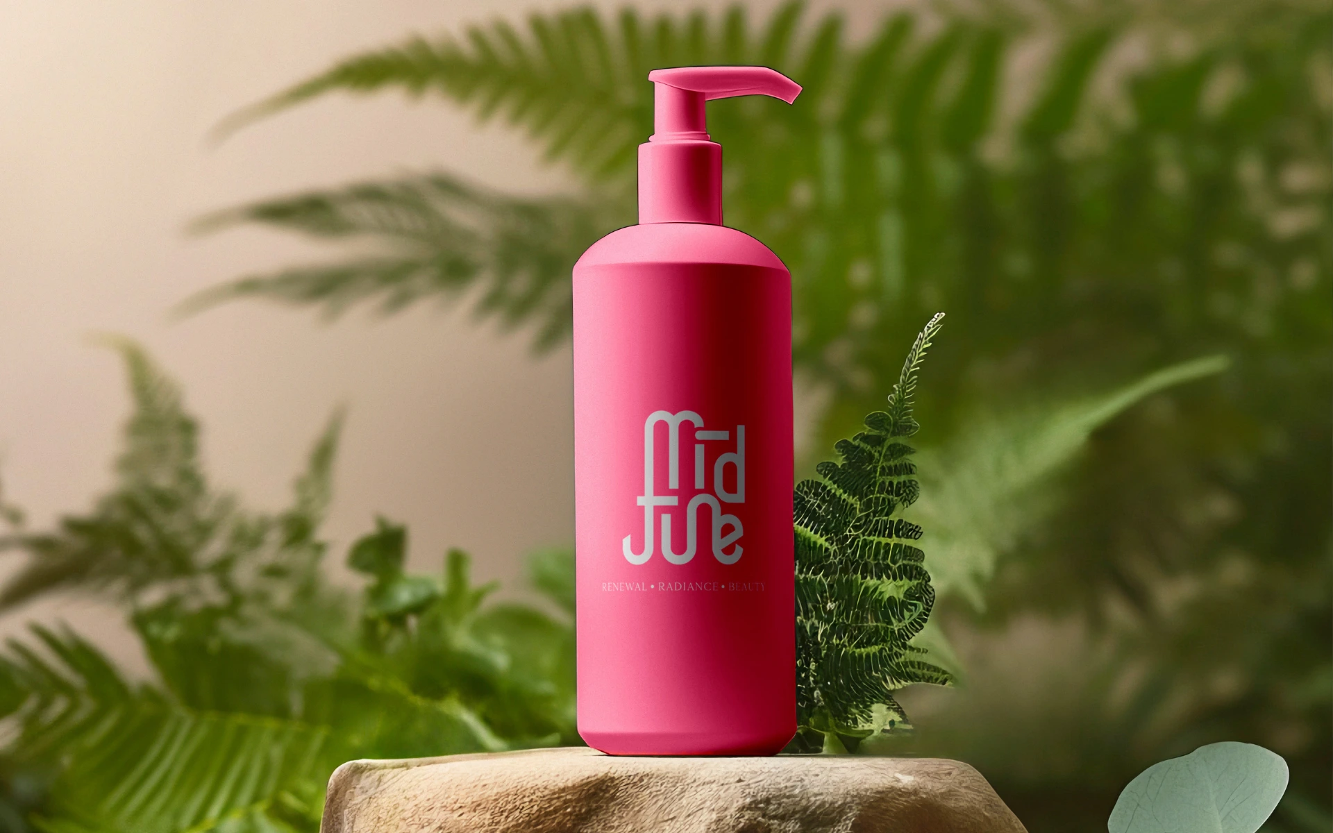
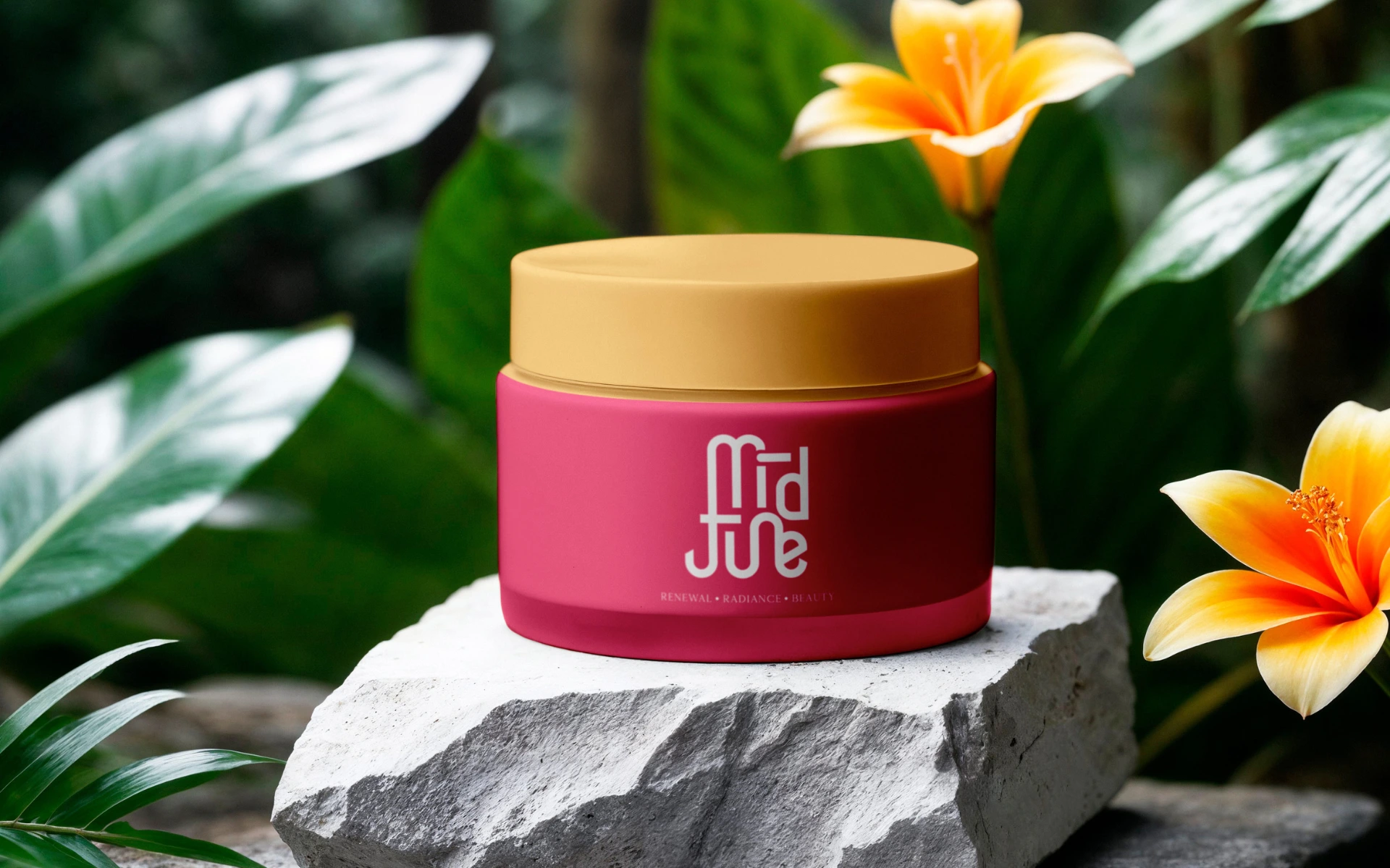
We designed the logo to feel sensorial—like something you don’t just see, but feel. It flexes effortlessly across touchpoints: from embossed packaging to sunlit retail shelves.
More than a mark, it’s a ritual you want to come back to.
The Mid June logo is a visual vacation.
It captures a mood, a season, a glow. One that’s not just about outer beauty, but about the joy of presence, ritual, and radiance. Built for a brand that celebrates skin—not as perfection, but as poetry.