Natrio
Packaging
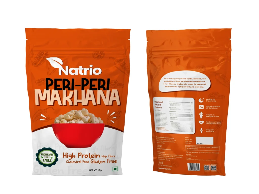
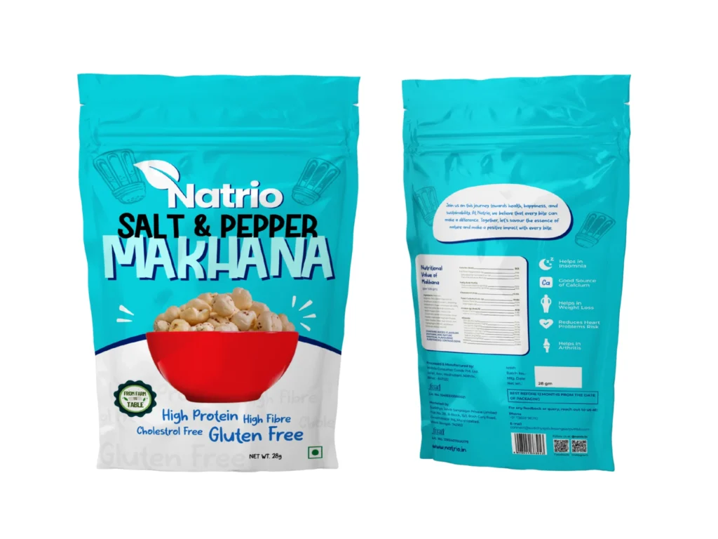
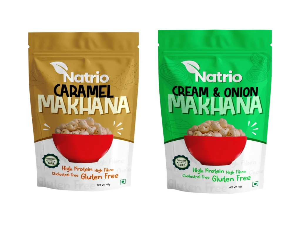


Natrio isn’t just another snack brand—it’s a mood. We built a packaging system that feels just as punchy, flavorful, and addictive as the makhanas inside it.
Their ask was clear: create a packaging identity that breaks clutter, builds craving, and creates instant shelf impact.
Tasty Tops set out to create an entirely new category in the U.S.—and we knew the packaging had to carry the weight of both education and emotion. Our strategy: simplify the message, amplify the roots, and build a visual language that travelled well—from Indian kitchens to New York pantries.
Snack First. Think Second.
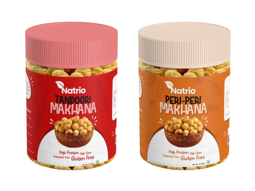
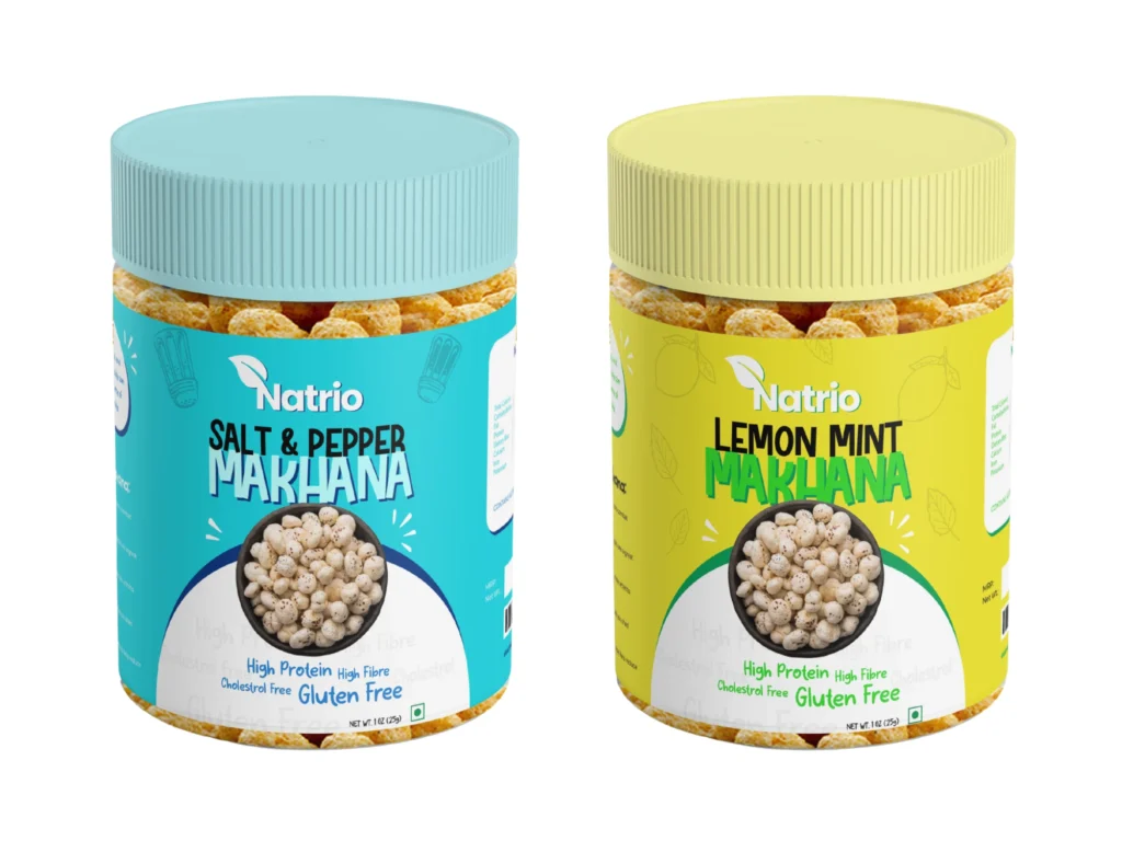
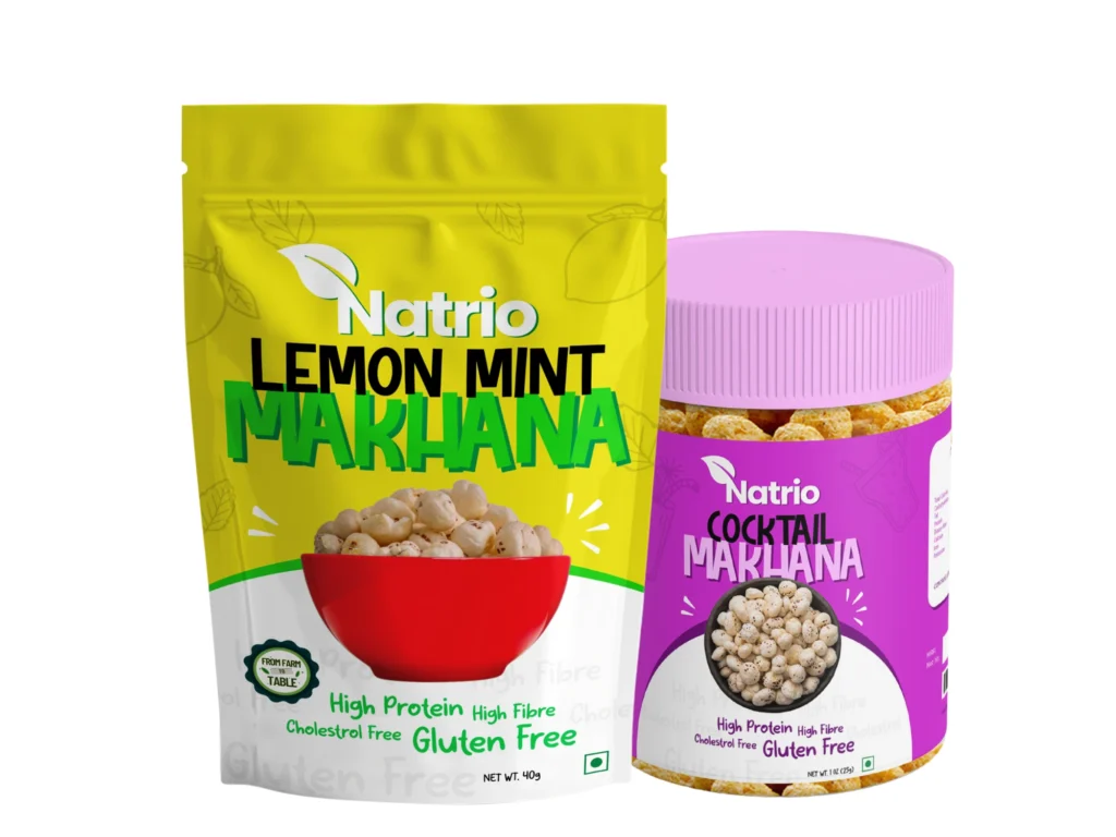
From Chat Masala to Cocktail.
We assigned each flavor a signature shade that feels intuitive and energetic: tangy green for Lemon Mint, smoky maroon for Chat Masala, cool teal for Cream & Onion, bold orange for Peri Peri, and so on.
Flavors were renamed where needed to feel more snackable, less generic.
We didn’t design for a snacking brand.
We designed for a snack break that becomes a habit.
Every visual, from color to icon, was meant to trigger desire—then subtly reassure with clean cues like “no palm oil,” “no additives,” or “homegrown.” The idea was to make every pouch feel like something you want to reach for — & feel good doing it.