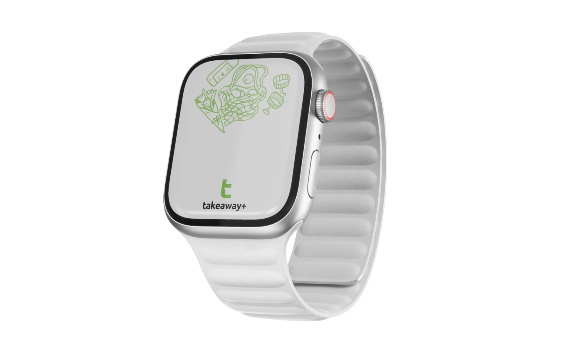
Takeaway Plus
Logo Design
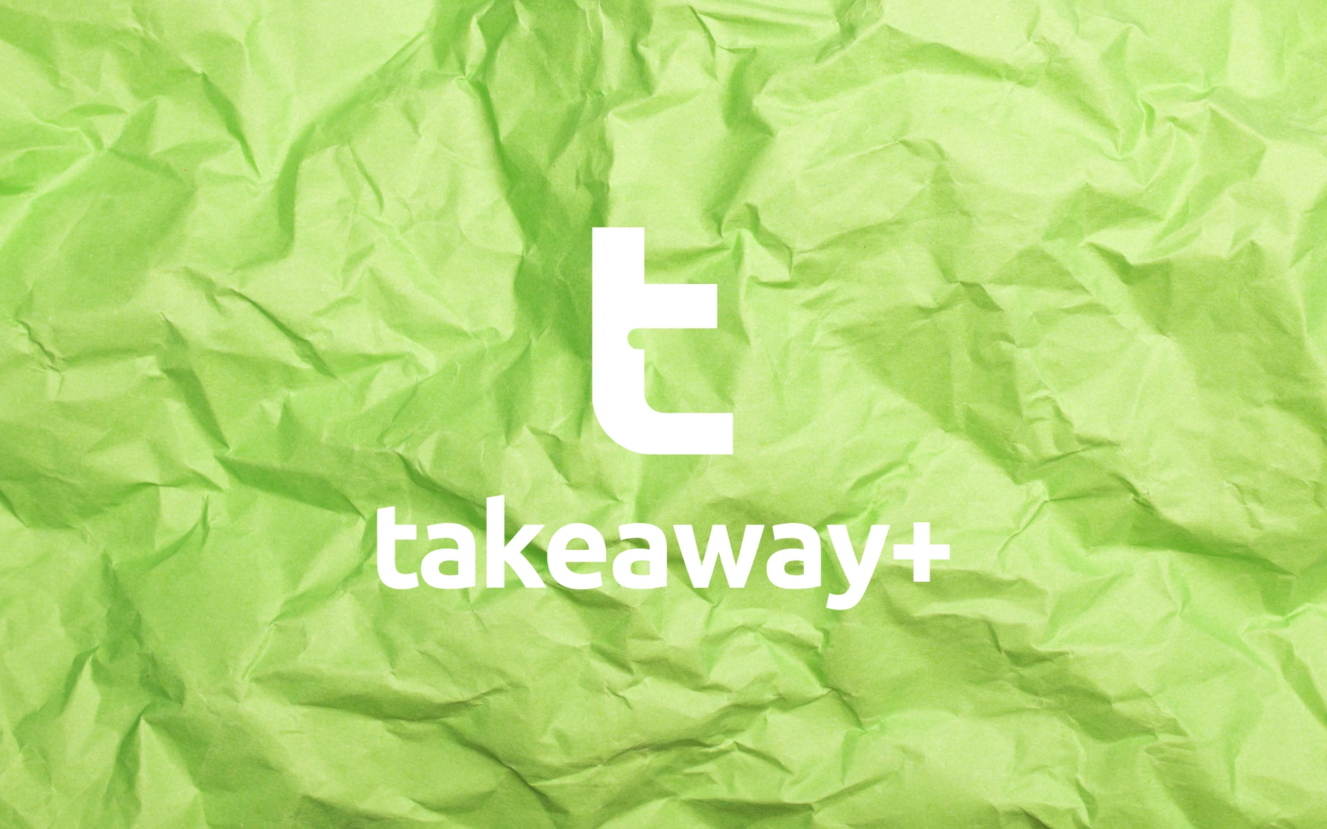


In a world of disposables, Takeaway+ brings design, purpose, and the planet into every parcel. Built for a new era of conscious consumption, this brand needed more than a name—it needed a signal.
A sign that this isn’t just another packaging brand. It’s a better way forward.
Takeaway+ is a sustainability-first brand designing smart packaging and take-away solutions for the food and beverage industry.
Rooted in eco-innovation, its purpose is clear: make sustainability the default, not the afterthought.
The identity had to reflect that same clarity—modern, intentional, and quietly brilliant.
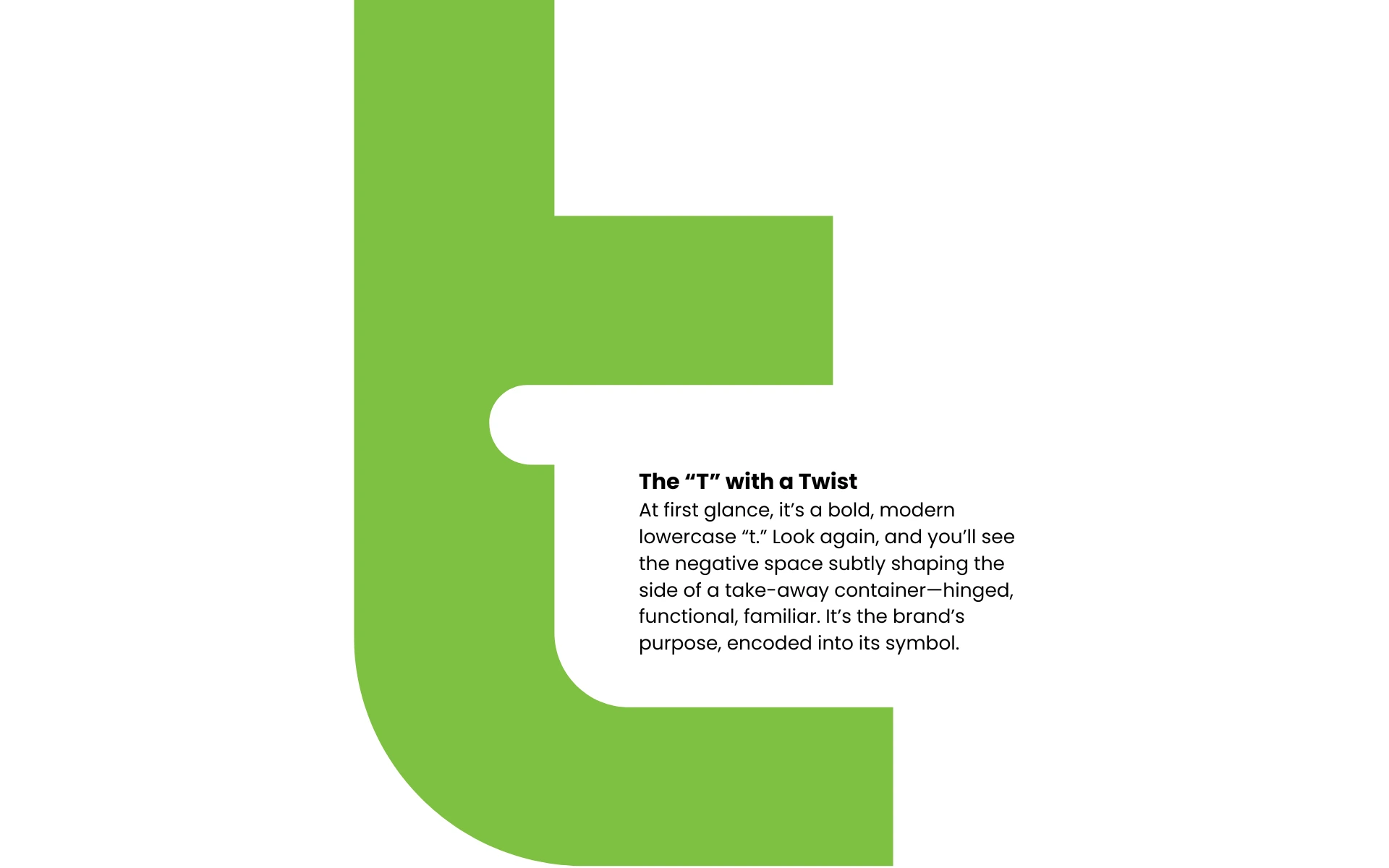
Sometimes, the smartest ideas are the simplest. But they take looking twice.
Bold Geometry Meets Gentle Curves
The mark balances sustainability and strength. It’s no-nonsense, yet fluid. Practicality and creativity—just like the brand’s approach to eco-packaging.
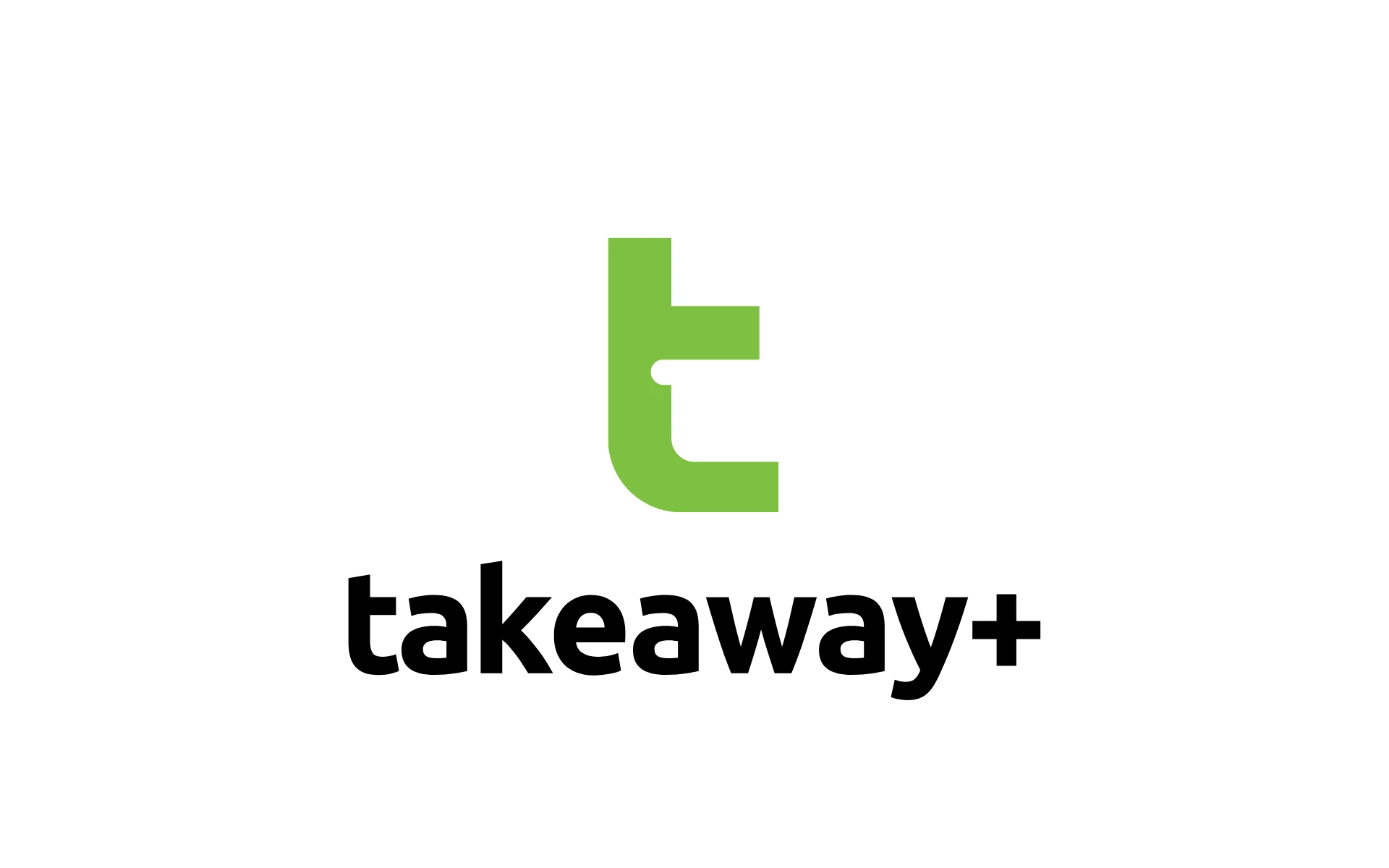
Green for Good
A confident, energetic green gives the logo instant recognition while reinforcing the brand’s commitment to environmental responsibility.
The Plus Sign
This isn’t just takeaway. It’s takeaway, upgraded. The “+” signals added value—better for business, better for the planet.
Lowercase Wordmark
Friendly, accessible, and modern. The brand feels down-to-earth, not preachy. It invites participation, not perfection.
We designed Takeaway+ to feel like an innovation hiding in plain sight—smart, minimal, and meaningful.
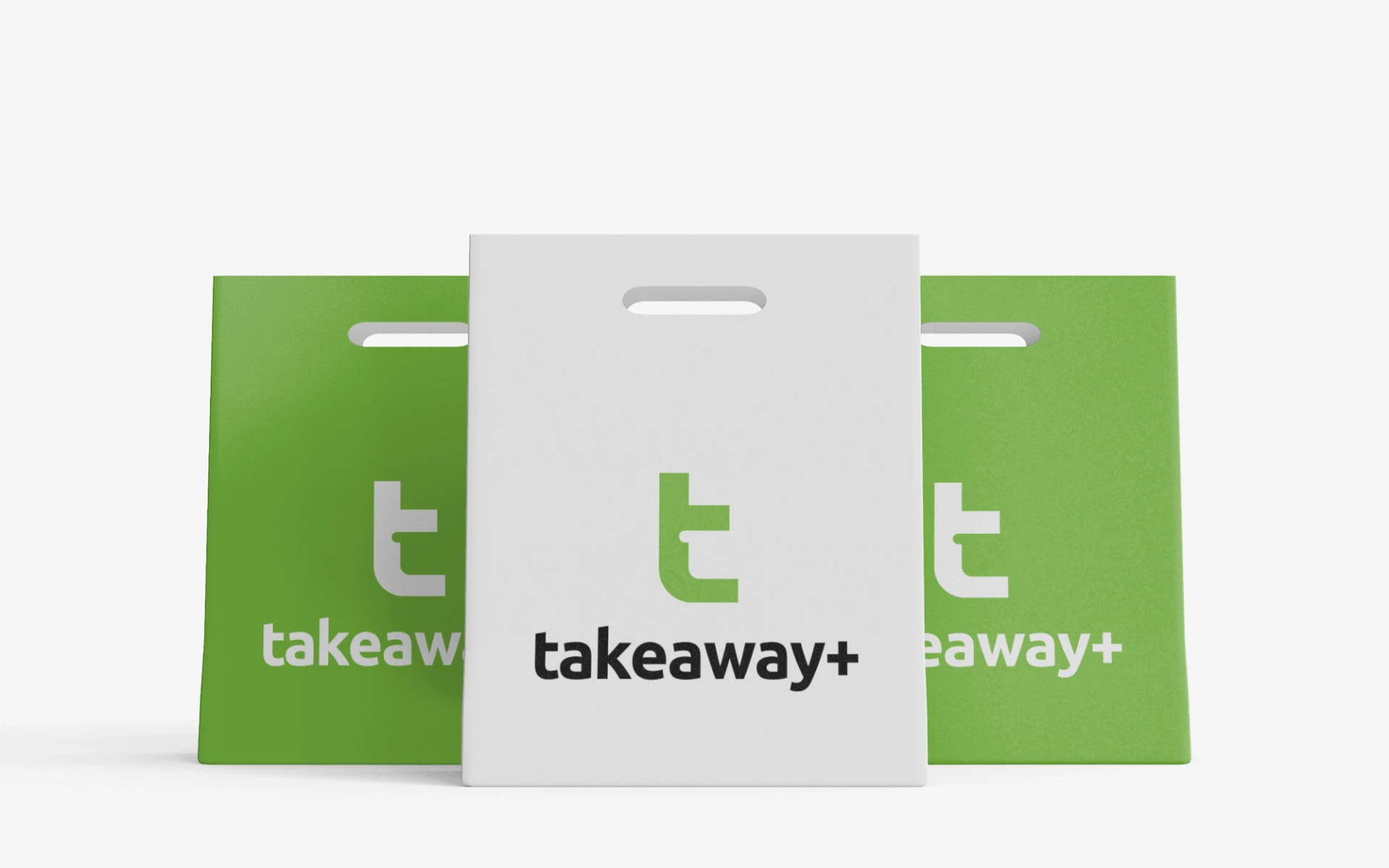
The logo scales effortlessly across mediums, from corrugated boxes and compostable cutlery to app screens and investor decks.
It’s a mark that moves with the product—and the planet.
The Takeaway+ logo is what happens when design meets insight.
It turns an everyday object into a visual metaphor. It makes sustainability feel smart, not smug. And most importantly—it delivers.
Because in a cluttered category, clarity is the most sustainable thing of all.