Travjoy
Logo Design


TravJoy is a travel brand built around the idea of joyful exploration — the kind where the journey is just as important as the destination.
The brand needed a logo that felt dynamic, intuitive, and unmistakably about movement.
We designed a bold, directional wordmark that makes joy and travel feel like two sides of the same signpost.
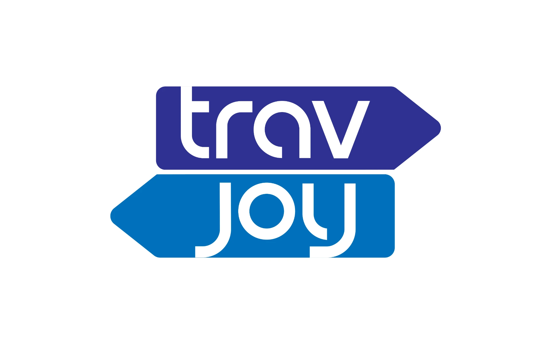
Stacked Arrow Forms
The two-part name was split into a stacked formation — with each word housed in a bold arrow shape. This immediately evokes travel signage, wayfinding, and forward movement.
Custom Typeface
Rounded lowercase letters give the logo approachability and warmth — balancing clarity with playfulness. The ‘t’ and ‘j’ mirror each other visually, reinforcing symmetry across levels.
Color Palette
A deep violet paired with a vibrant blue — striking enough for travel ads, ticketing kiosks, or luggage tags. The palette signals trust, ease, and youthful energy.
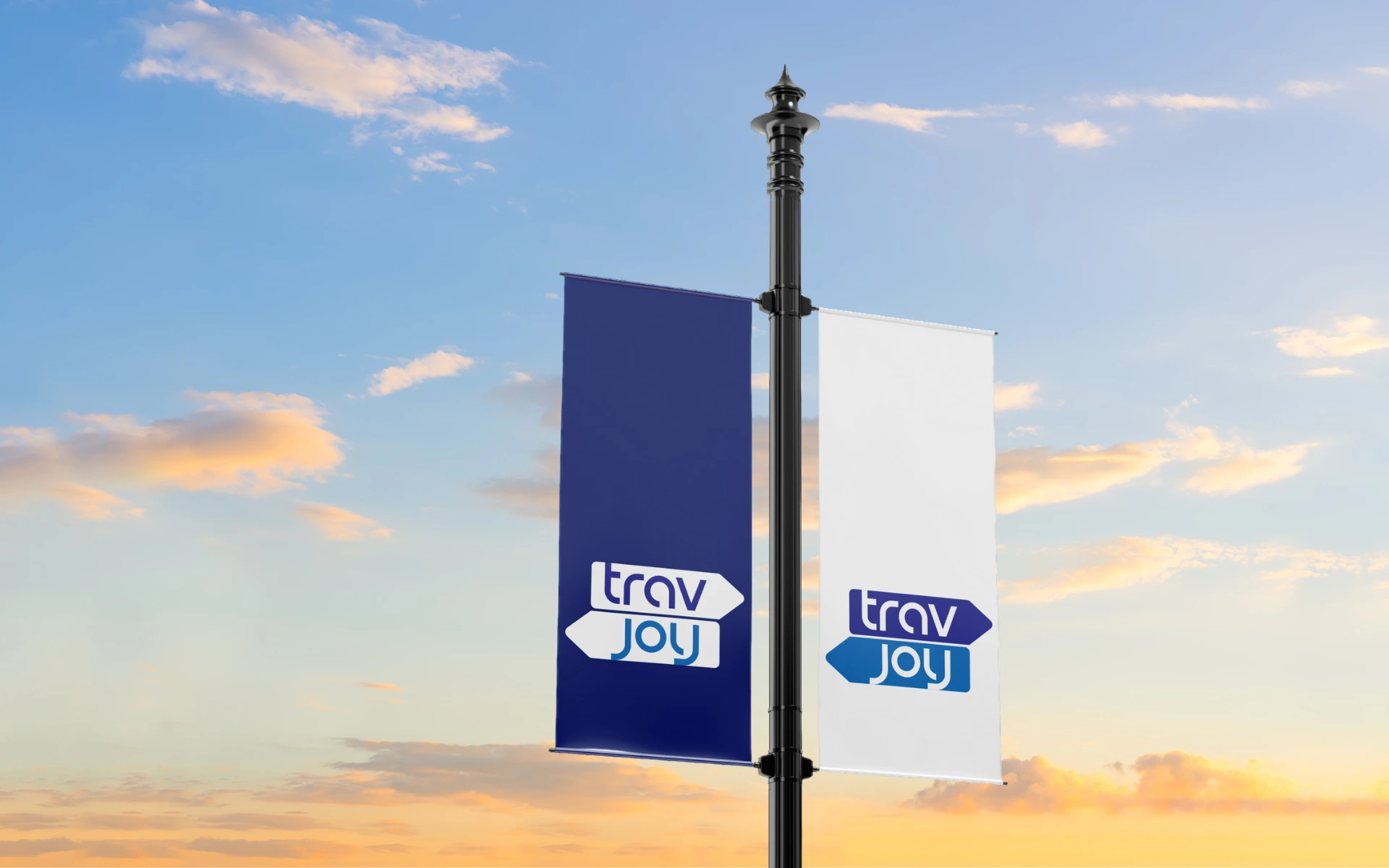
The logo isn’t just a mark. It’s a navigational symbol — instantly readable, highly adaptable, and rooted in the experience of travel itself. Whether printed on boarding passes or featured on digital banners, it holds its own.
TravJoy’s logo doesn’t need to explain itself. It’s travel, made joyful — and it points the way.