Vedobhava
Logo Design


A logo that captures centuries of healing—refined for today’s world.
Vedobhava wasn’t just another Ayurvedic brand. It was a bridge—between the ancient and the modern, between ritual and relevance.
The brand needed a logo that could carry this duality. One that reflected deep-rooted Ayurvedic wisdom, while still feeling contemporary, calming, and clean. The goal: to stand apart in a cluttered wellness space—not by shouting louder, but by speaking with purpose.
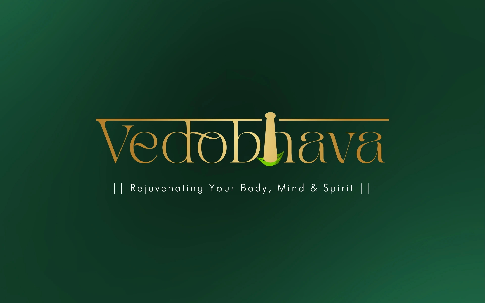
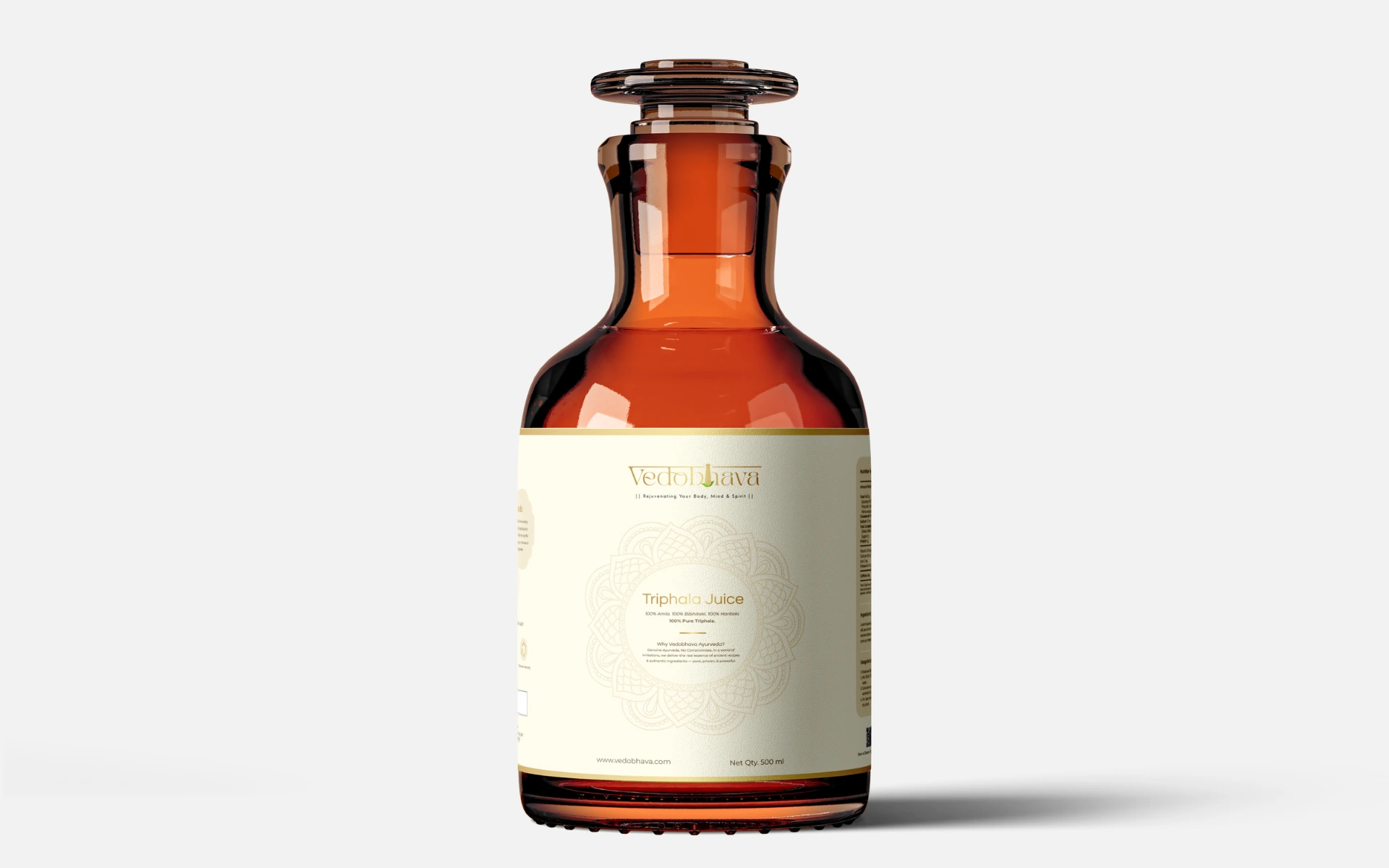
The logo is minimal—but it carries centuries of meaning.
The central icon: A simplified pestle wrapped in leaves. The pestle—a classic symbol of Ayurvedic preparation—stands upright like a totem of knowledge and care. The leaves enveloping its base represent the natural, healing origins of every formulation.
Form meets function: The logo shape subtly echoes a human form—grounded, balanced, and whole. A reminder that Ayurveda treats the person, not the symptom.
Color cues: The palette balances earthy greens with warm ochre—drawing from Ayurvedic herbs and oils. It feels nurturing, but never dated.
Typeface: Clean, rounded typography complements the visual icon with clarity and approachability—while retaining a sense of seriousness and trust.
We didn’t just design a logo. We distilled a philosophy.
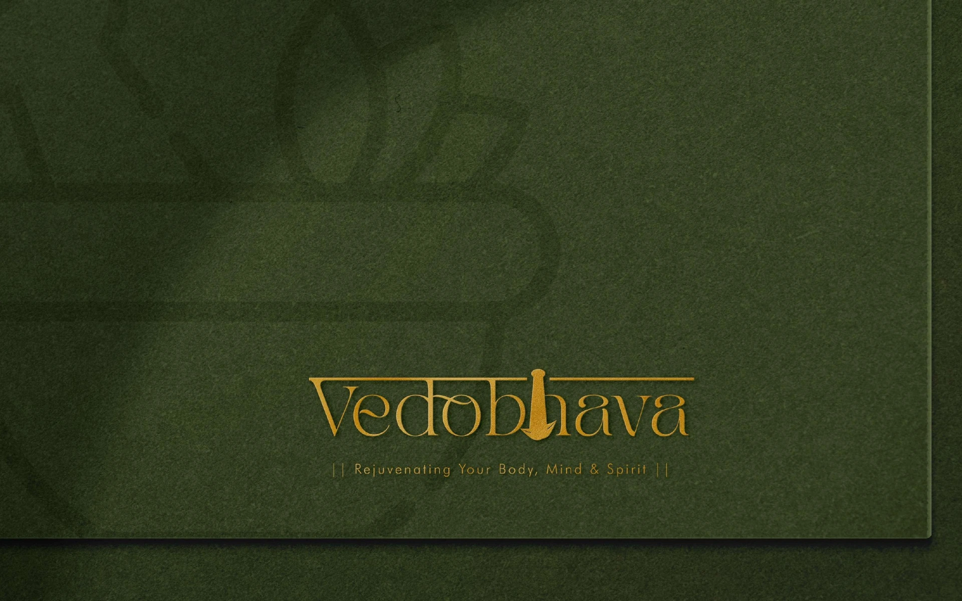
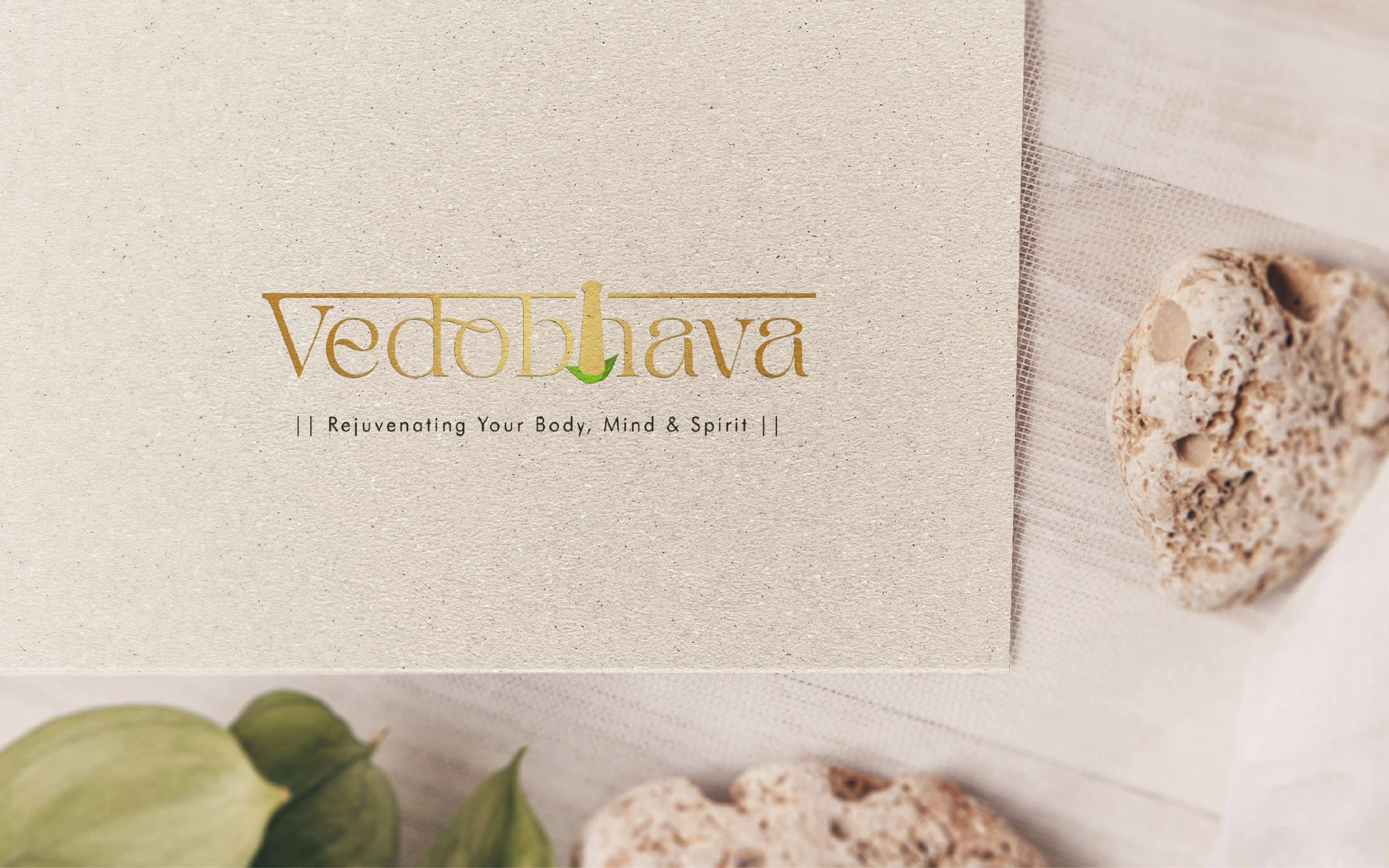
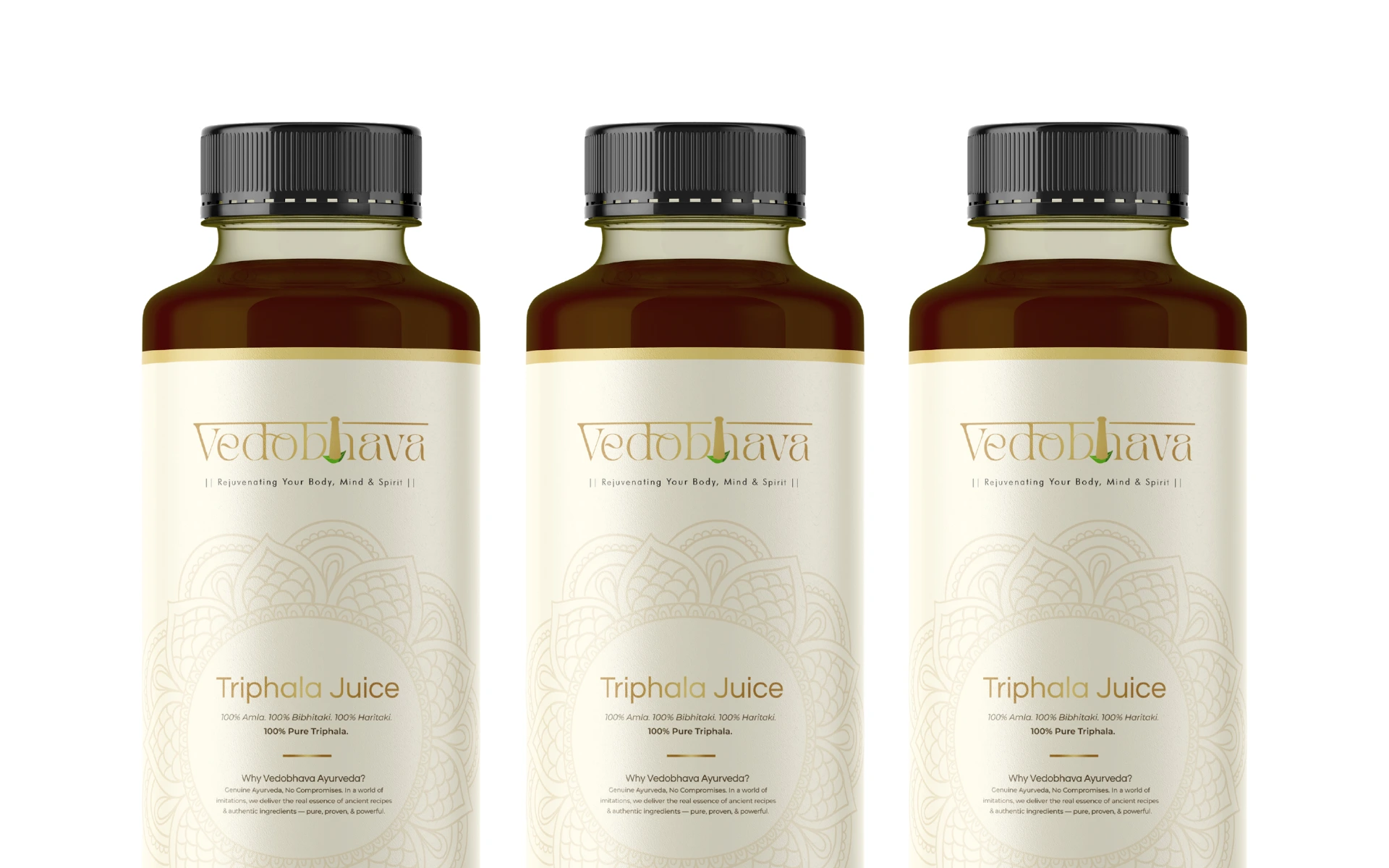
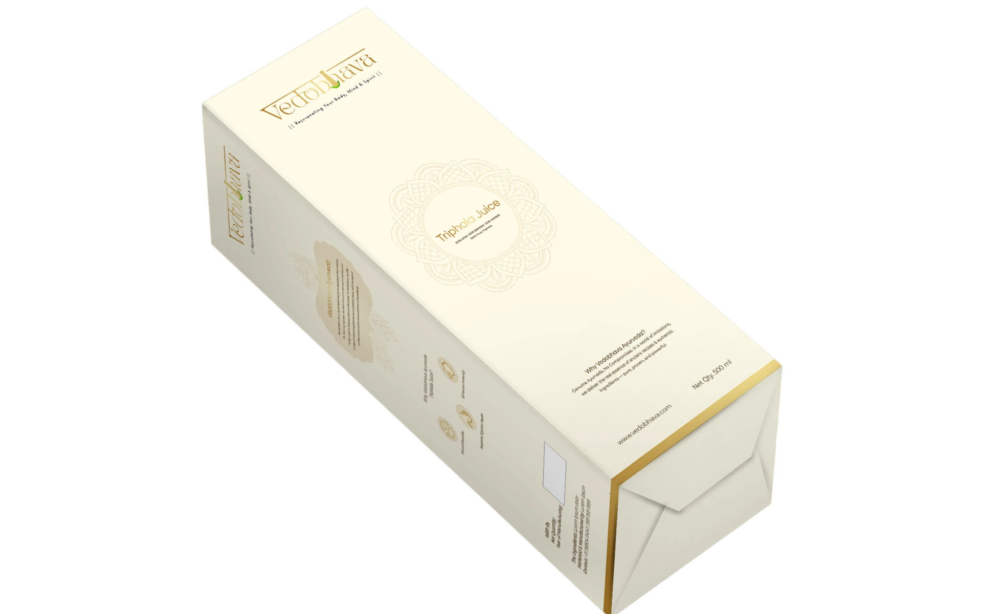
Vedobhava’s identity needed to reassure without overwhelming. Every line, curve, and color was chosen to represent care, calm, and credibility. The result is a mark that works across clinical, retail, and digital environments—whether on a product label or a consultation slip.
The Vedobhava logo doesn’t try to modernize Ayurveda. It honors it. By balancing tradition with tact, symbolism with simplicity, the logo becomes a seal of trust. One that welcomes both the believer and the beginner.