Immershivaa
Logo Design


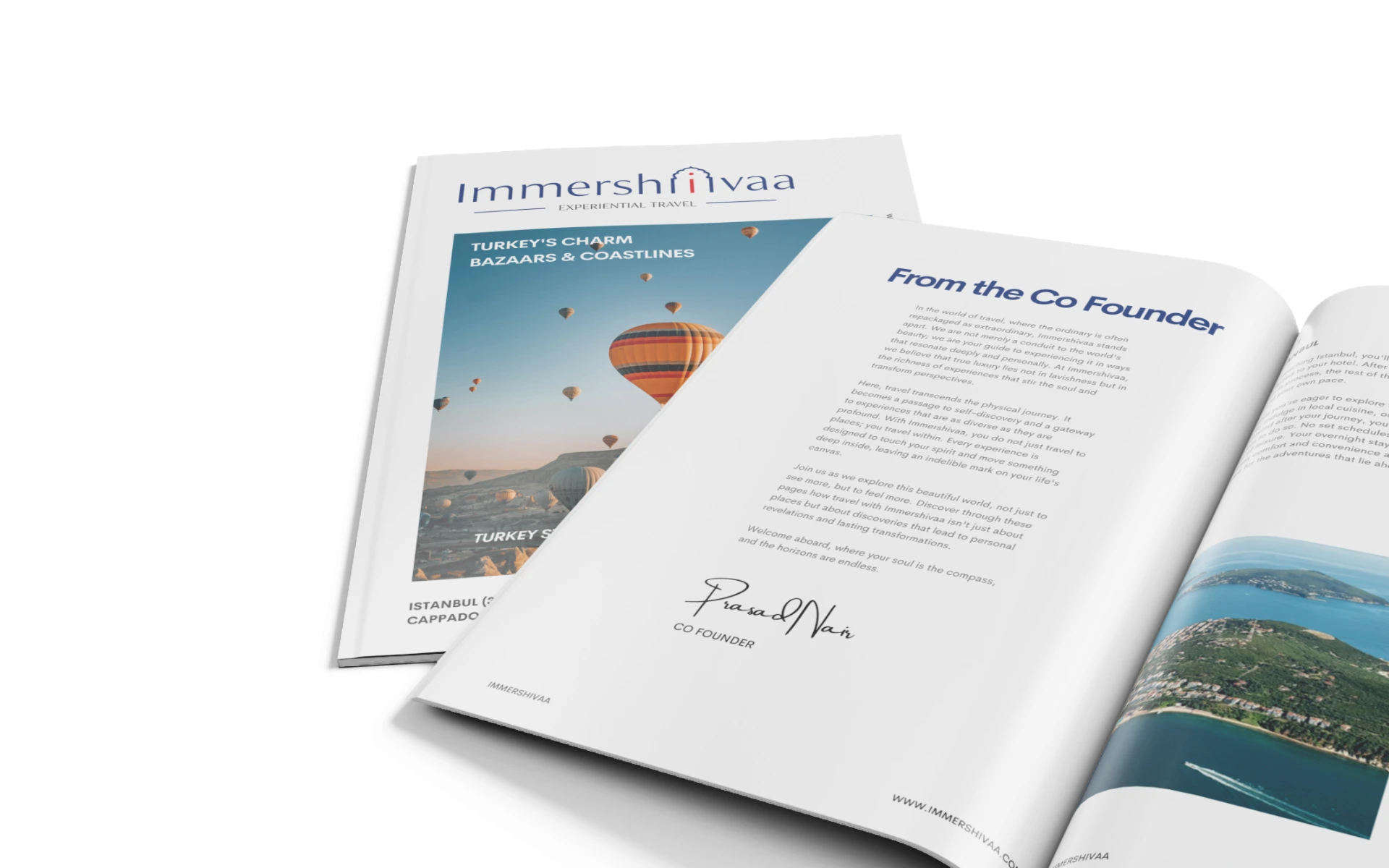


A logo inspired by journeys—not just across landscapes, but through culture, history, and self. That’s what we crafted for Immershivaa, a premium experiential travel brand that redefines what it means to explore India.
Immershivaa isn’t about sightseeing. It’s about soul-seeing.
Positioned at the intersection of heritage and luxury, the brand offers immersive journeys through India’s spiritual, cultural, and architectural richness. The identity needed to echo that promise—of depth, elegance, and rooted storytelling.
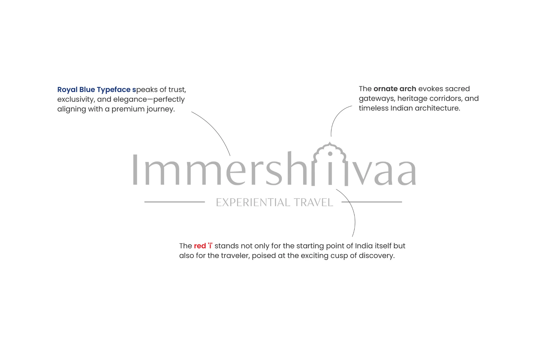
We designed a wordmark that opens doors—visually and symbolically.
The Ornate Arch:
A tribute to India’s sacred gateways and timeless architecture. Placed around the “i”, it transforms the dot into a journey—marking entry into a deeper kind of travel.
The Red ‘i’:
A bold highlight at the center. It represents the traveler—curious, present, and standing at the cusp of something profound. It also nods to India as the origin of the journey.
Royal Blue Typeface:
Elegant and refined, the deep blue carries connotations of trust, serenity, and exclusivity—perfectly aligning with the premium nature of Immershivaa’s curated experiences.
Together, the elements form a logo that feels poised, premium, and rooted in narrative.
This wasn’t about logos. It was about legacy.
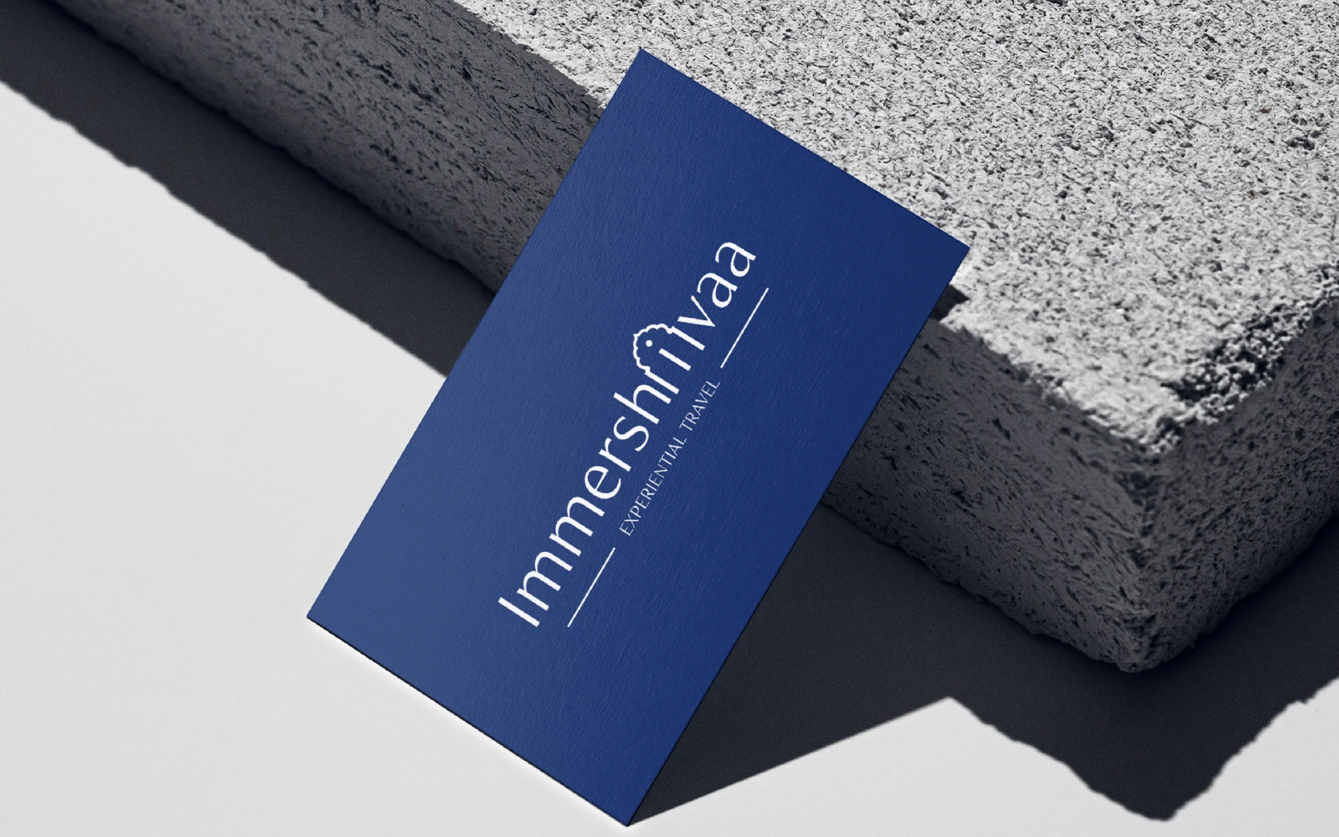
We studied Indian architectural forms, spiritual symbolism, and luxury brand cues to arrive at a design system that could feel contemporary without losing cultural depth. Whether embossed on stationery or printed on passports, the identity adapts with quiet authority.
The Immershivaa logo invites you in—and makes you want to stay.
It’s not flashy. It’s foundational. The kind of logo that feels like it’s always existed—because it draws from places that always have. With one glance, it tells you: this isn’t just a trip. It’s a transformation.